10 graphic design projects by award-winning Miami Ad School graduates
An Apple Watch app that helps identify and alleviate symptoms of a panic attack features alongside a music campaign that sheds light on disparities between male and female sexual pleasure in this VDF school show by Miami Ad School. The show includes 10 projects developed by this year's graduates of the Portfolio Programme for Graphic The post 10 graphic design projects by award-winning Miami Ad School graduates appeared first on Dezeen.


An Apple Watch app that helps identify and alleviate symptoms of a panic attack features alongside a music campaign that sheds light on disparities between male and female sexual pleasure in this VDF school show by Miami Ad School.
The show includes 10 projects developed by this year's graduates of the Portfolio Programme for Graphic Design from the school's locations in Atlanta, San Francisco and New York. Each were awarded prizes for their efforts.
Portfolio Programme for Graphic Design, Miami Ad School
University: Miami Ad School
Course: Portfolio Programme for Graphic Design
Course statement:
"Miami Ad School presents award-winning work from 10 recent design graduates as part of their VDF school show. The projects focus on ideas that positively impact product and experiential design.
"The work showcased here was completed during the student's last quarter at Miami Ad School, with the aim of preparing students for creative practice and leadership. Education is hands-on and interactive, in the hopes of facilitating innovative ideas and concepts. Students learn to design fresh solutions that contribute to our communities.
"With a global network of 15 schools, Miami Ad School offers design students the opportunity to learn in three intense, full-time degree programme options: portfolio, bachelors or masters. Graduates are prepared to design with the knowledge of how to think, make and do."
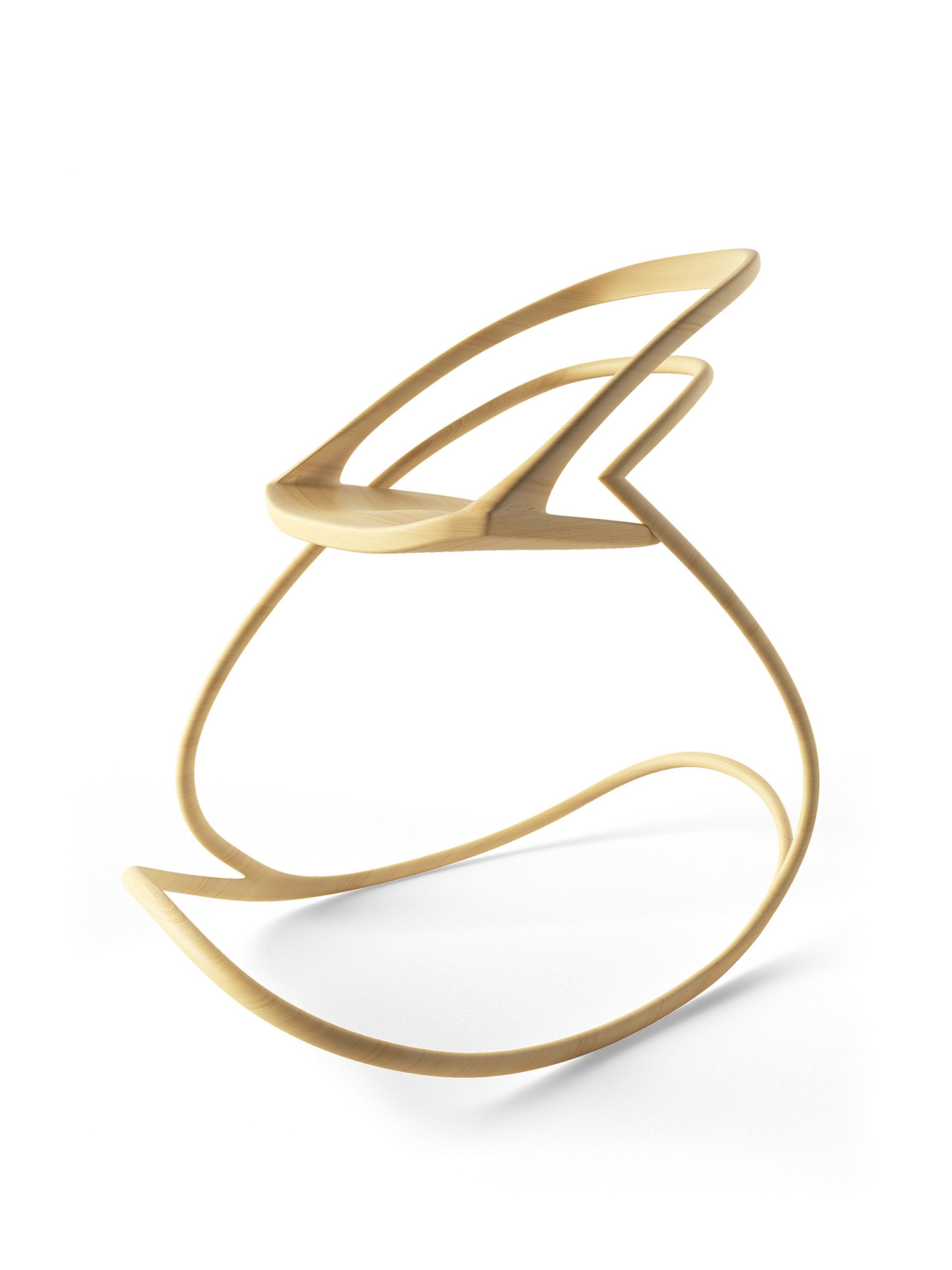
One of a Kind by Anaya Reyes
"This chair is a symbol of independence. It touches on the infinite love and support I have constantly received from my mother and how she provides me with the strength I need to confirm my own independence.
"The base of the chair is made entirely of bamboo, which allows the seat to be securely held by a single foundation."
Email: anayareyes7@gmail.com
Portfolio: behance.net/anayareyes
School: Miami Ad School @ Portfolio Center, Atlanta
Tutor: Hank Richardson
Studio: Design History
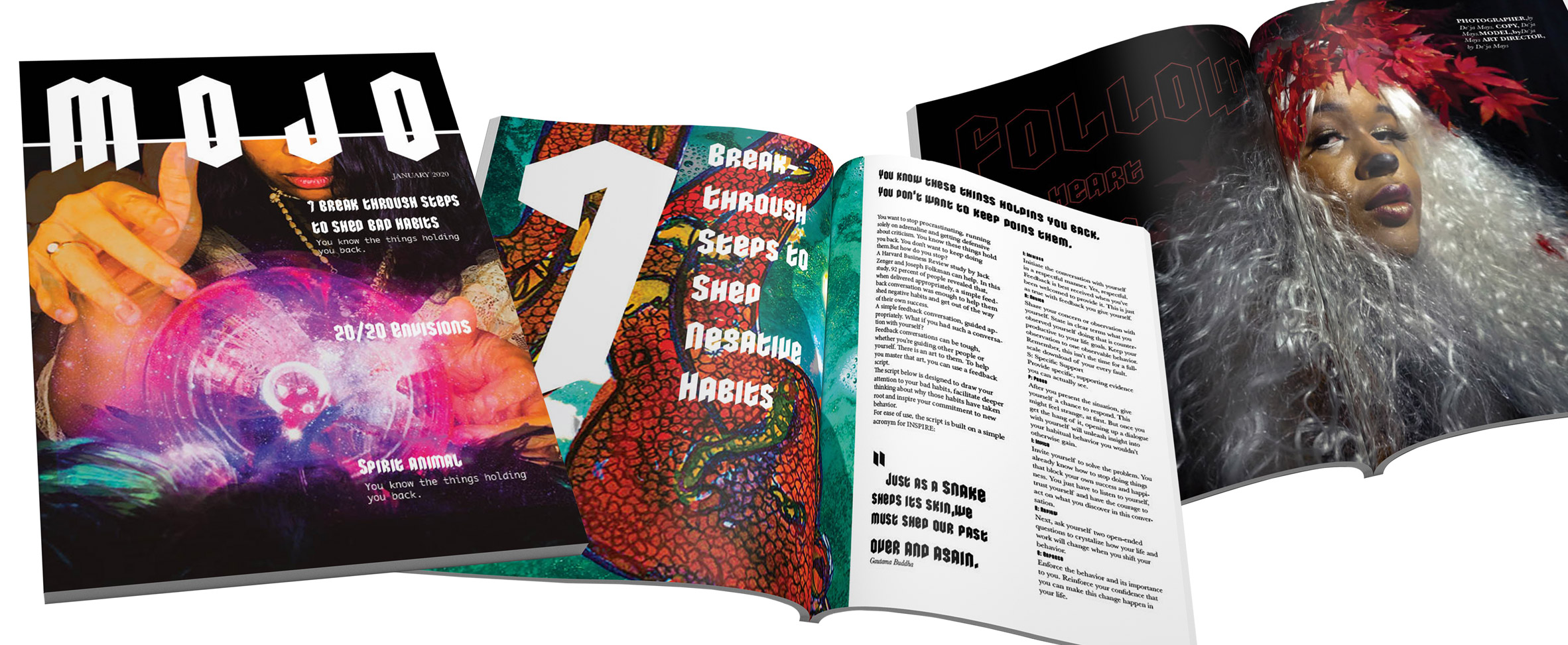
Mojo Magazine by Dèja Pocahontas Mays
"Mojo Magazine is inspired by people who love Lush cosmetics. The brand unites science and magic, so the publication aims to create a sense of wonder in its readers that is backed up by science.
"The design features Lush products such as bath bombs alongside illustration and the brand's trademark edgy, unisex appeal."
Email: dejapocahontas@gmail.com
Website: dejapocahontas.com
School: Miami Ad School @ Portfolio Center, Atlanta
Tutors: Stephanie Grendzinski and Pippa Seichrist
Studio: Typography
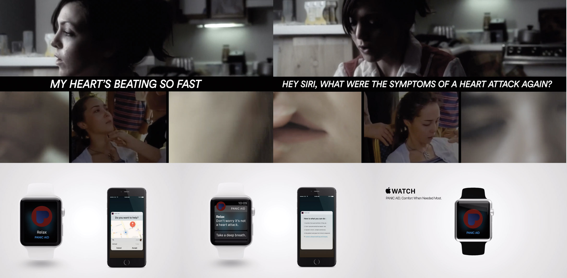
Panic Aid by Hatem El Akad in collaboration with Abdo Soliman, Refaat Rico and Ahmed Radwan
"People who suffer from panic attacks are often too embarrassed to ask for help. They also experience the constant fear that their panic attack is actually a heart attack and they are about to die. We decided to build on the Apple Watch product to alleviate the social and personal stress experienced by panic attack sufferers.
"Panic Aid is an app that detects an irregular heartbeat and launches to help the panic attack patient to cope with the situation. It also sends a notification to other Apple Watch users with instructions on how they can help."
Email: hatemelakkad@gmail.com
Portfolio: hatemelakad.com
School: Miami Ad School San Francisco
Tutor: Manolo Garcia
Studio: Advertising and innovation
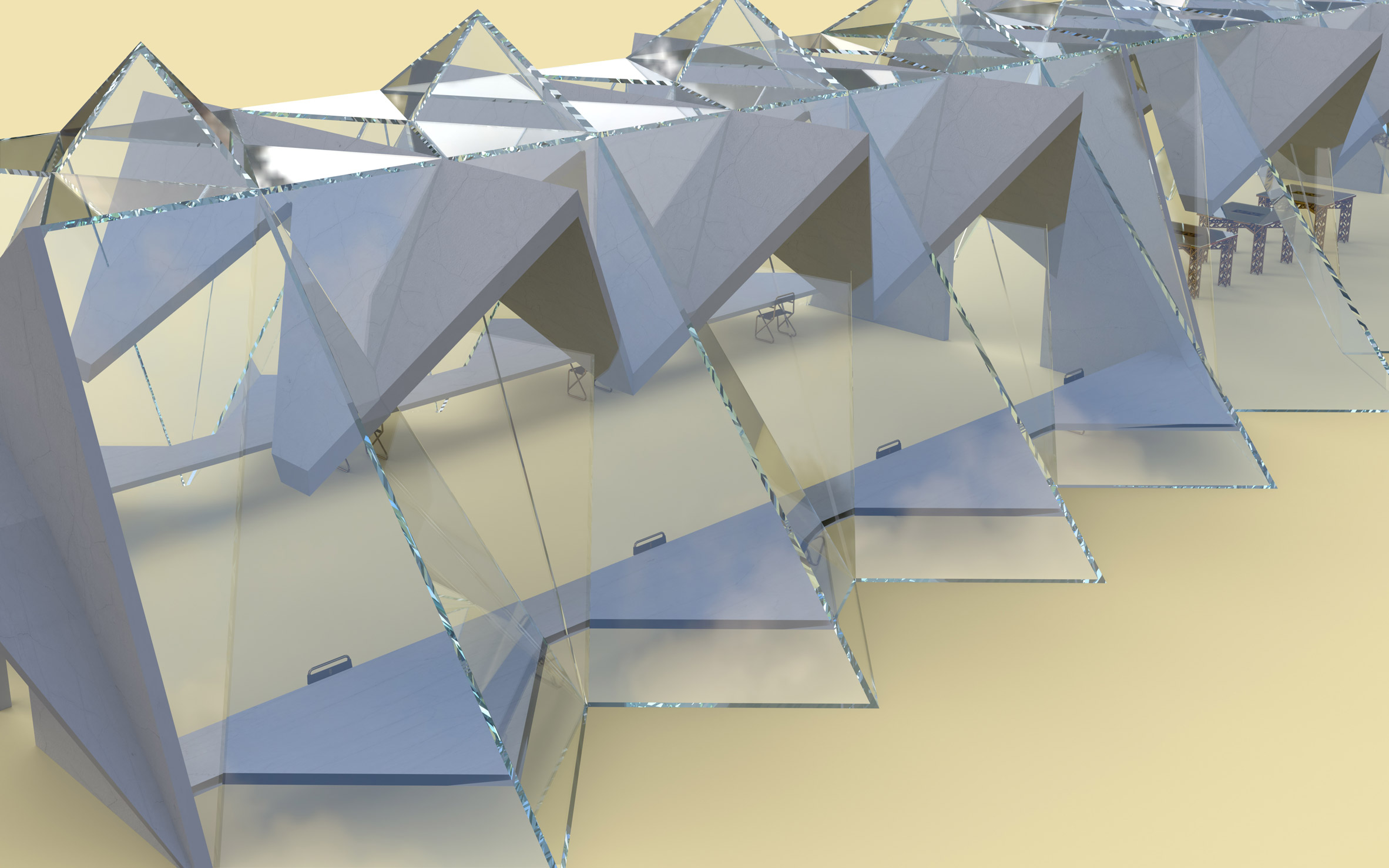
The Bridge Project by Jackson Watkins
"The Bellwood Avenue Viaduct in Atlanta, more commonly known as The Bridge to Nowhere, stretches over railroad tracks and into a parking lot. I propose to repurpose this disused space for an entrepreneurial education program called The Bridge Project for students from Atlanta's public schools.
"The building's position over the railroad is a reminder of Atlanta's origins, while the openness of the structure acts as a reminder of the city. Looking out of the back windows reveals old factory buildings while modern Atlanta is visible in the front."
Email: jacksonwatkinsdesign@gmail.com
Portfolio: behance.net/JacksonWatkinsDesign
School: Miami Ad School @ Portfolio Center, Atlanta
Tutors: Brooke Southerland and Hank Richardson
Studio: Design Thinking
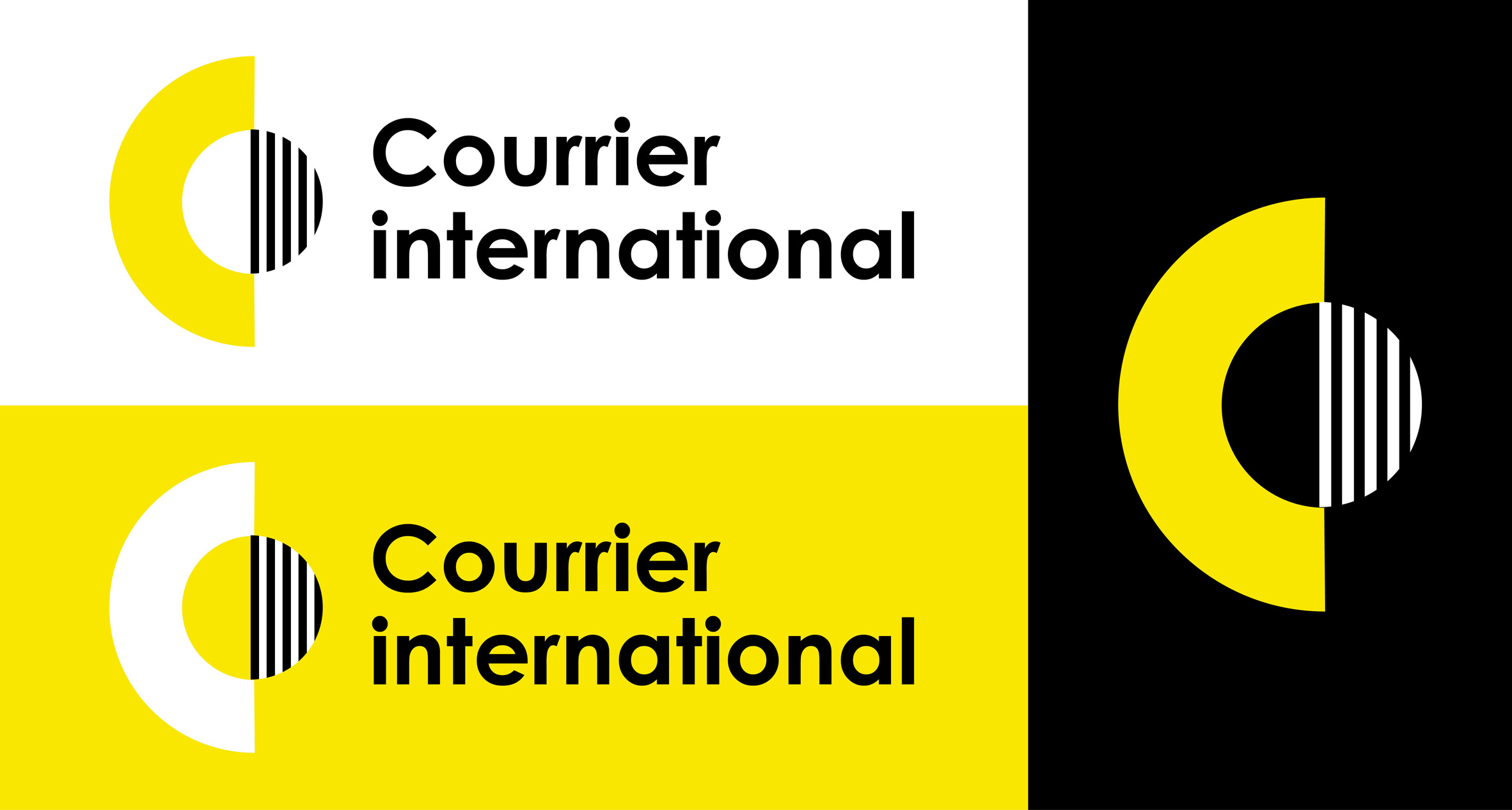
Courrier International by Margaux Salzman
"This project consists of the branding and brand identity for Courrier International, a weekly French newspaper that translates and publishes excerpts of articles from more than 900 international newspapers.
"In homage to the typographic work of Paul Rand, the logo uses simple geometric shapes to represent an open mind that is curious about the world. Together, the two shapes draw the newspaper's initials CI. The sans serif typeface, Century Gothic, adds to the modernity and simplicity of the logo."
Email: margaux.salzman@gmail.com
Website: margauxsalzman.com
School: Miami Ad School San Francisco
Tutor: Carmen Ferreira
Studio: Typography
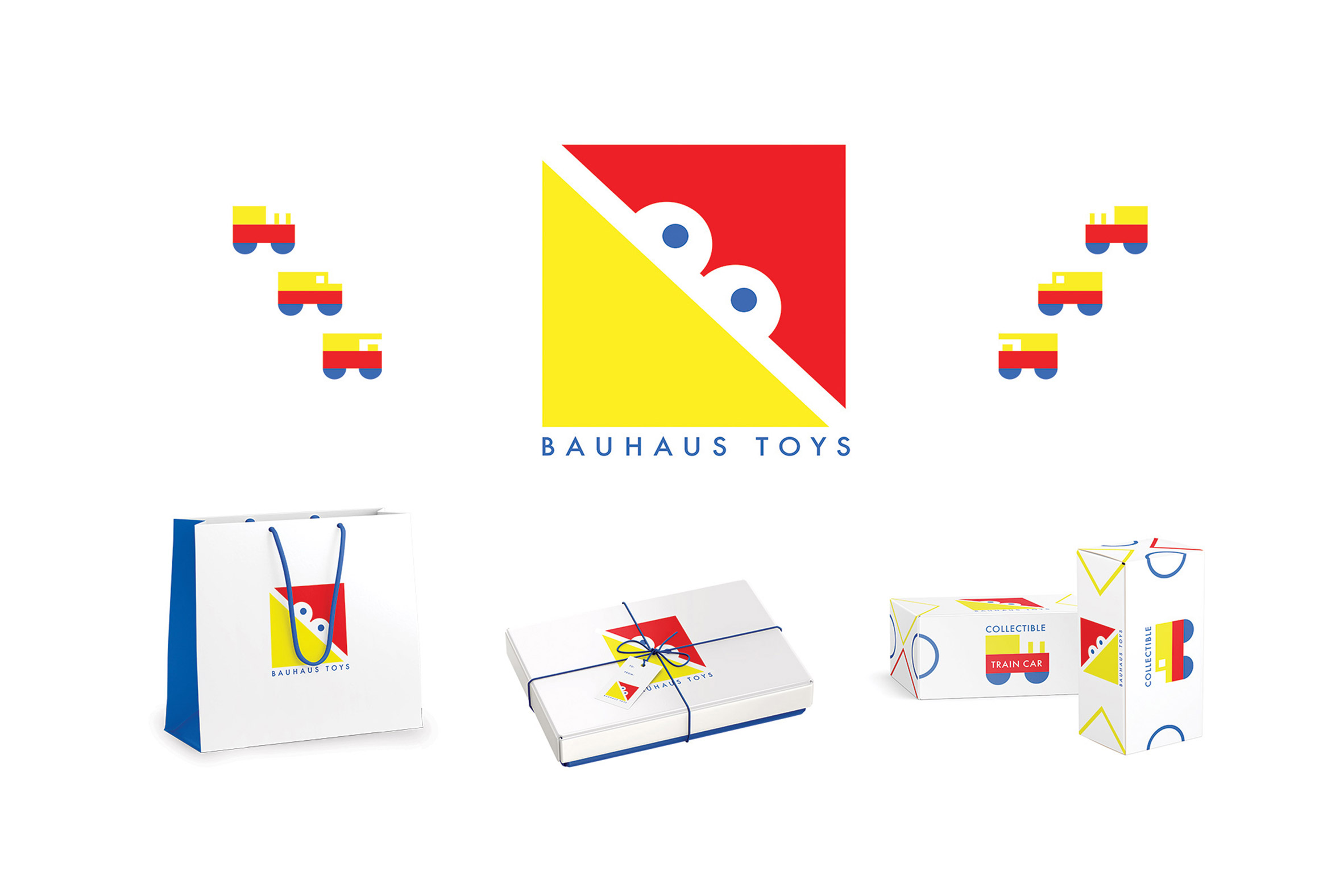
Bauhaus Toys logo by Millie Nicholson
"This logo was designed to embody the essence of both the Bauhaus and the idea of play. Its geometric design creates a bird's face, with a yellow triangle for the beak and a red triangle for the head while B is rendered in the negative space between them to create eyes with blue pupils.
"Bauhaus Toys embodies the shapes and colours of the Bauhaus and the playful spirit of a toy bird. The mark is paired with Futura Bold because of Futura's sturdy, geometric quality."
Email: millienicholson23@gmail.com
Portfolio: behance.net/millienicholson
School: Miami Ad School @ Portfolio Center, Atlanta
Tutors: Mike Kelly and Hank Richardson
Studio: Logos

Vestige by Romina Salini
"This project is based on a brief calling for the design of a bottle using Victorian hand lettering and is based on a story from the time. The label design is based on Edgar Allan Poe's short story The Black Cat, with the sharp lines and edges of the typeface representing the cat's claws and the visceral murder committed by the narrator.
"The vanishing depth of the letters reflect the disintegration of his morals throughout his abusive relationship with alcohol."
Email: rsali009@fiu.edu
Portfolio: behance.net/rominasalini
School: Miami Ad School @ Portfolio Center, Atlanta
Tutor: Brennan Holloway
Studio: Typography

In-Sink Dishwasher by Ronak Patel
"Based on a brief calling for the redesign of everyday products, I created a more ergonomic version of a classic dishwasher. Assumptions about the aspirations and responsibilities of people are reflected and reinforced by the ways that home appliances have been designed, marketed, used and imagined.
"My goal was to eliminate these faux assumptions and bring the dishwasher into the context of today's social fabric and ergonomic identity. Issues with current dishwasher models that were noted and considered in the design
include the long cycle time, large capacity, location, loading mechanism and size. My solution is the In-Sink Dishwasher."
Email: ronakp.design@gmail.com
Portfolio: behance.net/ronakdesign
School: Miami Ad School @ Portfolio Center, Atlanta
Tutor: Hank Richardson
Studio: Product Innovation

Running Of The Bulls by Stella Ruthe
"Running Of The Bulls is an event, based in Pamplona, Spain, where bulls are lead to the bull ring by runners through the streets of the town's old quarter.
"In this logo for the event, straight lines show the strength of the bull – a powerful animal following its aim. The circular frame holds the logo together while giving the eye something to focus on."
Email: stellaruthe@hotmail.de
Website: stellaruthe.com
School: Miami Ad School @ Portfolio Center, Atlanta
Tutor: Hank Richardson
Studio: Logos

Unfinished by Vanessa Bittante in collaboration with Vanessa Bittante and Maidenly Pham
"While the pleasure gap disproportionately affects women, Unfinished uses a medium that is universally understood by all: music. By using music to challenge ideas surrounding female pleasure, the project raises awareness around the topic and sparks conversation.
"Unfinished normalizes the journey of exploring and nurturing one's sexuality, ultimately encouraging users to take charge of their sexual health. By empowering women to take complete control over their bodies and wellness, this empowers them in all aspects of life."
Email: vanessa.bittante@gmail.com
Website: vanessabittante.com
School: Miami Ad School New York
Tutor: Austin DeJonge
Studio: Portfolio development
Virtual Design Festival's student and schools initiative offers a simple and affordable platform for student and graduate groups to present their work during the coronavirus pandemic. Click here for more details.
The post 10 graphic design projects by award-winning Miami Ad School graduates appeared first on Dezeen.
