UBA Bank
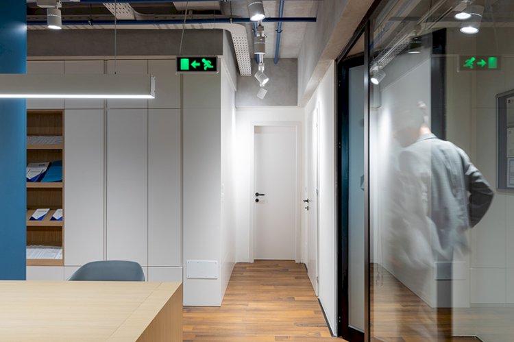
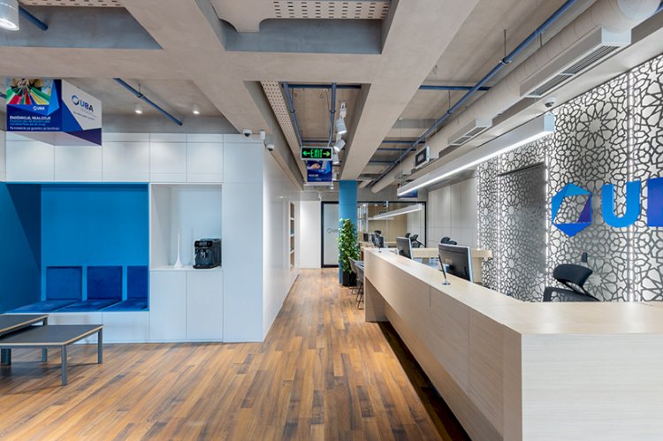
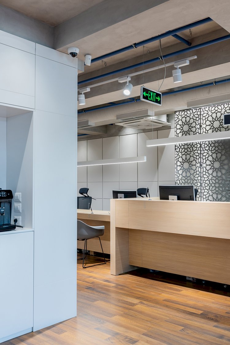
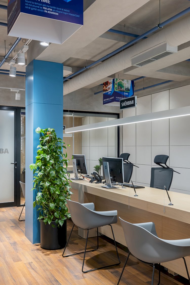
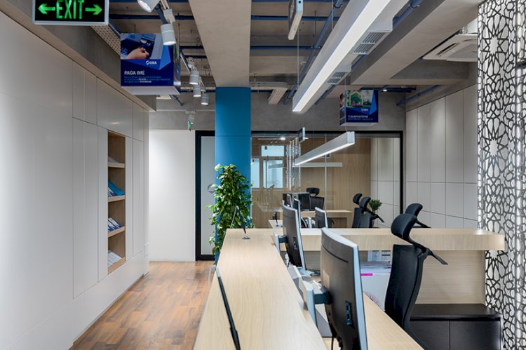
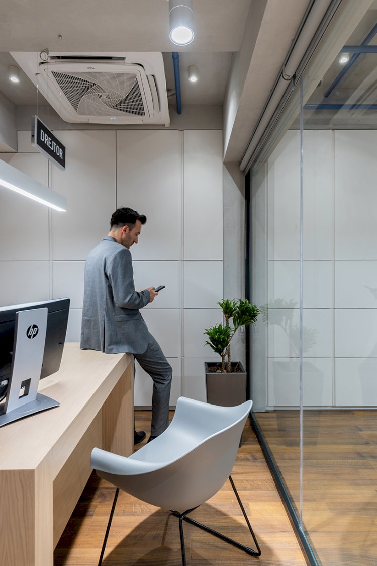
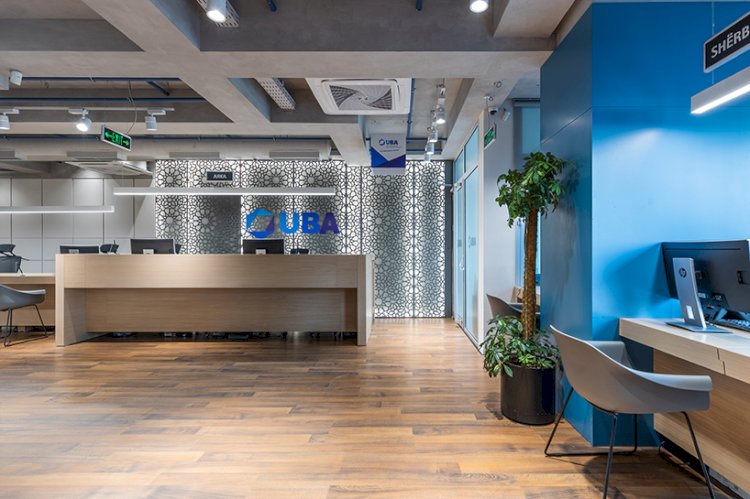
The United Bank of Albania aims to be a bank in the Albanian market that creates transparency for the citizens, provide stability and create the feeling of unity between the bank and its clients, which are inherently connected to each other. Tharm Architects have tried to convey this feeling in the interior design of the bank, aiming to create a brand identity. UBA Bank in design relies on three main elements: - (Safety) Transparency - Stability - Uniting the bank with the citizen To give the feeling of transparency, light-colored wooden tables were used so that everything on the table is easily visible. A sense of transparency is very important for a long-term relationship between the bank and its customers. To express the durability and guaranty of the bank, deep interlocking concrete beams are used that show the safety and seriousness of the bank, based on wide "columns", covered with MDF with oak veneer to give the feeling of security, but also of the warmth of a large family, such as the bank. Wood elements (MDF) give the feeling of hospitality and warmth. UBA is a bank which is based on the principles of Islamic Finance and Banking. Inspired by the geometric motifs of the Islamic faith that has had an impact on Albanian culture, several decorative panels made of sheet metal in the form of grids with hidden lighting have been created. They are mounted on the sides of the walls, giving a pleasant atmosphere. Based on the color scheme of the logo, blue has been used extensively in elements such as column cladding, decorative tubes, and waiting areas. Neutral gray chairs are combined with the color of decorative panels, concrete beams, as well as structural glass of the bank, which stand harmoniously in the totality of elements and materials. The connection (union) between the citizens and the bank Using the beam elements that connect between them and the perimeter walls, the feeling of a connection and union of the bank with the citizens is given. These elements symbolically express support and assistance to citizens. By the same logic, decorative pvc pipes connected to the beams were used. To maintain the maximum height in the environment, the suspended ceilings have been removed. In this way a maximum space in the environment is obtained. Since in different buildings we have beams with different heights, we integrate the given solution as part of the decor, creating a scenography that can be adapted to any environment. The project has been selected as a winner in the BIG SEE Interior Design Award 2022. It has also been nominated for the Grand Prix award in the category Retail.


