Archetypes

ArchetypesDavid K. Ross; Edited by Reto GeiserStandpunkte/Park Books, August 2021Hardcover | 8-1/4 x 11 inches | 112 pages | 40 illustrations | English | ISBN: 9783038602217 | $49.00PUBLISHER'S DESCRIPTION:Archetypes features a recent series by Canadian artist David K. Ross, who works at the interface of photography, film, and installation. His images of architectural mock-ups, staged at night with dramatic lighting that isolates structures from their surroundings, demonstrate how these objects have become a charged form of proto-architecture. They also change how we view the practice of architecture by documenting and framing unseen aspects of its emergence. Built at full scale, these architectural fragments—to be removed from construction sites as buildings near completion—ensure that a project can be executed exactly to design, and they provide clients with a simulation of a building that leaves little space for speculation. The task of mock-up documentation is usually left to architects and contractors, who take quick snapshots for their reference during site visits. Archetypes is the first-ever photographic compilation of this type, reaching beyond a mere artistic record of building technologies and typologies. Instead, the book offers an effective platform to consider what it means to pre-construct fragments of buildings in all their complexity. Published alongside Ross’s images are four essays framing the historical, technological, and civic significance of the mock-up. Archetypes offers an intellectual and aesthetic reference for a wide range of audiences from professionals in architecture to anyone interested in photography and art, or fascinated by arcane aspects of building construction.David K. Ross is a Canadian artist who uses film and installation to research and document fragmentary and ephemeral aspects of civil and cultural infrastructures. Reto Geiser is a designer and scholar of modern architecture, and an associate professor at Rice University’s School of Architecture in Houston, Texas.REFERRAL LINKS:   dDAB COMMENTARY:Back in September 2016 I attended a hard-hat tour of the Hunters Point Library designed by Steven Holl — yes, that library. In addition to venturing inside the building's concrete shell, getting behind the green construction fence allowed me to get up close to the mock-up of the exterior wall that was designed as reinforced concrete covered in aluminum foam, a little bit like the same architect's Editions de Parfums Fédéric Malle store in Greenwich Village. Unfortunately — but not surprisingly, given the  branch library's long construction and escalating costs — the aluminum foam was value-engineered out of the building, leading to the substitution of silver paint on the concrete walls. Doubly unfortunate, in its final form the library exterior looks like brightly painted OSB, given how the concrete exhibits the impression of the inexpensive formwork that was used but was never meant to be seen in this way. It's hard not to think back to my brief encounter with the mock-up of Holl's library when flipping through Archetypes, which presents a series of photographs by David K. Ross that hones in on mock-ups at construction sites, many in Switzerland but quite a few in New York City and other North American cities. After all, it's not everyday that people encounter construction mock-ups: the full-scale assemblies made to test design and construction details, set a quality standard for the contractor and their subs, and show to the client and the rest of the project team what a portion of the facade will look like. Occasionally I've come across mock-ups that are publicly accessible (ones for buildings at Europaallee in Zurich come to mind, though apparently they were not exceptional enough for me to photograph), but in the United States they tend to be tucked behind construction fences, making them hidden secrets rather than public displays of what's to come — or not quite to come, in the case of Hunters Point Library.As a few of the examples below indicate, the mock-ups photographed by Ross tend to be architecturally interesting, but more than that they are beautifully captured. Taken at night with bold lighting that gives the impression of the mock-ups floating in a void or being seen theatrically in front of huge black curtains (they are neither), the photographs draw our gaze to temporary constructions, or what Peter Sealy calls in his contribution to Archetypes pieces that occupy a "liminal zone between representation and construction." Sealy's essay relates these 21st-century mock-ups to 19th-century plaster casts and their representation, but I'm more interested in seeing them for their intrinsic value, namely as constructions that further innovation in architecture. Ted Kesik explores this area in his contribution to the book, seeing mock-ups as "an opportunity for all involved on the project [...] to engage in the project together," making it a "more democratic and co

Archetypes
Archetypes
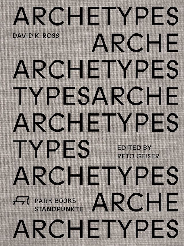
David K. Ross; Edited by Reto Geiser
Standpunkte/Park Books, August 2021

Hardcover | 8-1/4 x 11 inches | 112 pages | 40 illustrations | English | ISBN: 9783038602217 | $49.00

PUBLISHER'S DESCRIPTION:

Archetypes features a recent series by Canadian artist David K. Ross, who works at the interface of photography, film, and installation. His images of architectural mock-ups, staged at night with dramatic lighting that isolates structures from their surroundings, demonstrate how these objects have become a charged form of proto-architecture. They also change how we view the practice of architecture by documenting and framing unseen aspects of its emergence. Built at full scale, these architectural fragments—to be removed from construction sites as buildings near completion—ensure that a project can be executed exactly to design, and they provide clients with a simulation of a building that leaves little space for speculation. The task of mock-up documentation is usually left to architects and contractors, who take quick snapshots for their reference during site visits.
 
Archetypes is the first-ever photographic compilation of this type, reaching beyond a mere artistic record of building technologies and typologies. Instead, the book offers an effective platform to consider what it means to pre-construct fragments of buildings in all their complexity. Published alongside Ross’s images are four essays framing the historical, technological, and civic significance of the mock-up. Archetypes offers an intellectual and aesthetic reference for a wide range of audiences from professionals in architecture to anyone interested in photography and art, or fascinated by arcane aspects of building construction.

David K. Ross is a Canadian artist who uses film and installation to research and document fragmentary and ephemeral aspects of civil and cultural infrastructures. Reto Geiser is a designer and scholar of modern architecture, and an associate professor at Rice University’s School of Architecture in Houston, Texas.

REFERRAL LINKS:

Buy from AbeBooks Buy from Amazon Buy from Bookshop.org Buy via IndieBound

dDAB COMMENTARY:

Back in September 2016 I attended a hard-hat tour of the Hunters Point Library designed by Steven Holl — yes, that library. In addition to venturing inside the building's concrete shell, getting behind the green construction fence allowed me to get up close to the mock-up of the exterior wall that was designed as reinforced concrete covered in aluminum foam, a little bit like the same architect's Editions de Parfums Fédéric Malle store in Greenwich Village. Unfortunately — but not surprisingly, given the  branch library's long construction and escalating costs — the aluminum foam was value-engineered out of the building, leading to the substitution of silver paint on the concrete walls. Doubly unfortunate, in its final form the library exterior looks like brightly painted OSB, given how the concrete exhibits the impression of the inexpensive formwork that was used but was never meant to be seen in this way. 

It's hard not to think back to my brief encounter with the mock-up of Holl's library when flipping through Archetypes, which presents a series of photographs by David K. Ross that hones in on mock-ups at construction sites, many in Switzerland but quite a few in New York City and other North American cities. After all, it's not everyday that people encounter construction mock-ups: the full-scale assemblies made to test design and construction details, set a quality standard for the contractor and their subs, and show to the client and the rest of the project team what a portion of the facade will look like. Occasionally I've come across mock-ups that are publicly accessible (ones for buildings at Europaallee in Zurich come to mind, though apparently they were not exceptional enough for me to photograph), but in the United States they tend to be tucked behind construction fences, making them hidden secrets rather than public displays of what's to come — or not quite to come, in the case of Hunters Point Library.

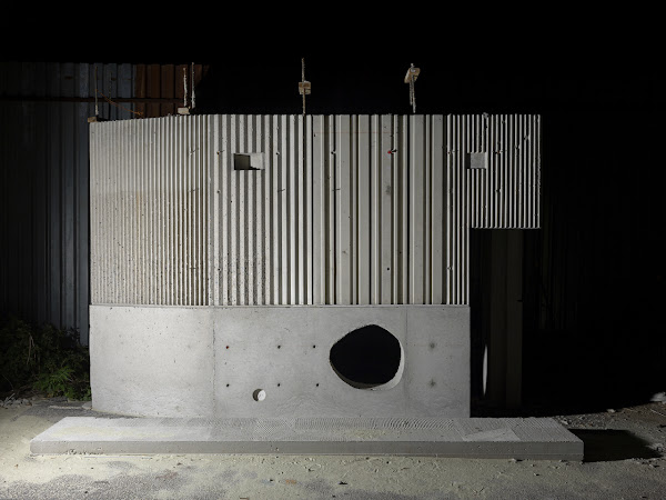
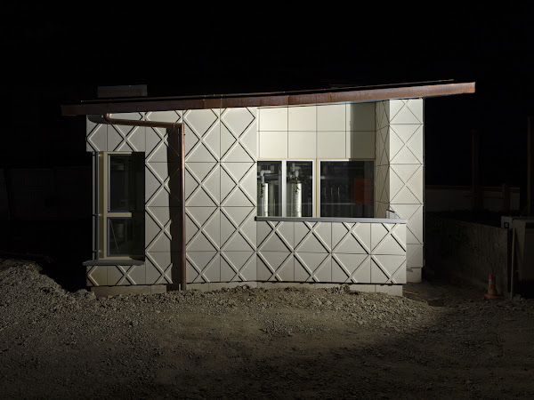
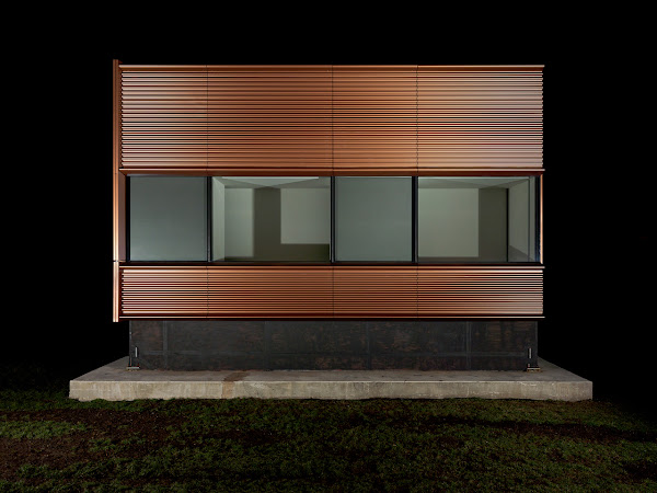
As a few of the examples below indicate, the mock-ups photographed by Ross tend to be architecturally interesting, but more than that they are beautifully captured. Taken at night with bold lighting that gives the impression of the mock-ups floating in a void or being seen theatrically in front of huge black curtains (they are neither), the photographs draw our gaze to temporary constructions, or what Peter Sealy calls in his contribution to Archetypes pieces that occupy a "liminal zone between representation and construction." Sealy's essay relates these 21st-century mock-ups to 19th-century plaster casts and their representation, but I'm more interested in seeing them for their intrinsic value, namely as constructions that further innovation in architecture. Ted Kesik explores this area in his contribution to the book, seeing mock-ups as "an opportunity for all involved on the project [...] to engage in the project together," making it a "more democratic and collaborative exercise for achieving the project's critical requirements while respecting the original design intent."

Ross's photographs are found across the first roughly 65 pages of the 112-page book, presented simply as one photo per spread without any captions or other text. In the back of the book, beyond the essays by Sealy and Kesik, and a couple more by Reto Geiser and Sky Goodden, is a key to the works that includes for each a thumbnail of the photo, the name of the architect, the building, the location, and the year the photograph was taken (all are from 2016 to 2019). Here we see that Ross spent lots of time in Basel and Zurich, as well as Toronto, Boston, and New York City. Oddly, a few projects that I know are located in NYC (one in Chelsea and two at the Cornell Tech campus on Roosevelt Island) come with the place name "Calverton." Turns out the town out on Long Island is home to Island Exterior Fabricators, which puts Morphosis's Bloomberg Center at Cornell Tech atop its home page and boasts of its year-found "fabrication campus." Evidently, Ross ventured out to their campus to photograph that trio of buildings, in turn capturing extreme examples of construction mock-ups being done note only far from the public eye, but remote from the final buildings themselves.

IMAGES:

Swiss Life Arena Zurich (Caruso St John Architects), Switzerland 2019 (IV) Courtesy of the artist. © David K. Ross
Amant Art Campus (SO–IL), Brooklyn, USA 2017 (I). Courtesy of the artist. © David K. Ross
Wohnsiedlung Schwamendinger-Dreieck (BS+EMI Architektenpartner), Zurich, Switzerland, 2018 (I). Courtesy of the artist. © David K. Ross
The Pavilion, Hospital of the University of Pennsylvania, (Foster + Partners), Philadelphia, USA, 2018. Courtesy of the artist. © David K. Ross