Before & After: In Spain, a Compact 1960s Apartment Gets a Quirky, Experimental Retrofit
Designer Ismael Medina Manzano stretches the limits of an 861-square-foot flat in San Sebastián with mirrors, curves, and a kitchen island on wheels.

Designer Ismael Medina Manzano stretches the limits of an 861-square-foot flat in San Sebastián with mirrors, curves, and a kitchen island on wheels.
When it comes to home design, Spanish designer Ismael Medina Manzano thinks we need to shake things up. "We live in a time when society is changing a lot, and there is no single family type or domestic space," says Manzano, who divides his time between New York City and Madrid, where he carries out built projects while pursuing a PhD in advanced architectural projects. "I’m always wondering, can we conceptualize the domestic space as something less fixed and more flexible?"

Designer Ismael Medina Manzano renovated this 816-square-foot apartment in San Sebastián, Spain, bringing a new level of flexibility and personality to the space.
Hiperfocal
Manzano brought this open-ended approach to the renovation of a compact apartment in San Sebastián, Spain, owned by friends of a friend. "This apartment has been in the family for a while, but it didn’t meet our needs," says the homeowner. "It was dark and very compartmentalized." Manzano’s task was to bring his research to life, and he sought to transform the apartment into a place that could accommodate many different family members and a range of activities.
Before: Entrance

Previously, the apartment was segmented into many smaller spaces with bedrooms on the perimeter, making the main living area in the center feel dark and cramped.
Photo: ismael medina manzano
Located in a 1960s building, the apartment was typical of housing built in northern Spain during that period and it had a standardized, compartmentalized layout. While at the time, many designers thought that closed rooms and rigid floor plans would make domestic life more efficient, the apartment wasn’t working for the owners. "We wanted it to accommodate family members in wheelchairs, kids, or friends who might want to visit," says the homeowner. "The main goal was to create a space for sharing."
After: Entrance

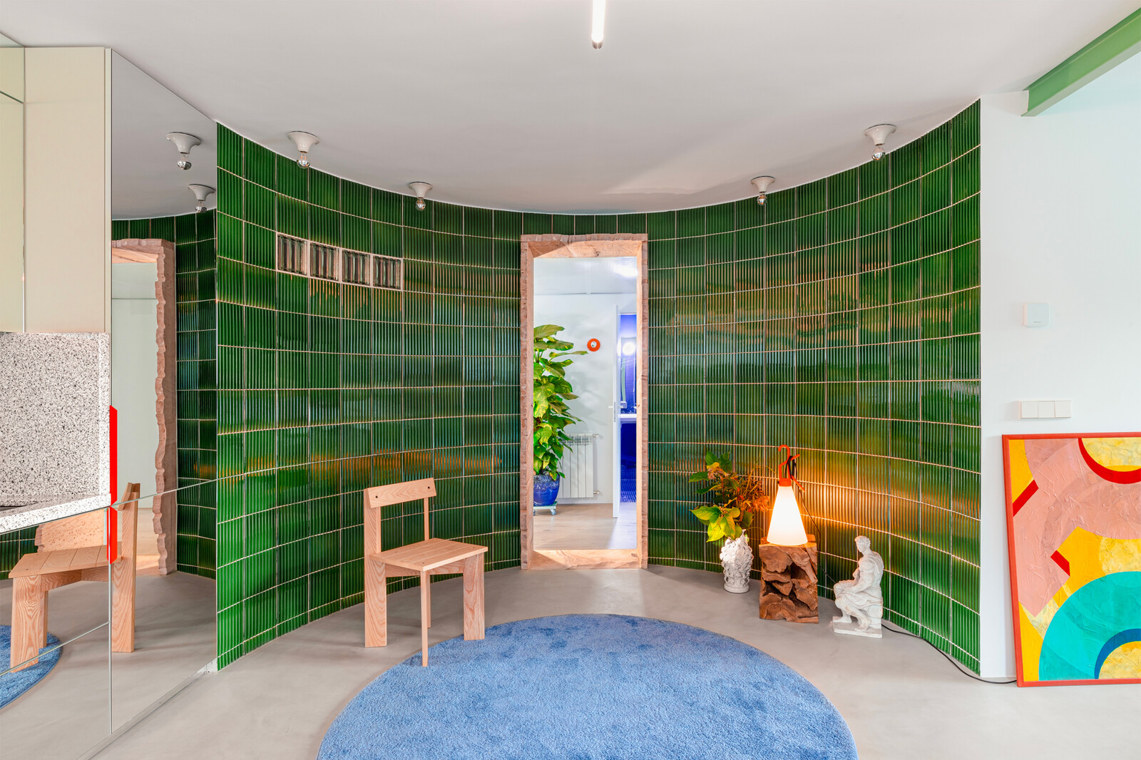
A key intervention in the space was the addition of a curved wall just off the entrance. "We like doing curved things that are not sharply defined," says the designer. "You get more transition and amplification of space." Framing the doorway in locally sourced sandstone highlights regional building materials and traditions in a new way.
Hiperfocal
See the full story on Dwell.com: Before & After: In Spain, a Compact 1960s Apartment Gets a Quirky, Experimental Retrofit
Related stories:
