Beton Cire Paint Showroom by NDB Design
Located in a busy commercial district of the city, the project’s strikingly minimalist, visually pure aesthetic presents an environment reminiscent of a stage, punctuated by the vibrant colors of various architectural elements and objects placed within. The designer Ni Dongbo, inspired by the abstract paintings of Kazimir Malevich, has employed the lively shapes and compositions of the artist’s work in the space planning of the project, resulting in a series of interconnected rooms which announce themselves with a crisp, almost 2-D feeling. Ni believes that virtually anything can be treated as a work of art, and as such has created a number of ‘installations’ in the space which reconfigure everyday, local objects, inviting visitors to imagine them in a fresh and unusual way.
Background
The city of Chengdu is a dynamic urban center of over 16 million people, with a rich cultural history, a thriving arts scene, and an elegant, life-affirming atmosphere.
This project was conceived within the greater context of the vibrant city in which it resides, aiming to create a kind of stage for its visitors where they can participate and interact with an eclectic range of scenes and objects.
The contemporary, minimalist aesthetic which runs through the various spaces of the project was inspired by the paintings of Kazimir Malevich, particularly Black Square (1915) and Suprematist Composition (1916). The former, a simple black square on a white background, provided a template for a kind of space which is pared back, something ultimately simple and subtle – setting a number of abstract scenes which utilize black surfaces, allowing other foreground elements to announce themselves with a crisp, almost 2-D feeling. The designer also referenced the interiors from various residential projects designed by Le Corbusier, such as the La Roche House, and the way they employ brightly colored architectural elements against a ‘backdrop’ of neutral surfaces within a given space.

Source of Inspiration
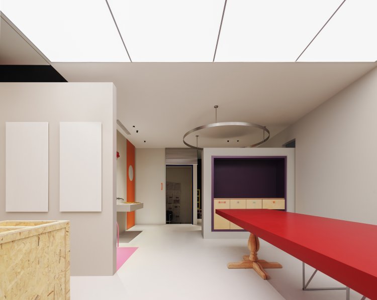
Additionally, the designer has employed the lively colors, shapes, and patterns of Malevich’s other Suprematist paintings and used them in the space planning of the showroom. Taking the client’s programmatic requirements as a starting point, the designer then overlaid yellow, red, and green shapes from Malevich’s works onto the plan of the existing space, which was treated as a black base. This method was used as a way of organizing the different areas of Entrance, Brand History, Product Display, Meeting Room, and Interactive Space.

The final result is a layout of interconnected rooms of varying scales which flow one into the other, providing a pattern of circulation which evokes the freedom of movement between the color elements in Malevich’s paintings.
Contextual background
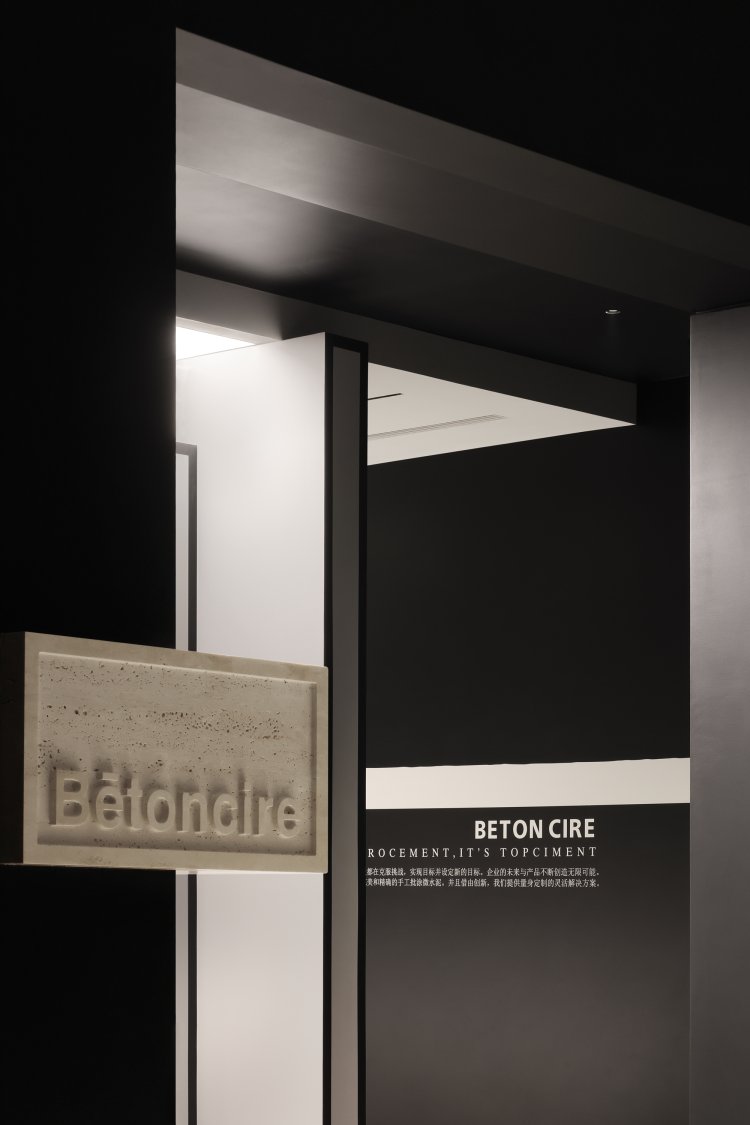
The project is located in a specialty shopping centre within a busy commercial area of Chengdu, dedicated to building supplies and materials. The designer aimed to create an environment which set itself apart from its busy surroundings, offering an elemental, visually pure experience for its visitors and clients.
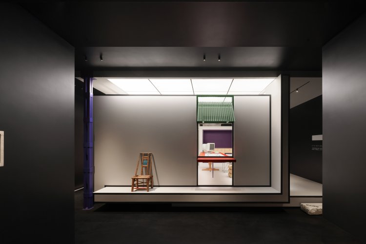
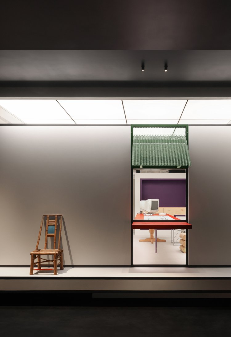
This intention is immediately clear when first entering the showroom, with the brand’s logo etched into beige stone protruding from the outer corner of two opaque black walls. A dramatically lit stage presents itself within the entrance area, with a number of objects arranged on and around it: a traditional wood chair representative of ancient Chengdu, a green metal canopy which recalls the roofs of local architecture, and a red cantilevered countertop which evokes the take-away counters of neighborhood restaurants. Altogether they reference the city’s cultural heritage while incorporating colors taken from the company’s catalogue – emphasizing their products through use on real-world examples.
Wandering Inside of the showroom
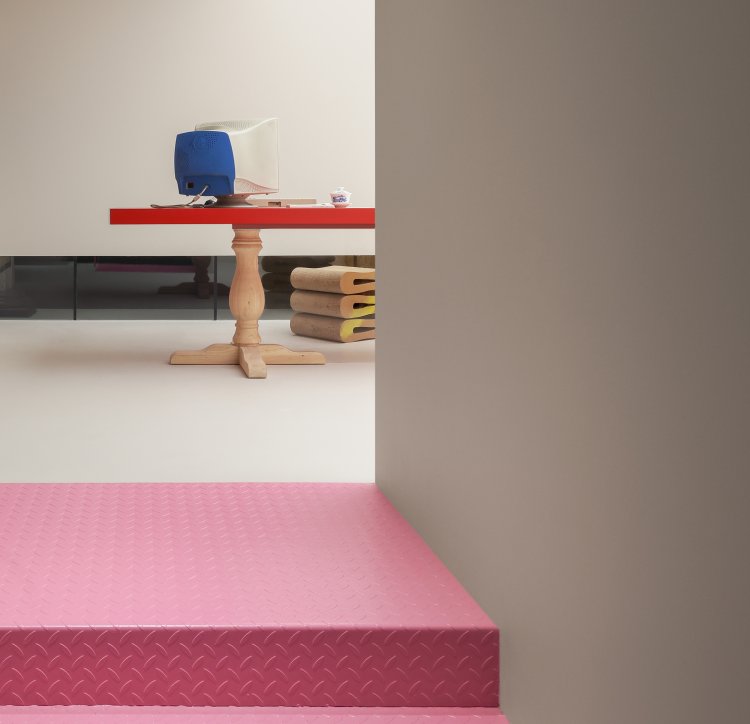
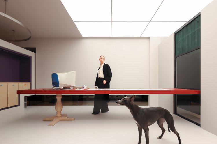
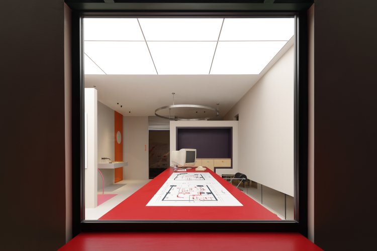
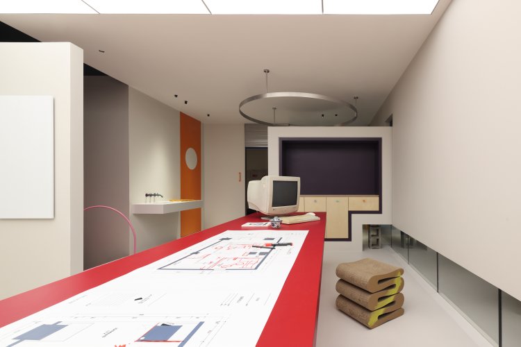
Visible through an opening in the Entrance area stage wall is a multi-use work area which the red countertop extends into, drawing people’s attention into the space beyond. The far end of the countertop is supported by a vintage wooden table leg, while a classic PC computer has been provided in the workspace. They are part of a design approach in which found objects are incorporated into the project in the spirit of inclusiveness, and to provide an additional level of aesthetic detail in order to enrich the spaces with local textures.
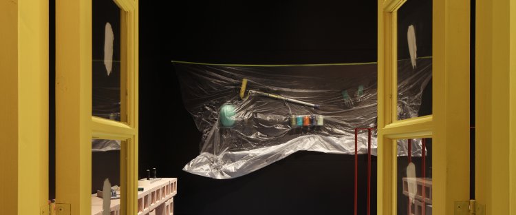
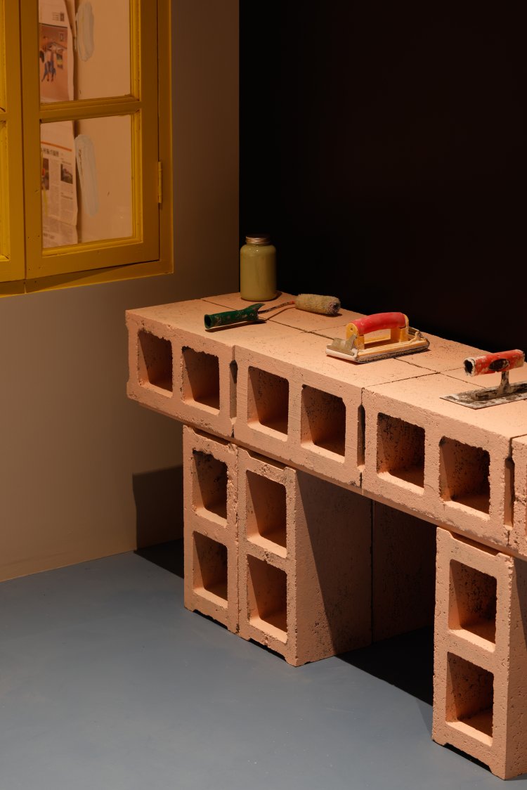
The designer believes that virtually any found object can be treated as a work of art, such as the small grass broom taped to the wall in the hallway which leads from the entrance area to the main display and interactive spaces. The hallway, partially illuminated by a strip of low, floor-level windows connected to the work area, also accommodates a number of ‘installations’ which introduce everyday paint and construction materials, placed onto concrete blocks or fixed to the wall and covered in a thin layer of transparent plastic. The designer was struck by the aesthetic qualities of the plastic used by onsite workers during the construction process, and decided to introduce it as a contrasting surface, with the objects beneath it painted in varying pastel tones.

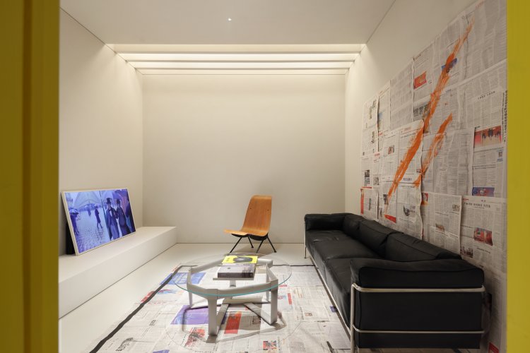
Opposite the installations is a brightly painted yellow-framed vintage window, taken from an abandoned building, which provides a view into the lounge/ meeting area. The individual panes of glass were initially marked with white paint by the site workers in order to avoid accidentally breaking the glass, which the designer liked and kept in the end for their aesthetic effect – creating another Malevich-like object within the space.

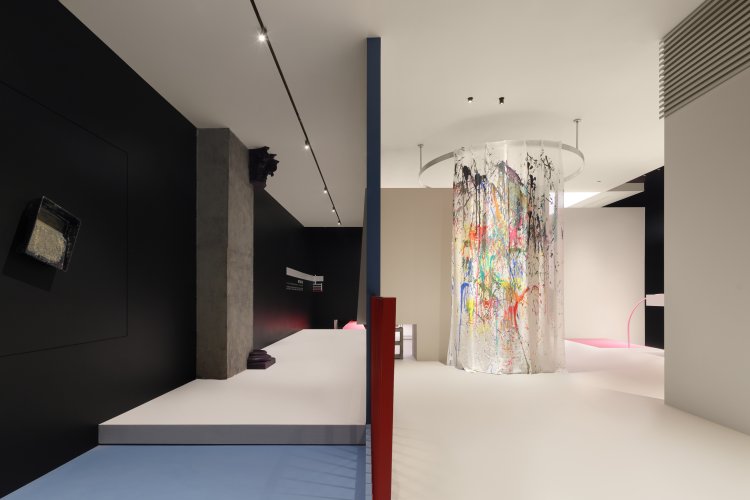
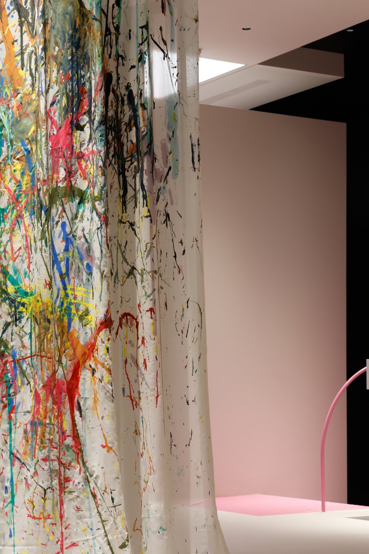
Venturing further into the main display area, visitors encounter a tall white curtain, hung from a circular track and playfully splashed with vivid colors – here, the designer sought to create a novel way of showcasing the company’s products, breaking expectations of what a ‘typical’ showroom is and introducing a sense of free-spiritedness and creativity. Every painted object in the project reinforces the quality and multiple uses of the company’s products, which are able to adhere to a wide range of surfaces normally unsuitable for painting.
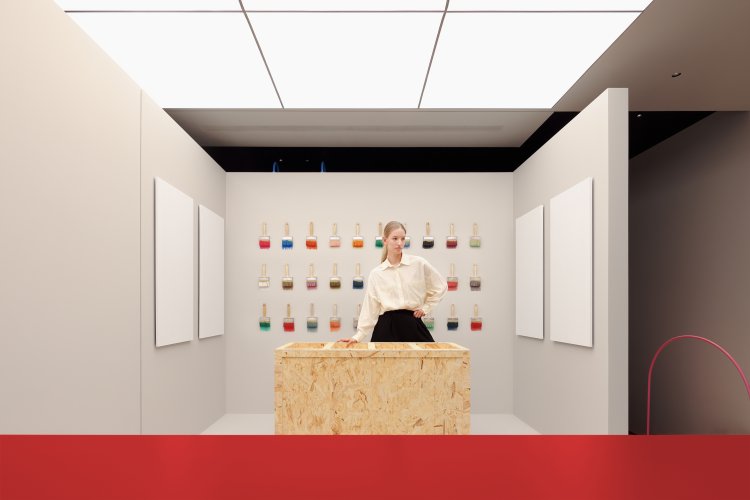
Within the interactive area, a number of paint brushes fixed to the wall offer another imaginative display, each one dipped in a different color and arranged in a grid, again substituting everyday objects in lieu of more typical color swatches or catalogues. Visitors here are encouraged to try the products themselves, using brushes supplied in the timber cupboard to apply paint to the blank white canvases fixed to the walls. By providing an opportunity for first-hand use, the project emphasises the culture behind the company and the effect of the paints, rather than the paints themselves.
By referencing the work of Malevich, Corbusier, and local culture, and incorporating a spirit of artistic openness and curiosity, the designer has created here a series of spaces which focus attention on the experience of the project, and invites visitors to imagine daily life in a fresh and lively way. He has aimed to present an aesthetic atmosphere which can be actively participated in, and which lingers in the memory long afterwards, fulfilling the original conception of the project and dissolving the wall between life and art.