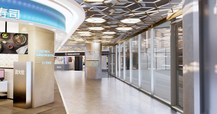
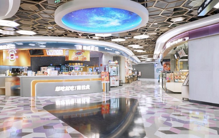
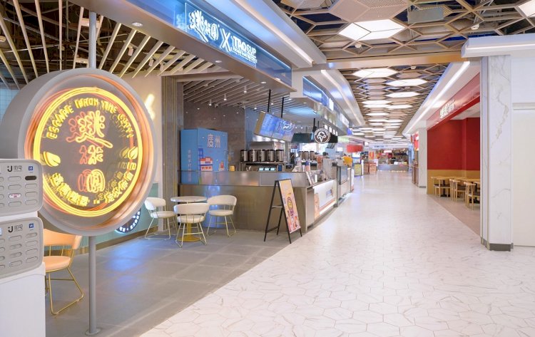
CapitaMall SKY+ B2 Food Court Renovation
The aim of the project is to create a new food court from that promotes interesting and improved the utilization of space while increasing traffic. Echoing the brand concept of Captialand, the new design is based on the image of IP’s main colour, in tune with the brand identity.
The food court located in the main area in shopping mall. The aim of the project is to create a new food court from that promotes interesting and improved the utilization of space while increasing traffic.
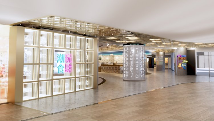
Echoing the brand concept of Captialand, the new design is based on the image of IP’s main colour, in tune with the brand identity. Our design concepts is young, cool and trendy.
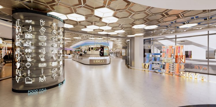
We creates a fun space, combines with delicious food and trendy music. So that provide an unique experience to customer. Besides, interior design combine with the interactive facilities that connect the brands and customers. It conveys the young feature of Capitaland and create more shopping experience and memories. After re-planning the moving line, the surrounding paths allows more tenants move into the food court and it bring more space for exploring.
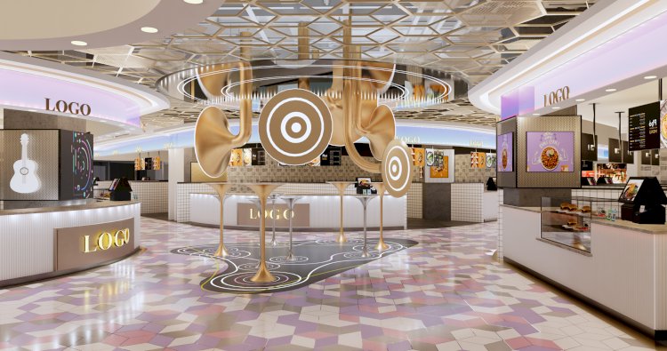
At the mean time, it provide a pleasant, relaxed shopping atmosphere. In design process, we considered the theme continuity of the space. The public area in food court are mainly decorated by aluminium perforated screen which in golden rose colour with combination of luminous film. It can highlight the main path of the space and avoid over using of the ceiling materials. In this way to save more energy and add more interest and flexibility to the space.
