Golde Ceramic Tiles Headquarter by Topway Space Design
Project Name: Golde Ceramic Tiles Headquarter
Project Location: Shiwan, Foshan, China
Project Area: 5000㎡
Design Time: 2020.04
Completion Time: 2023.03
Design Firm: Topway Space Design (www.topwayspace.com )
Chief Designers: Wang Zhike&Li Xiaoshui
Design Team: Lu Zhongwen, Lai Yuqin, Qiu Wenfeng
Soft Decoration Design: Yang Shiwei/IRIS HOUSE
Project Owner: Guangdong Hongyuan Ceramics Group
Main Materials: Golde Ceramic Tiles, Sintered Stone, LANSEN
Photographer: Xu Yiwen
Topway Space Design | A dancer with elegant steps
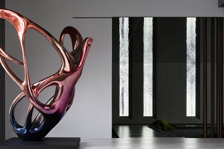
The butterfly flutters its wings
Emerging from its chrysalis after the storm
Dance gracefully like the wind
Spread its wings like a blooming flower
Its colors are vibrant like clouds
Its movements are elegant like romantic poetry
Butterfly, an art weaver, a dancer destined for fashion
The brief history of Golde
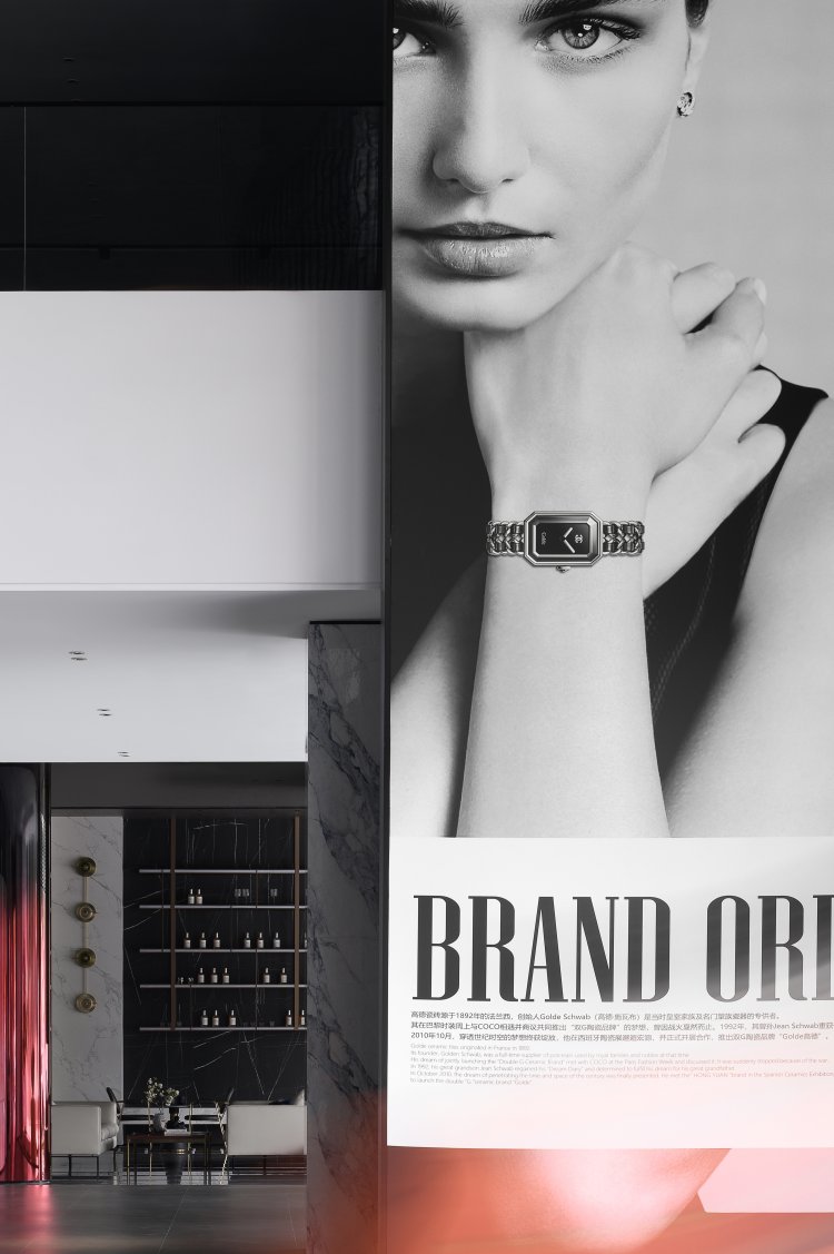
In 1920’s Paris fashion show, Golde Schwab met COCO CHANEL,an up-and-coming designer at the time. The two hit if off and discussed the development trends of the fashion. They claimed to co-found a ceramic brand with a logo of double G. In February, 2010, Jean got interested in a new type of stone from Hongyuan in CEVISAMA, an exhibition hold by Valencia Government with the aim of promoting the Spanish ceramics. He thought it was a suitable material for wall-curving which can perfectly integrate the art of carving with the product.Both sides showed a strong cooperation intention, therefore , Jean Schwab officially cooperated with Hongyuan in October, 2010, truly realized the envision of double G. That’s how Golde Ceramic was born.
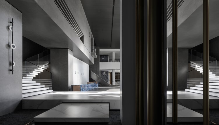
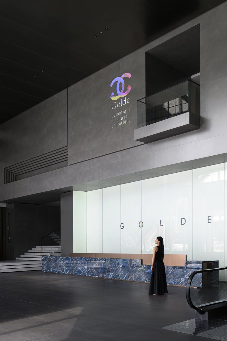
Golde originated from the encounter of two fashion enthusiasts and now has an old and long-standing history. It still maintains a deep collaboration with Hongyuan to this day. Golde, with a unique understanding of art&fashion and a deep researching of natural textures, has successfully achieved a perfect fusion of fashion elements with their products. The ultimate simplicity of lines expresses a discreet luxury, presenting consumers with a gluttonous feast of art and fashion.
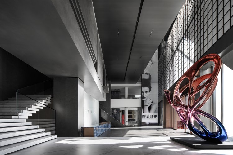

A butterfly emerges from its chrysalis
The designer draws inspiration from the process of butterfly emerging from its chrysalis. This marvelous transformation process showcases the brand's rebirth and rejuvenation. The exhibition is characterized by an extremely black, white, and grey color palette.We are able to sense the brand's commitment to Italian minimal style in the exhibition decorated by the deep grey cement-textured walls, statuary white marble staircase and pure white silk-screened painted glass backdrop. The stainless steel butterfly in the corner highlights the brand’s consistent taste of fashion.On the other hand, the front desk, made of indigo luxury stone, reflects the discreet luxury of the brand. For observers who are immersing themselves in this unique space, they can feel all-round exquisite taste of the brand. When the sun shining through the grid glass window in the morning,every corner of the lobby is illuminated. It outlined a sense of mystery and sacred beauty, with the interplay of light and shadows filling the space and emanating a unique and elegant atmosphere. The double-layered structure in hollow design, with incorporation of geometric elements and interlock square blocks, enhances both the exquisite quality of the products and artistic atmosphere of the space.That’s how a unique brand symbol formed.
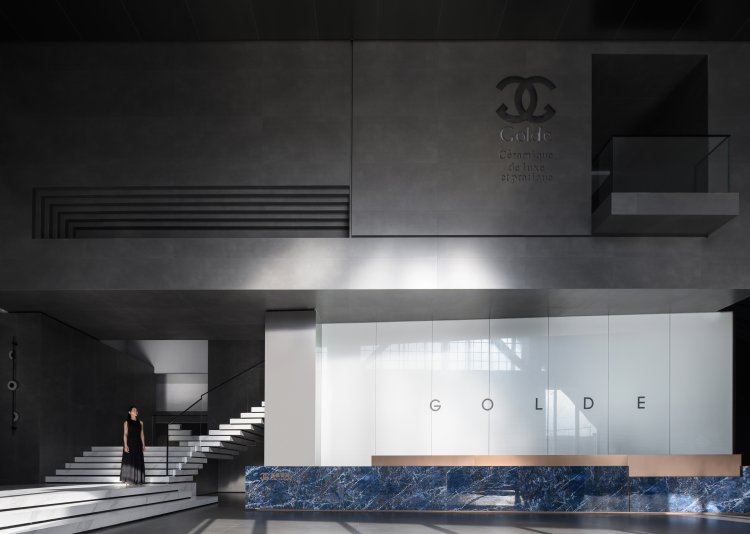
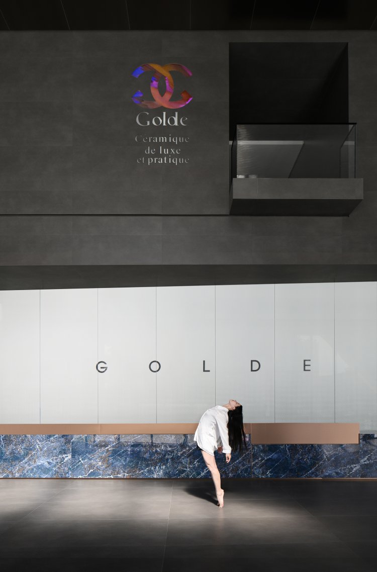
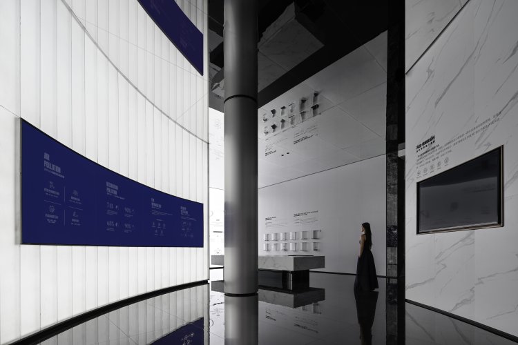
When the shadows from outside the window are cast upon the white silk-screened glass wall in the center of the lobby, it feels as if we are appreciating an abstract yet emotionally rich artwork from nature.The artistry light adds depth and layers to the wall whereas the delicate texture of the wall presents elegance, immersing viewers in the beauty of nature. This design is not just a wall, but also a unique expression of emotional connection in the pursuit of simplicity and elegance. It has became a marvelous place where nature and the soul engage in a dialogue.
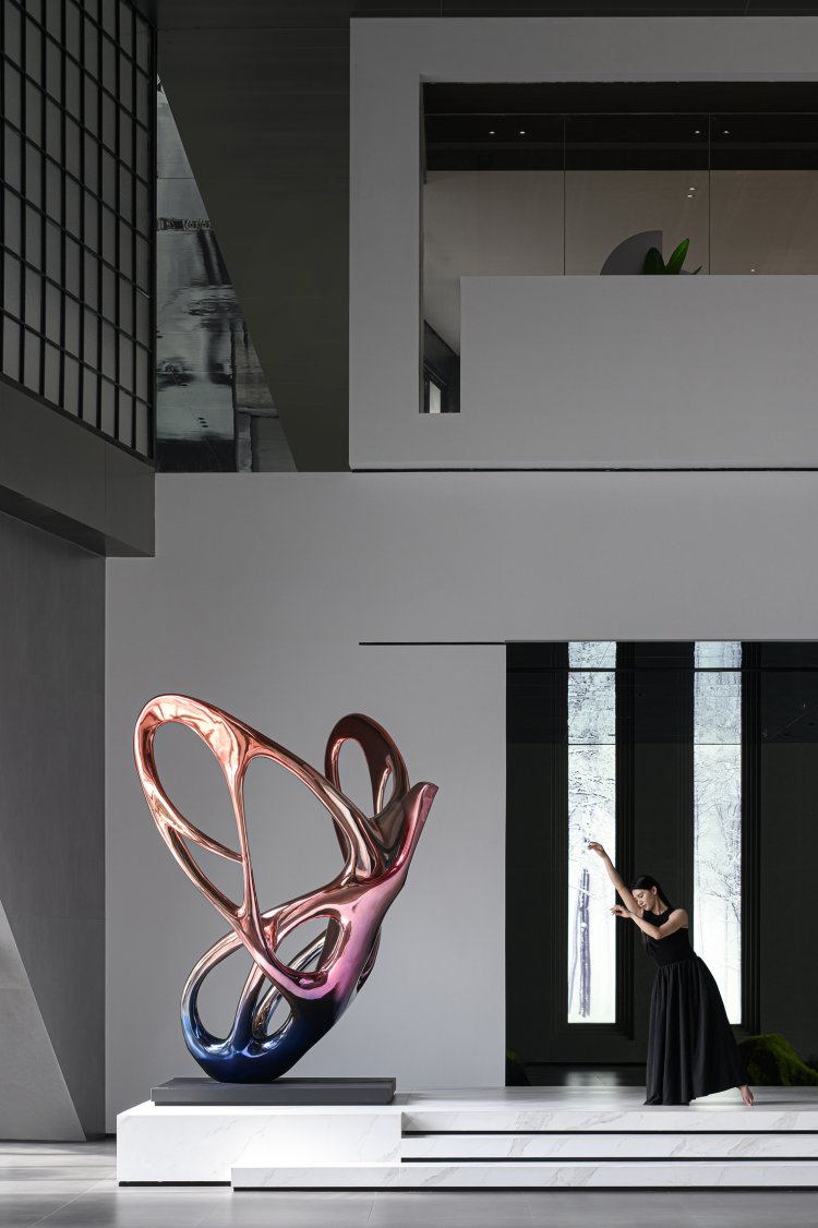
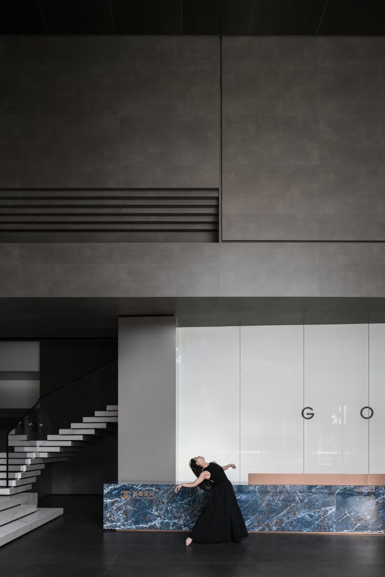
The designer has layered blocks on the branding wall, creating a multi-dimensional interplay of blocks that carries a sense of power and order and also serves as memory cues within the space.The exquisite silk-screened art glass backdrop, along with the navy-blue luxury stone front desk, both accentuate the fashionable and luxurious essence of the brand. The deep grey matte-finished products and white marble, as the main tone, create a decent space with elegance.
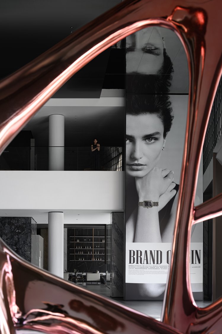
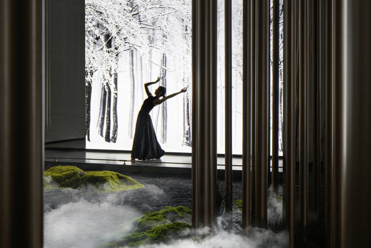
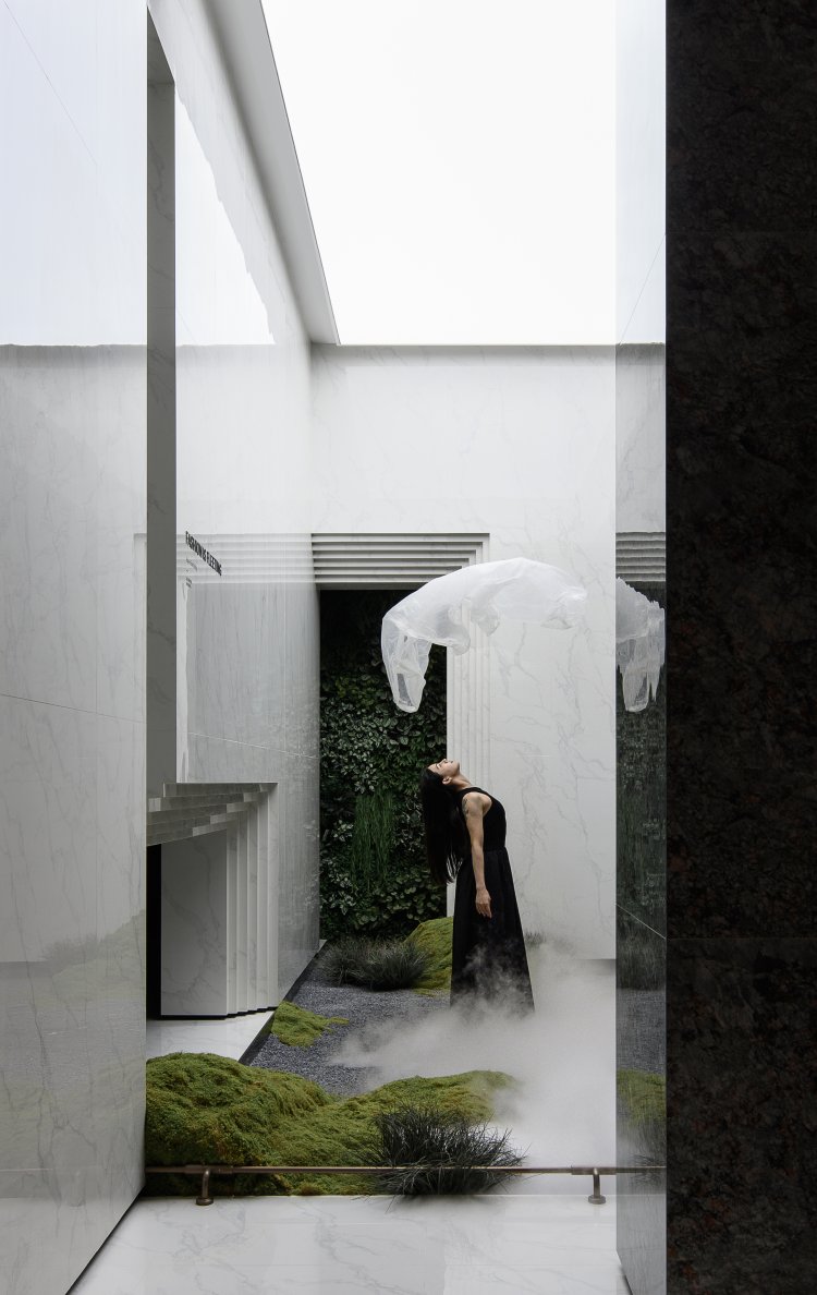
Stepping through the end of the lobby, one can enter into a secret forest where you can fly with the wings of imagination and integrate body and mind as one, experiencing a close connection between soul and nature. The designer has created a forest-like realm through stainless steel columns in different thickness,merging reality and illusion. Within the “jungle”, fog machines are strategically placed to create a misty ambiance that beautifully contrasts with the virtual frosty forest. The addition of a U-shaped pathway cutting through the jungle enhances the sense of ritual upon entering this space.
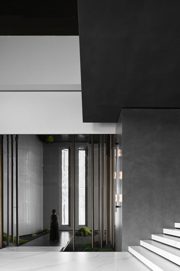
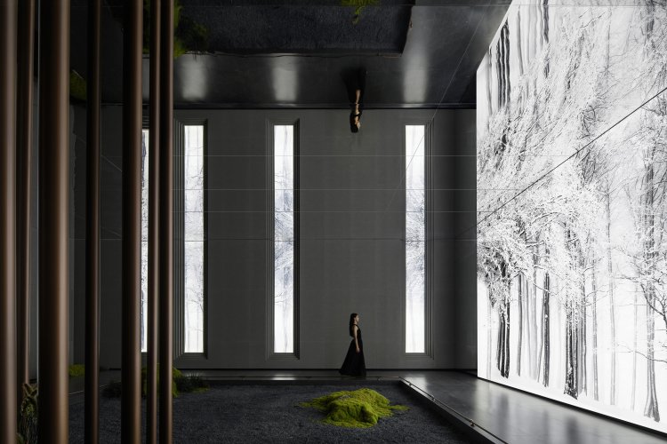
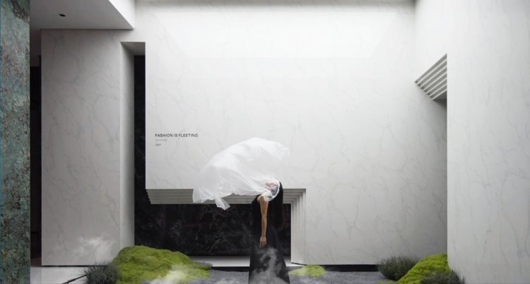
Dancer is becoming a fairy in the white forest where flowing mist and wafting clouds are spinning around, creating a sense of mysterious. She turns and spins in elegant steps, as if a fluttering butterfly.
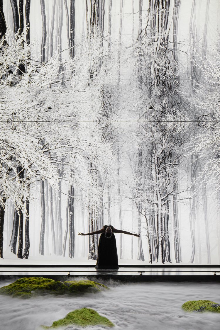
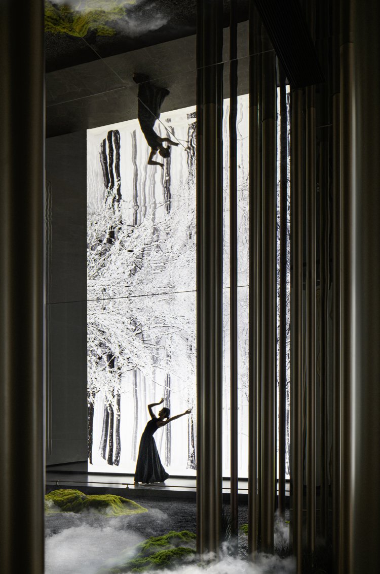
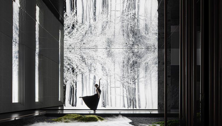
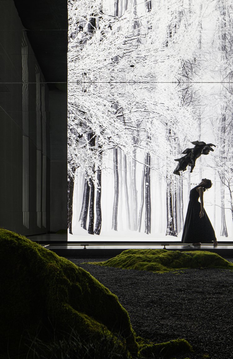
Merging in the nature and taking a meditation in tranquility, one can completely free themselves from hustle and bustle and immersing themselves in the serene beauty and finally become a part of nature. The soul gets a brief moment of rest, like a butterfly gracefully perched upon a petal, swayed by a gentle breeze that casts shadows upon the leaves. Life unfolds like an artistic masterpiece, accompanied by the enchanting fragrance of flowers filling the air. Within this serene space, humans harmoniously coexist with nature. The white walls and verdant walls depict a dreamy ecological tableau, inviting people to immerse themselves in the tranquility of the natural world.
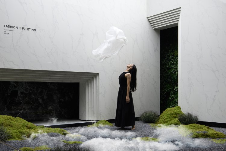
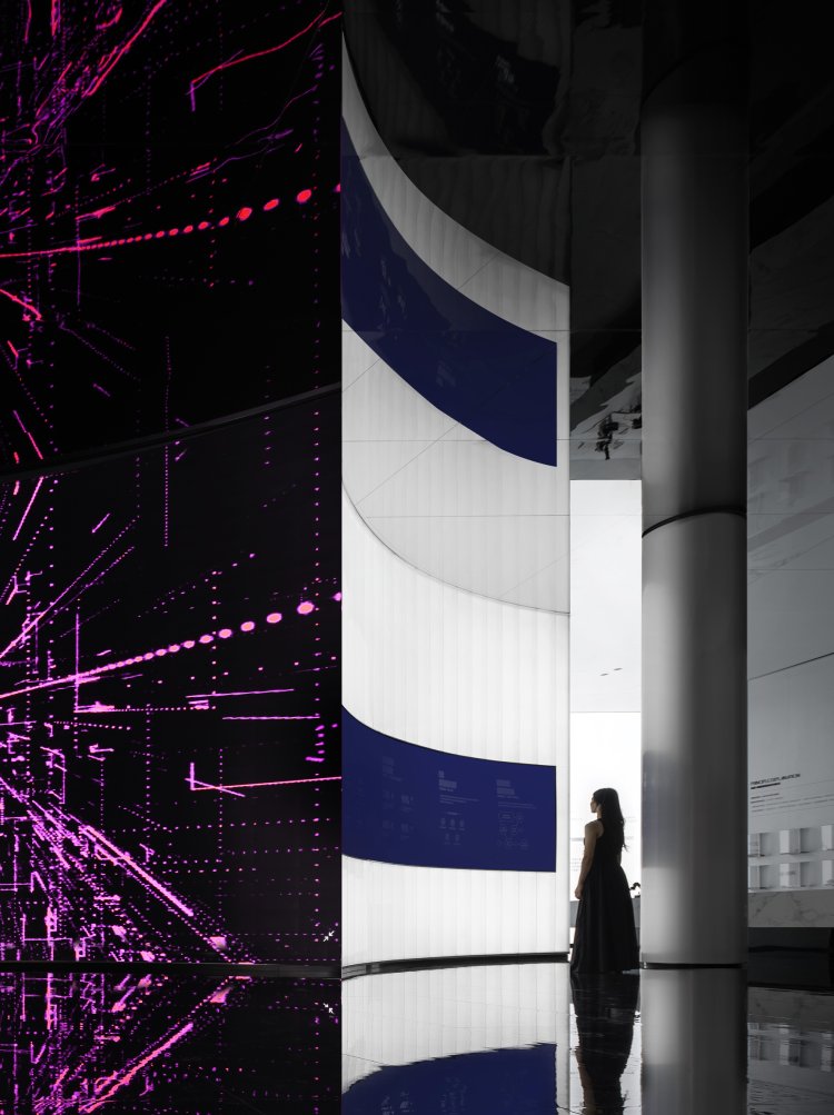
The benefits of the products, such as degradation of formaldehyde, antimicrobial effect and reduction of interior decoration pollution, are the main points the designer wants to show in the space.To achieve this, minimalist cultural symbols are chosen to exemplify the continuous release of far-infrared rays and negative ions from the product.This allows people to immerse themselves and experience the functionality of the product.In the "purification space" defined by the white color, a transformative LED wall visualized the far-infrared rays, allowing people to clearly observe the trajectory of light as they spread.
