hug x UMA WANG New Concept Store
Name: hug x UMA WANG New Concept Store
Location: Chengdu, China
Area: 485m²
Date: Dec 2020
Design Firm: ATMOSPHERE Architects
Chief Designer: Tommy Yu
Design Team: April Lo, Deniel Hwang
Animation Design: Vivi Lee
Main Material: Stainless Steel, Art Paint
Graphic Design: YiMoDuo Design
Furniture Supplier: YEPOM, Hodays
Lighting Solution: ArtLuci, Mario Tsai
Artist: Uma Wang, Ziggy Chen, Xander Zhou, SHAW STUDIO, OUDE WAAG
Photographer: Chuan HE from Here Space
Article: SIJIA
hug x UMA WANG New Concept Store
Retrace
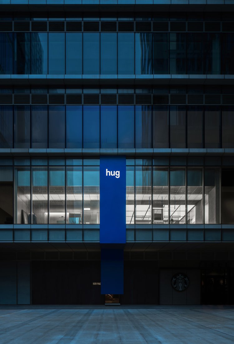
The space is slightly square, surrounded by walls, with gates on all sides, crisscrossing the city in a chessboard-like layout. This is Pompeii.
Which was destroyed because of Vesuvius, and got eternal for the same reason.
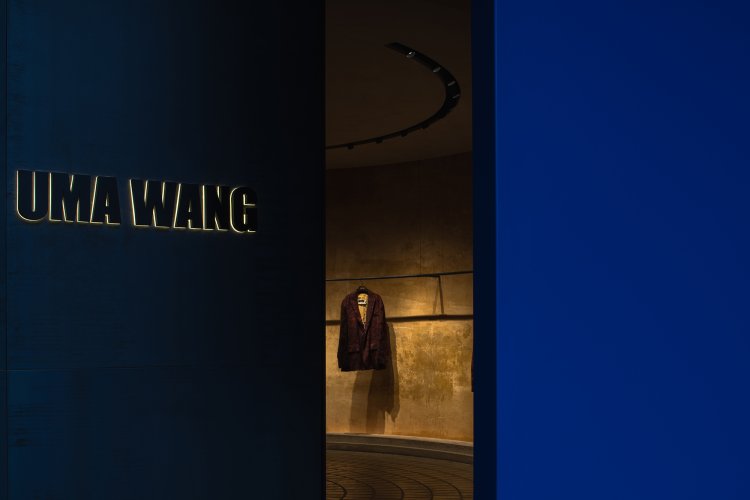
If Pompeii is UMA WANG's deconstruction and restoration of history through design, then this space tries to trace back this lost civilization through all the materials.
It's a tribute, but also a rebirth after looking back on history.
Metaphor
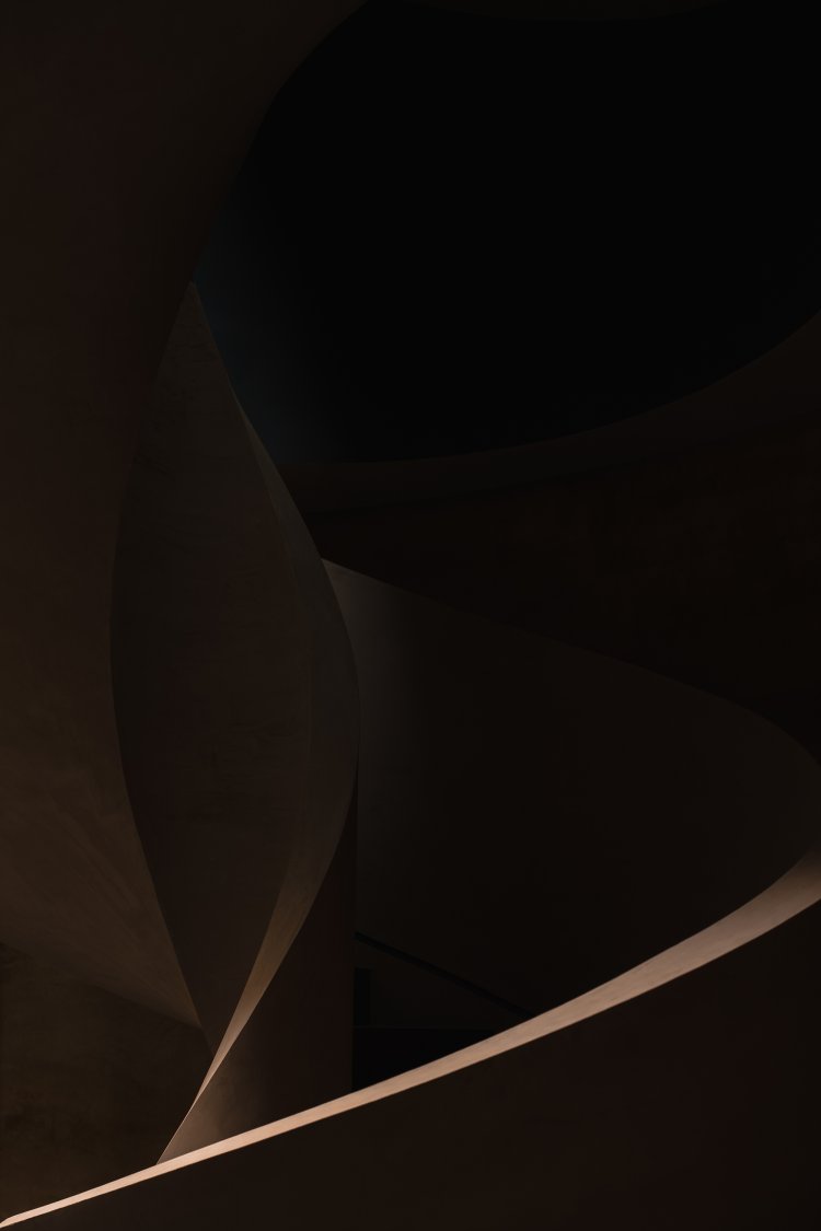
Solemn and concise, primitive and mysterious.
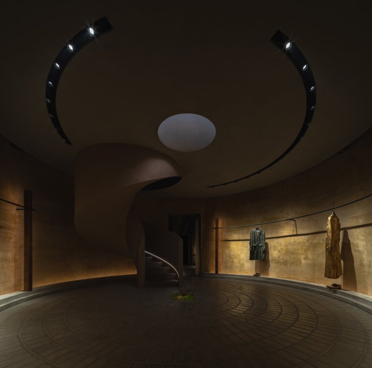
The sense of history beneath the ash after 2000 years are conveyed through the annular distribution of floor bricks, interior materials and wood elements in the space.
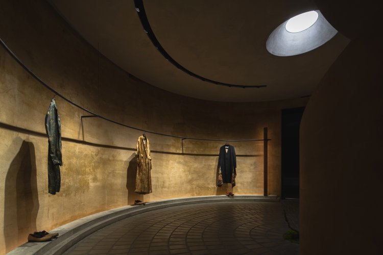
In this solemnness, the top light penetrates the room from above and falls on the green plants in the middle of the ground, as a metaphor for the arrival of hope after the ruins.

Churches, shrines, and the awe-inspiring atmosphere of ancient civilization two thousand years ago are recreated here in a concise and restrained combination.
Rebirth

The Pompeii series features Uma's rare fluorescent colors to restore the luster of falling ash and to symbolize new life.

The concept of space is also reflected in the presentation. In the overall simplicity of the atmosphere, through the annular space deep into it, in the fitting room under the shade of curtain, red color can be seen.

Like the eruption of a volcano with a red and hot moment.
This call should be the metaphor of UMA in the series, and the collision of colors also brings more layers to the space.

Ascend the steps along the rotating staircase, the light turns from dark to bright, and space changes accordingly.
Epiphqny

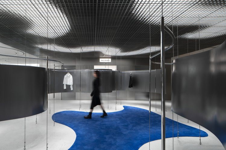
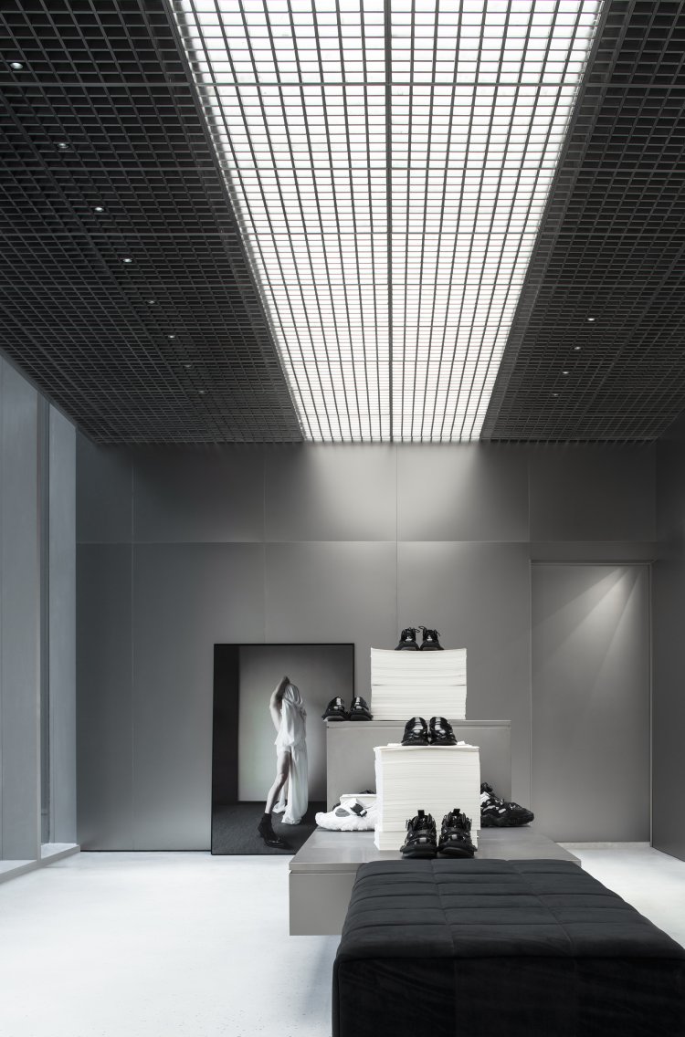
Different from the primitive and mysterious atmosphere downstairs, on the steps, the space dominated by silver and white suddenly opened the boundary of vision.

The concept of time and space has more multidimensional expression here, where the senses collide and intersect, giving the space a unique language system.

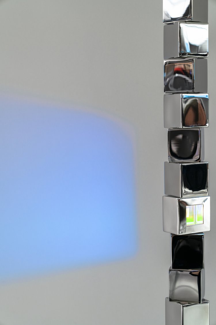
The circular and linear stainless steel rail display frame is a visual moving line, which connects the whole space in an orderly way.

Pioneer
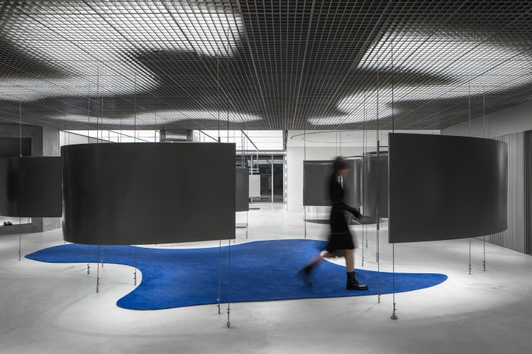
Since hug's inception, it has been its mission to select the works of independent designers from around the world -- to integrate different quality design brands, including Merci Beauty of hug's own.
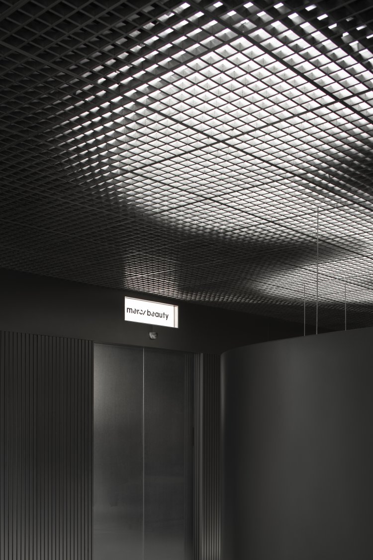
The application of curved surface elements to a certain extent neutralized the coldness brought by silver, and hug brand blue was interlaced with it, showing a sense of future and pioneer.
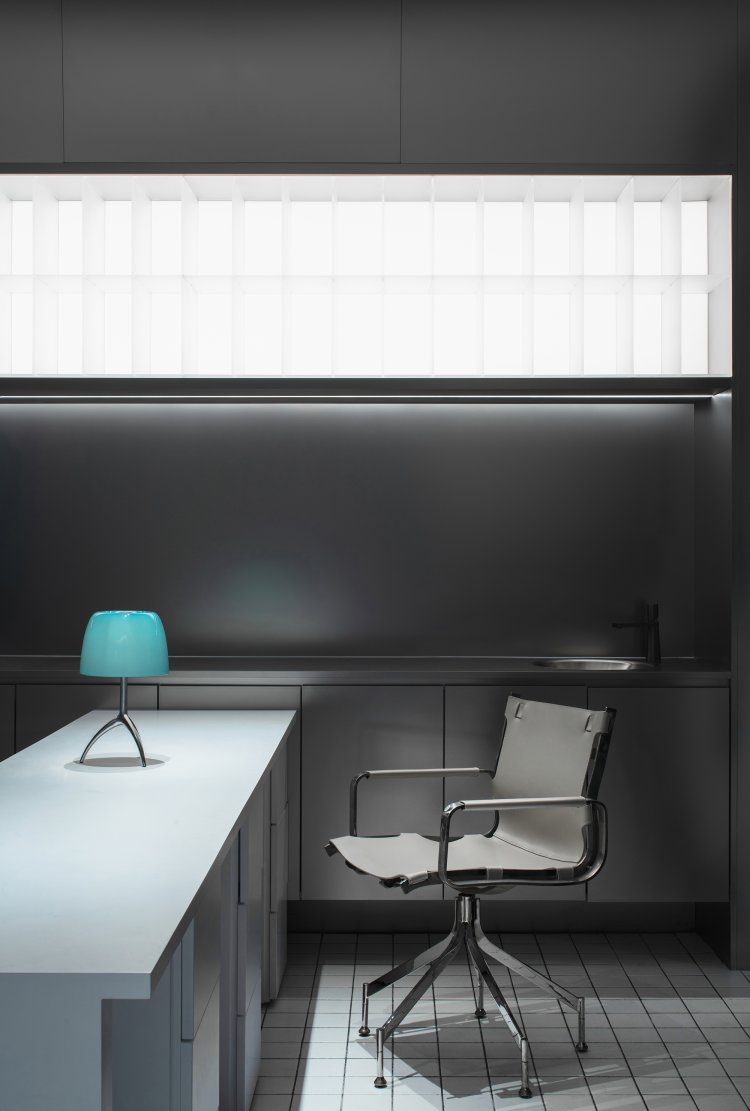
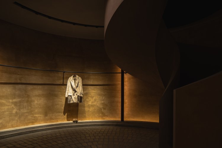
Avant-garde and neutral, inclusive and storage.
Not only the modern sense in western pop culture, but also the contemporary consciousness from the east.
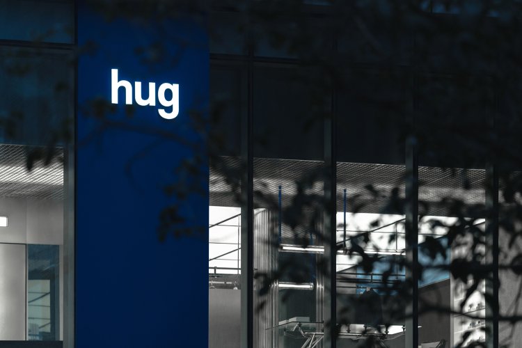

The use of shadowless lamp film ceiling fades the noise belonging to the outside world to the greatest extent, so that the space focuses on the clothing itself, which greatly extends the use cycle of the space.
hug is hug,
hug is more than hug.


