La Midas by CDA Architects
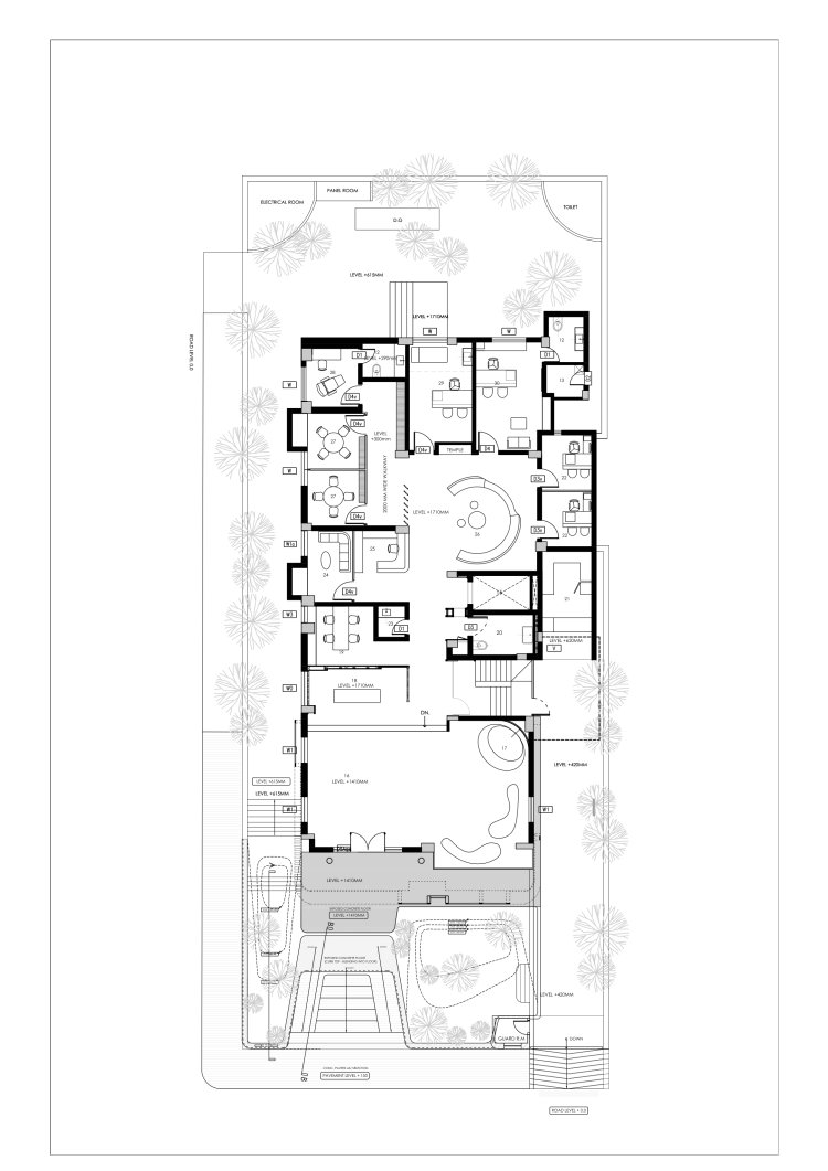
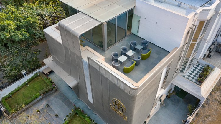
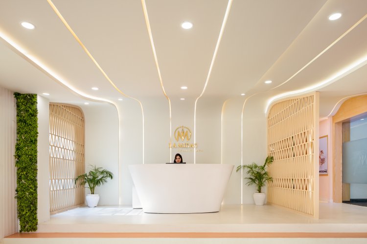
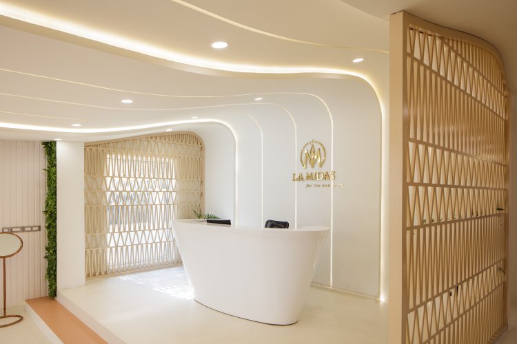
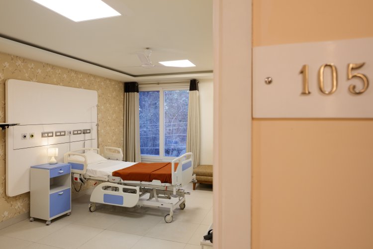
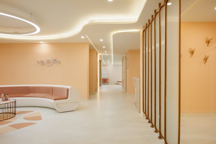
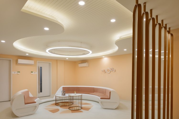
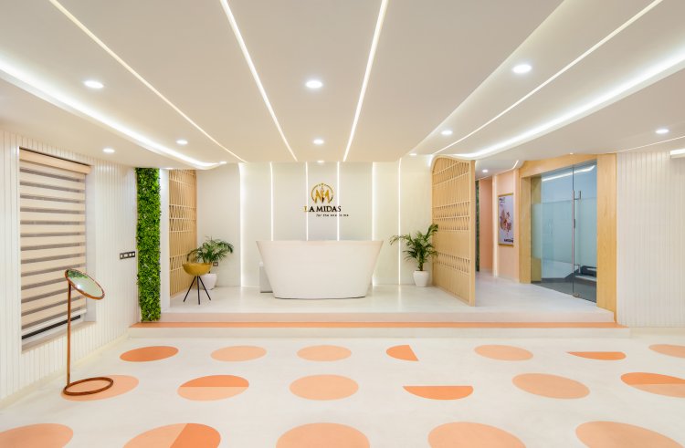
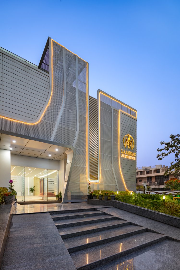
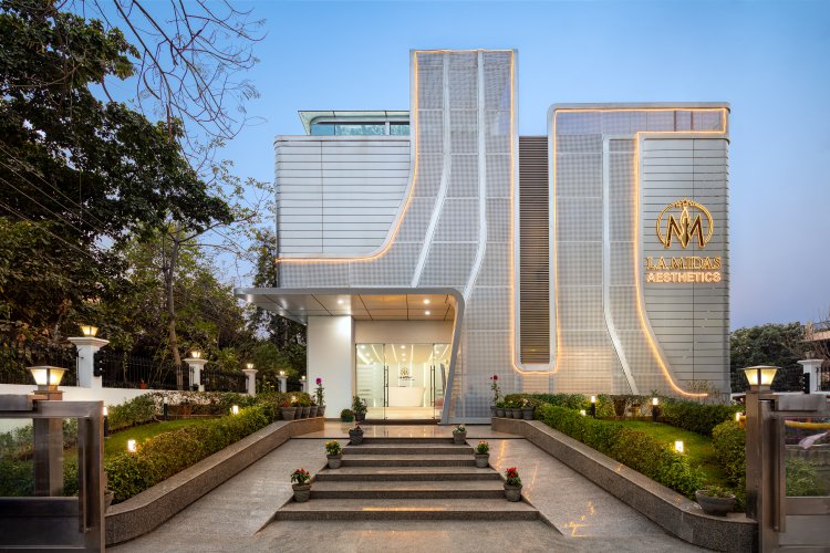
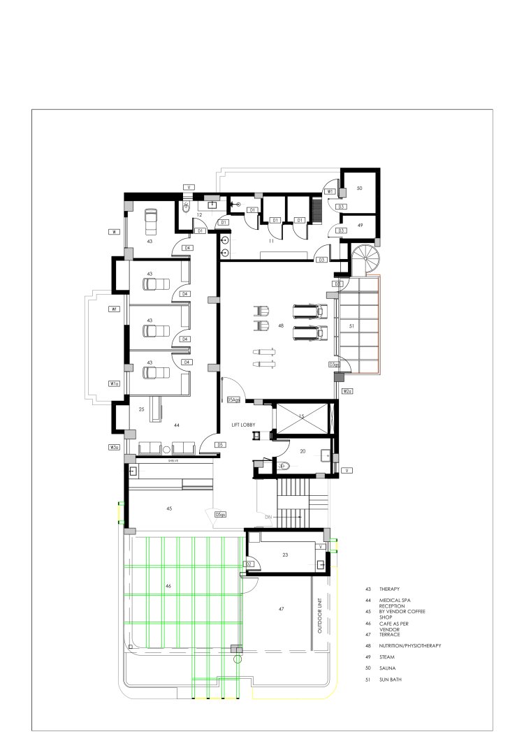
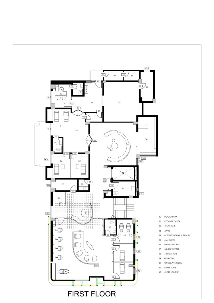
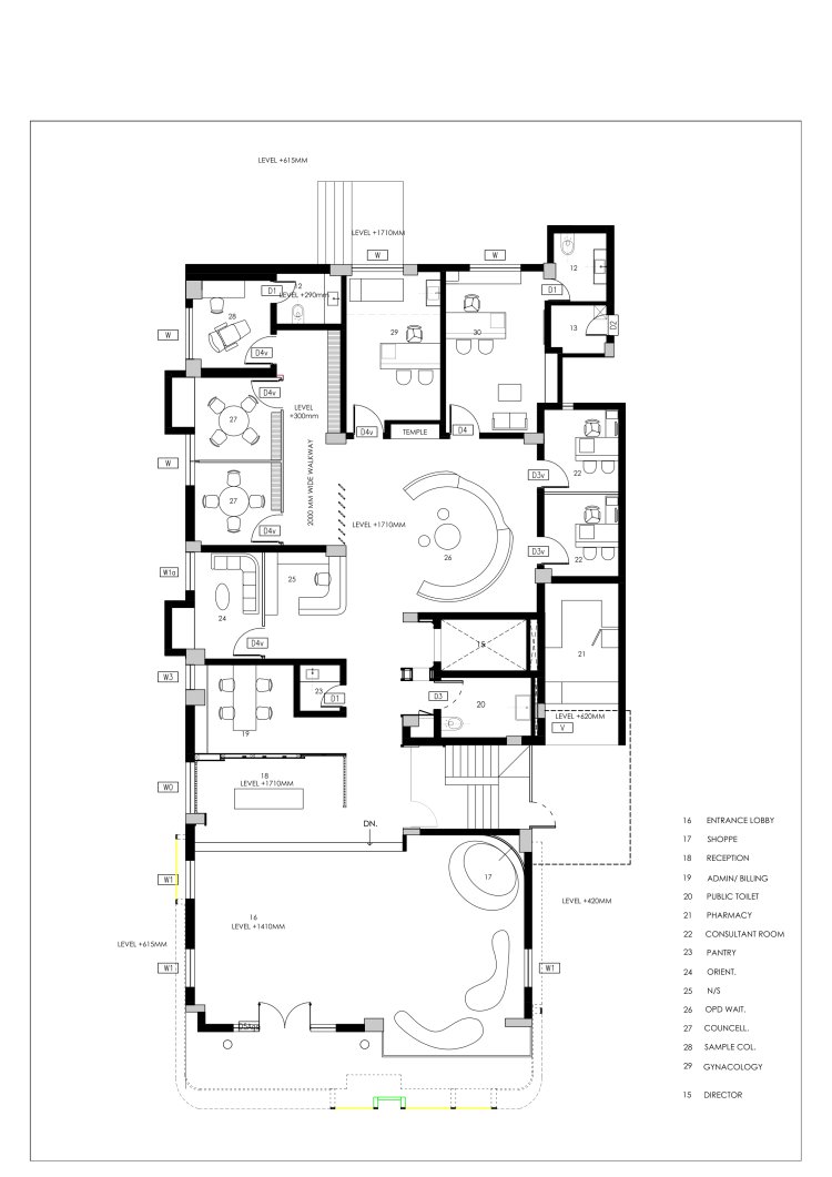
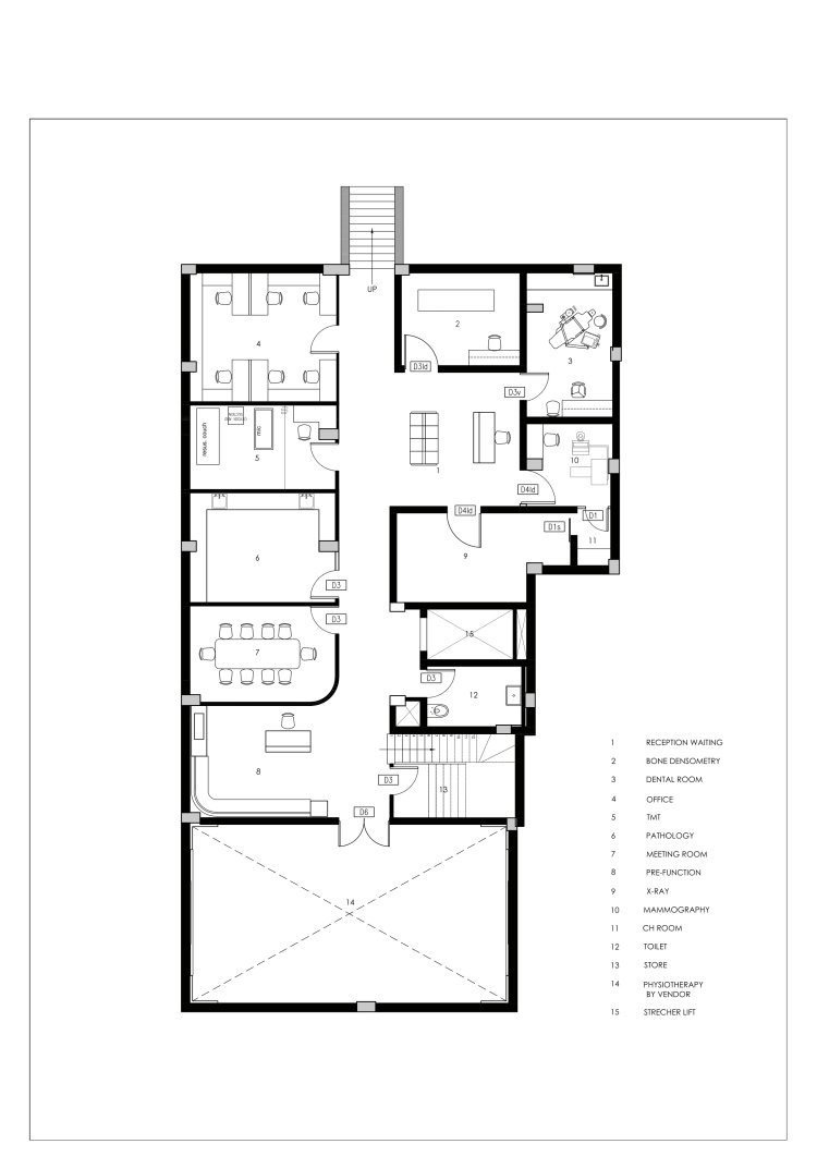
La Midas Wellness Centre, Gurugram Often bold architectural forms attract both appreciation and critique of the onlookers; however, the beauty of making such design choices is always reflective of the designer’s conviction. The La Midas Institute of Wellness in Gurgaon is one such piece of architecture that brings forth the finesse with which the architects have refurbished a twenty-year-old residential dwelling into a wellness centre. This design expression is envisioned to be viewed as bold street furniture amidst its residential surroundings, making it a contributor to the skyline of Gurgaon. The design of the wellness centre, primarily dealing with dermatological issues for women, takes inspiration from the female form. A complete turnaround of the programmatic configuration has been carefully choreographed alongside the design concept. Manifesting the formal notion of the volume, the façade detailing with definitive curves and the juxtaposition of textures helps to amplify the design’s starkness amidst its context. As the sun sets, the mildly lit façade comes alive, thereby accentuating the form in the evening sky. The facility houses the clinical treatment rooms of the various services and spaces to run spa and rejuvenation programs. The interiors are therefore reflective of clean and simplified forms that exude an aura of well-being and relaxation. The visitor is welcomed into warm and well-lit spaces that complement the pastel and muted undertones of the interior finishes. The furniture pieces bounce off the colours and textures of the spaces while bringing the fluidity of the façade from the outside to the inside. The spatial efficiency is enabled through the cleanly laid out planning, which aids the ease of movement through the various rooms. The spatial planning transmutes the house’s living areas into interactive waiting areas and other peripheral rooms into counselling and consultant functions on the ground floor. The first floor primarily houses in-patient rooms towards the front with a double skin façade along the South to minimise heat gain in summer. The rear section of the floor plan houses more controlled functions such as operating rooms while. The second floor houses rejuvenation and Ayurveda therapy rooms and a small cafe with a semi-open terrace for visitors to enjoy a post-treatment coffee. The flooring pattern, a two-toned, semicircular pattern, guides the visitors in the corridors and common areas to keep the visual interest sustained throughout the space, assisting with way-finding. The singular exposes concrete flooring is visually and functionally appropriate. It avoids any joints that could harbour bacteria/ microbes, jeopardising sterility. The walls are adorned with modern pieces of art that accentuate the space with varying textures. Pattern-making is most expressive in the wall-partitioning that flows with the ceiling’s curves and defines the boundaries with fluidity. The flow of curves used in the lighting fixture, furniture selection, partitioning, and the facade is synonymous with the elemental understanding of the female form. It employs a double skin perforated metal screen with a seamless finish. Together, the bold and subtle intricacies in the building’s design adhere to the cohesive idea of fluidity and the nuance with which each element is true to unifying the building’s entirety. Intended to be more than a mere facelift, the design makes way for a well-nurtured concept to come to life through built form.
