LANWUU IMAGINE by Aurora Design
Project Name: LANWUU IMAGINE
Location: Kunming, Yunnan Province, China
Area: 400㎡
Design Firm: Aurora Design (www.aurora22design.com)
Chief Designer: Yang Xuewan(instagram: yxwan )
Design Team: Wang Da, Zhang Sijie
Lighting design: Uniimport
Design Time: 2023.08
Completion Time: 2023.12
Construction: Rebuilding Space Lab
Photography: Na Xin from INSPACE
LANWUU IMAGINE - Time·Unfinished
LANWUU IMAGINE is a photography studio offering a range of services including wedding dress photography, wedding ceremony coverage, and portrait sessions. The founder's original aspiration is to capture moments of excitement, self-satisfaction, and highlight special moments through photography. They aim to take warm, heartfelt photos that record the beauty of everyday life. After discussions with the owner, we both hope to reflect this same brand spirit in the design of the space.
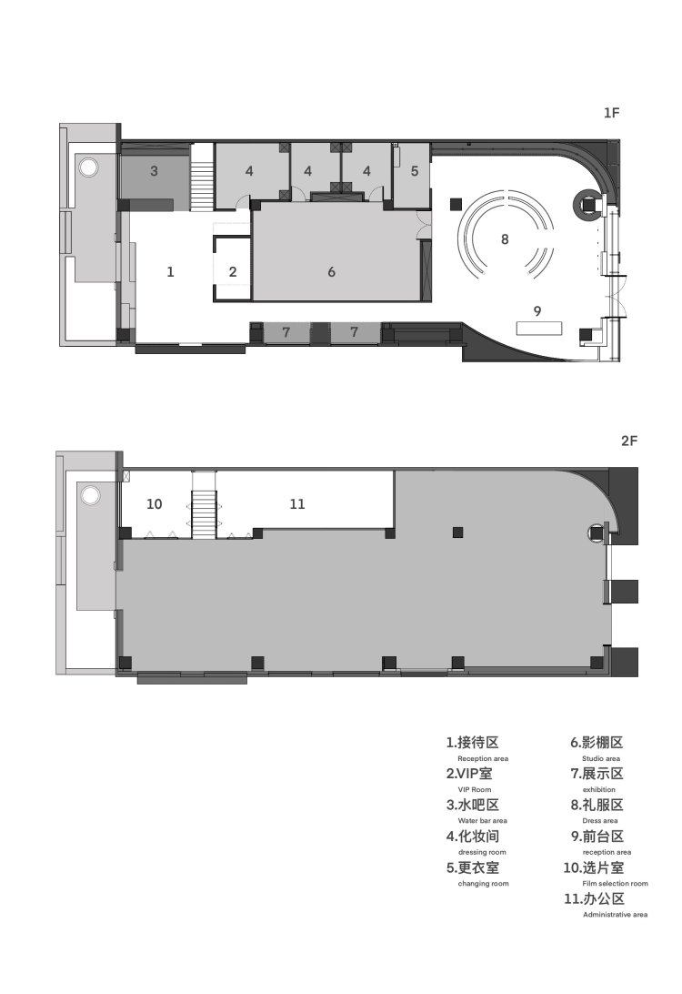
The project is located in a residential community. While aligning the brand mission with the distinctive features of the area, AURORA DESIGN seeks to capture the beauty of everyday moments. These moments are frozen within the fluidity of time, preserving the allure of ordinary life. The original structures of the site are preserved, unfolding around the central core area of the space to delineate functional zones sequentially. While maintaining the memory of the site, a new narrative form of space is crafted, generating tension between time and space, and creating a sense of 'unfinished' modern poetry.
Time·Unfinished
Throughout the entire design process, the designer utilizes various mediums to express the overall concept of "unfinished." She captures the beauty of the mundane from fleeting moments in time, while also contemplating the unknown in the unfinished future.
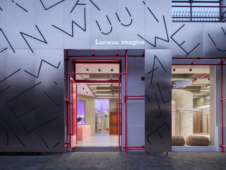
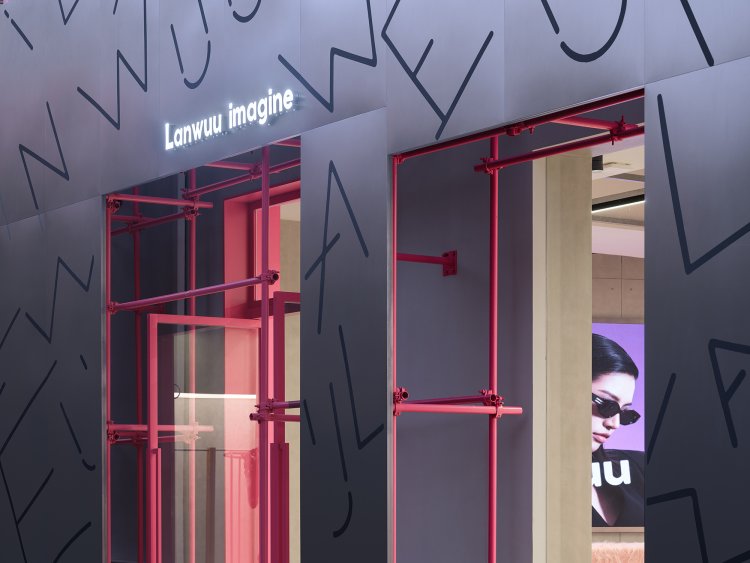
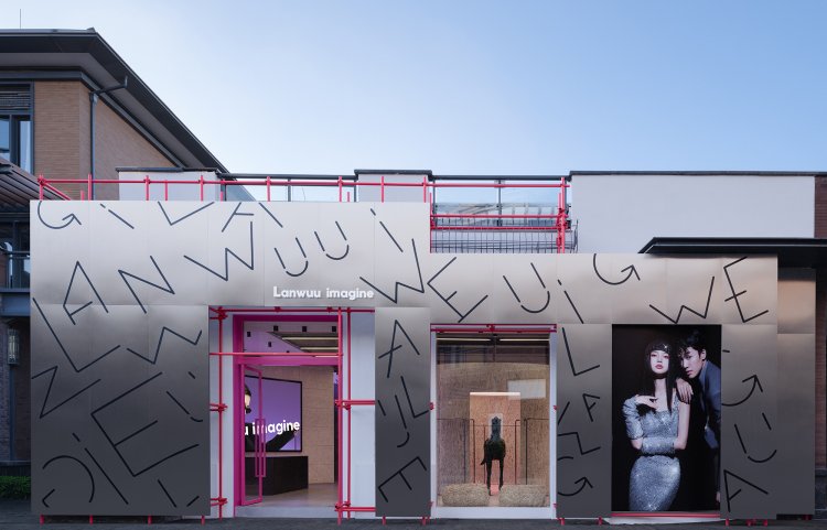
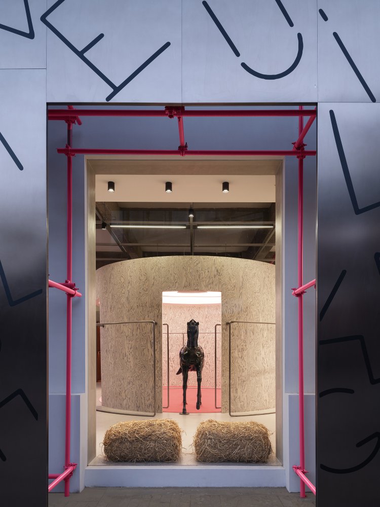
Breaking through the sunlight, a cool metallic sheen reveals a doorway before you. The vibrant flashes of pink décor captivate your gaze. As scaffolding appears, it transports you to a construction site that remains "in progress." Its eventual form is still subject to the passage of time, yet in its initial stages, it already exudes a charming allure. The designer showcases this "unfinished" state, inviting curiosity and exploration from onlookers.
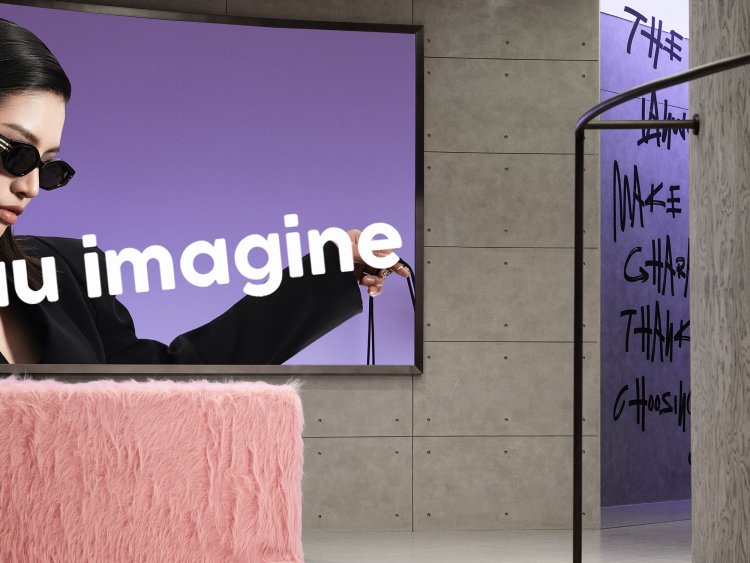
The interior structure tends to preserve the original narrative of the site, with ceilings featuring simple designs and lighting arranged in an orderly manner. This approach maintains the initial essence of the space, imbuing it with a sense of ambiguity and continuity. The interplay between its initial and ongoing states creates an infinitely expansive spatial form.
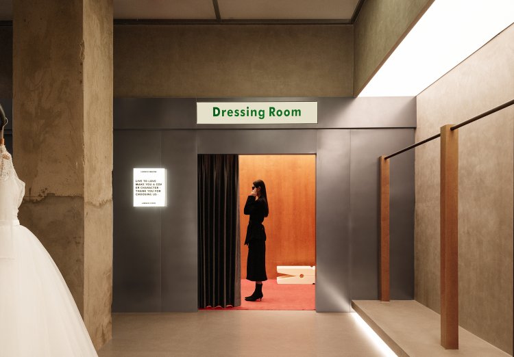
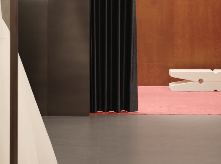
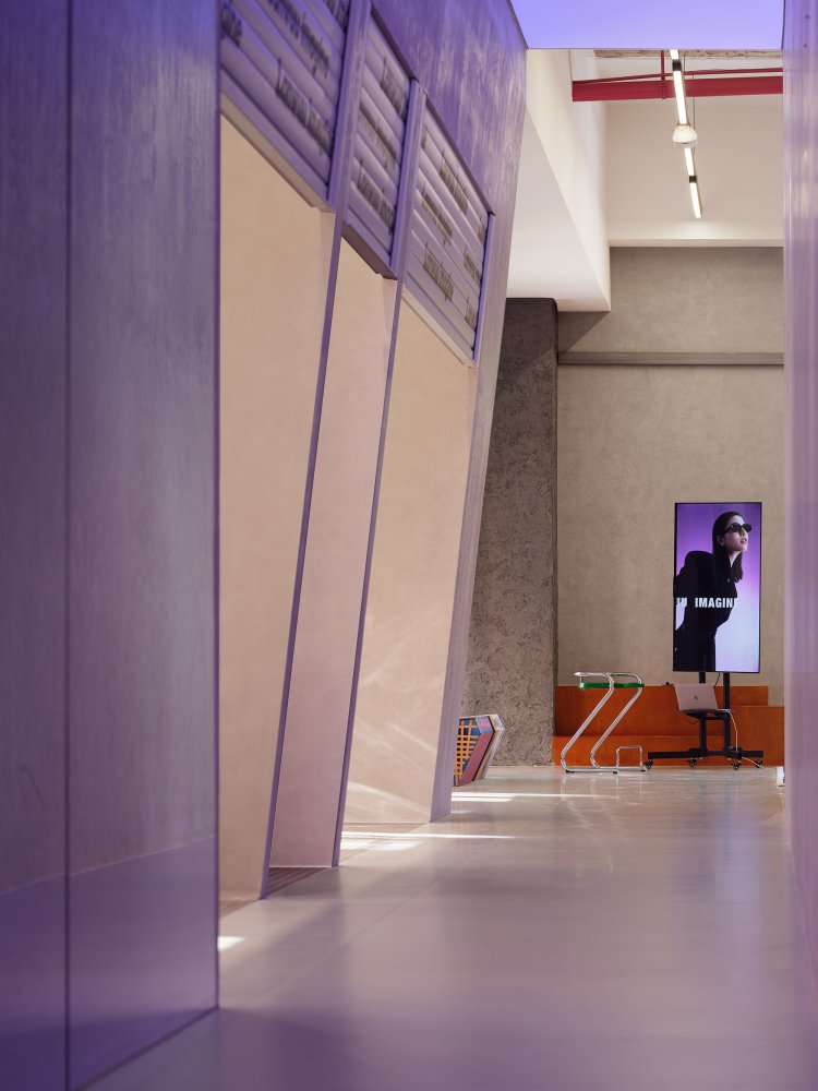
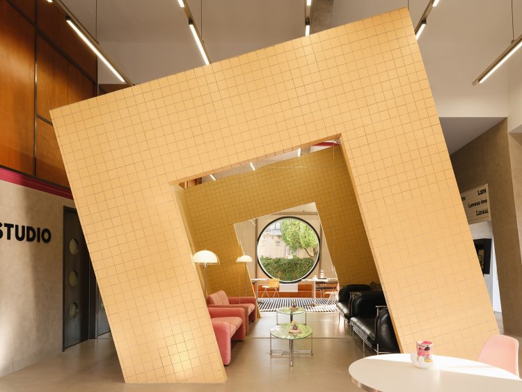
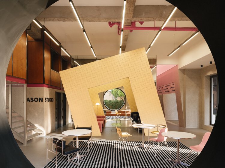
The basic element - mass is utilized to connect spatial relationships. Rotating cylindrical structures enclose spaces, capturing a moment where their unconstrained forms depict a sense of freedom and continuity, aligning with the functional attributes of the reception area. Within the exhibition space, the designer employs semi-enclosed cylindrical structures to define the space, creating a gently soothing form that accompanies the flow of viewers' emotions and directs their gaze. The transitions of scenes and changes in space rely on the most fundamental elements, establishing a new flow between guests and the environment.
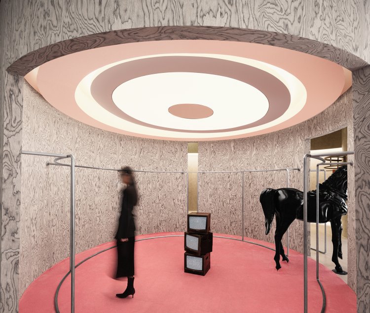
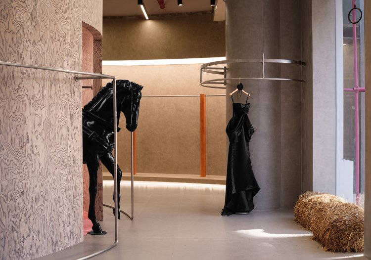
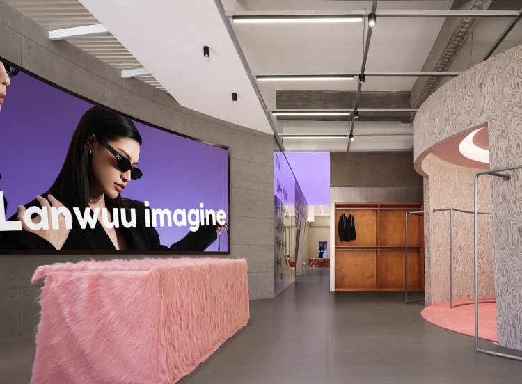
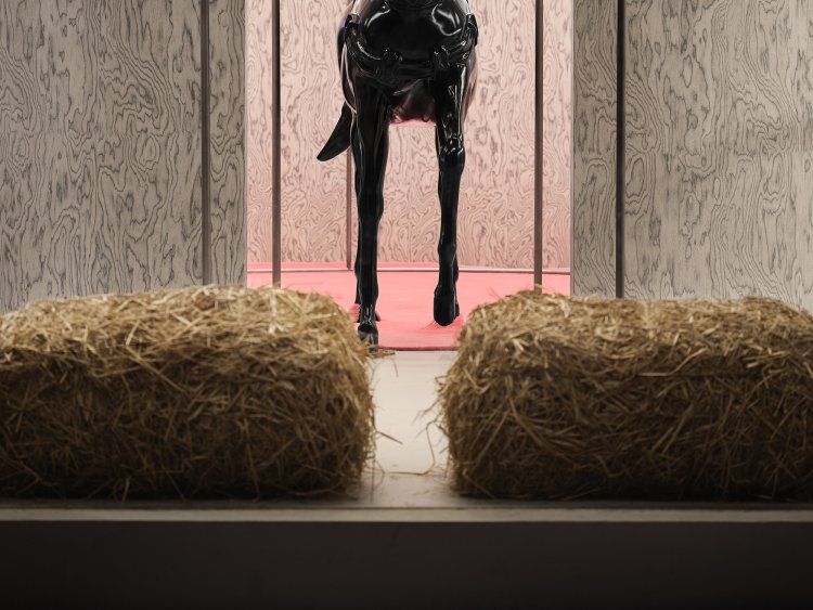
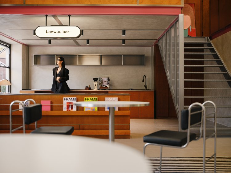
In terms of color application, we incorporate abundant elements of metal, stainless steel, concrete gray, wood tones, and marble coverings. These expressive colors infuse the space, creating a bold, sophisticated, and liberated ambiance. Especially notable is the extension of stainless steel and metal, imparting a futuristic sense of artistry and technological texture to the space.
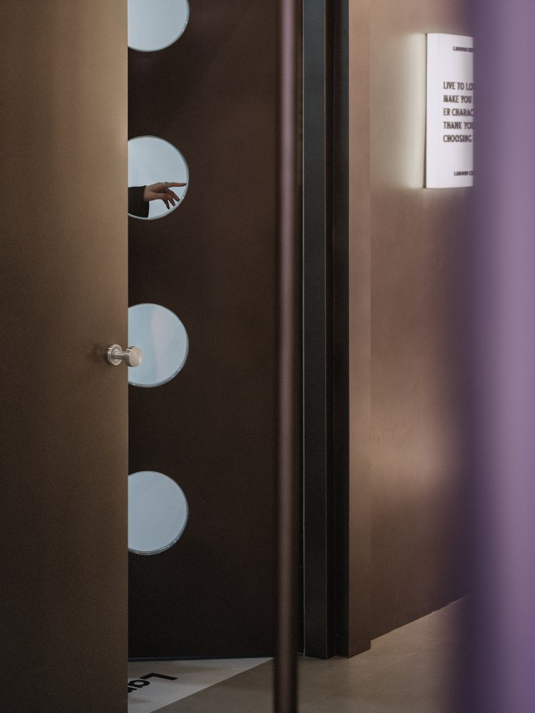
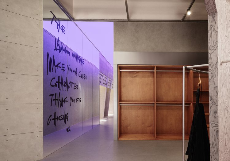
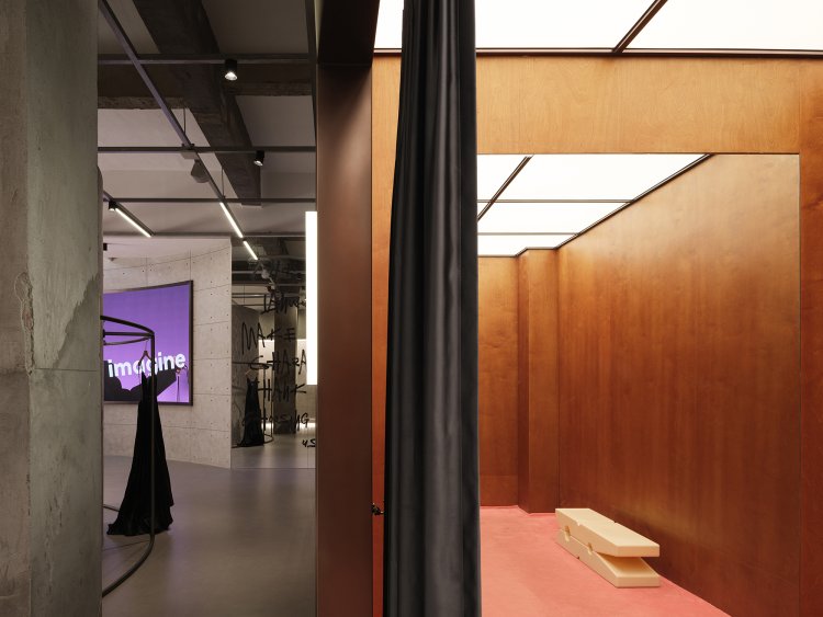
The designer employs basic geometric elements and colors to define the characteristics of the entire space, infusing it with a sense of freedom, sophistication, and boldness, along with an essence of 'unfinished,' reflecting the multidimensional aspects of the brand’s meaning.
Capture·Beauty
Starting with a romantic perspective on life, the design employs dynamic architectural language to reshape the indoor scenery, ultimately cultivating a rich narrative within the space. Upon entering from the main entrance, a circular structure draws one's focal point, while the semi-enclosed design fosters a sense of free and diverse spatial tension. The designer situates the showroom here, creating an emotional experiential center from the customer's viewpoint.
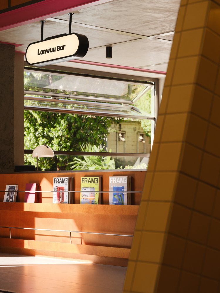
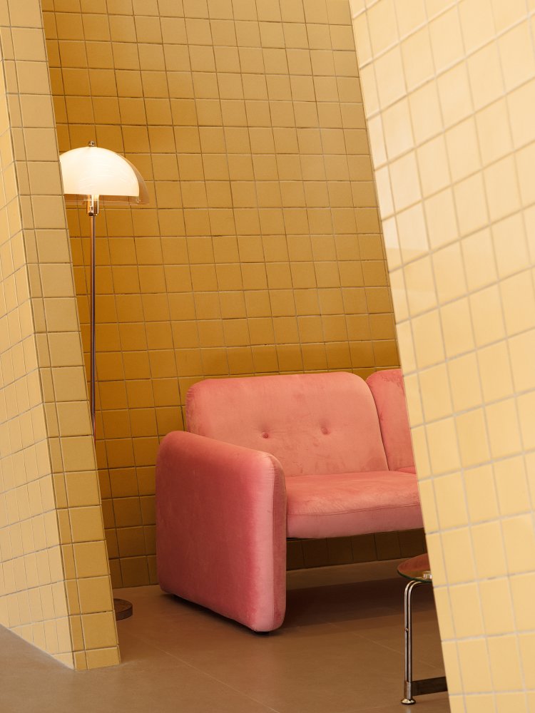
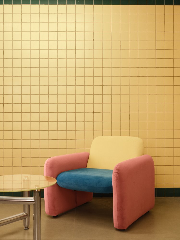
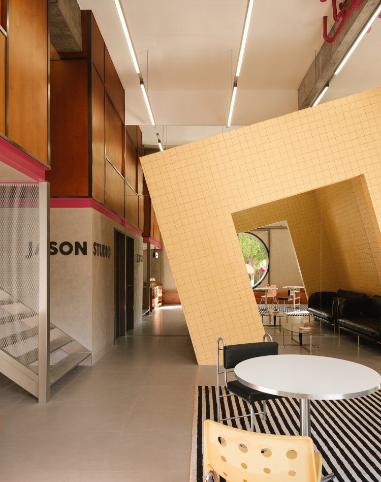
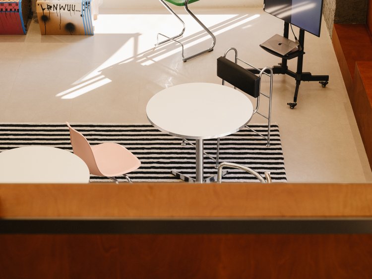
Shifting the perspective to another corner, the chat zone takes the form of a café bar. The overall layout design incorporates a blended commercial concept of coffee, infusing the space with the rich and warm aroma of coffee, enhancing the sensory experience. The chat zone presents a lively yet organized layout. The rectangular carpet complements the casually arranged seats, while the neatly arranged seating is enclosed within an irregular structure. At the far end of the space, a touch of green serves as a punctuation mark, reminiscent of a park in the neighborhood center or roadside seating, where one might encounter a few friends and sit down to chat about the pleasant events happening around them.
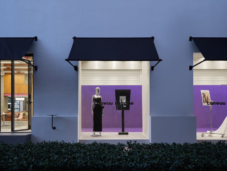
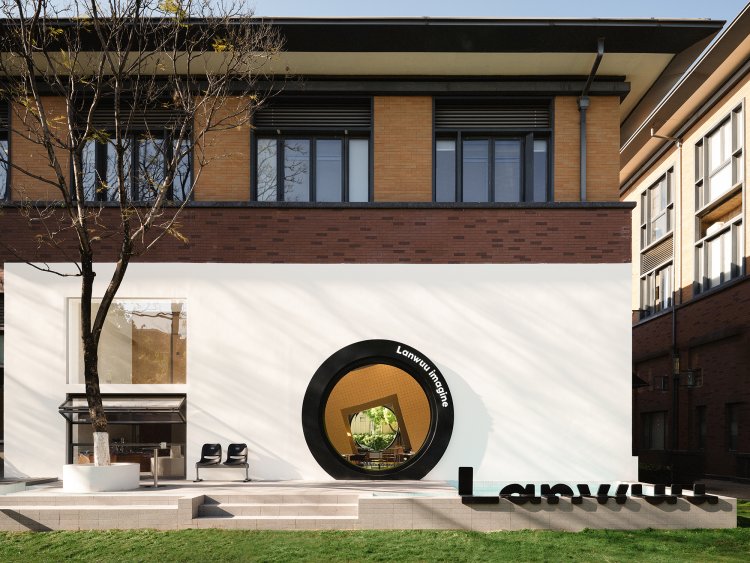
The designer shapes the window scenery into a circular form, mimicking as a camera lens. By integrating this round window view with the white exterior walls, LANWUU IMAGINE's distinctive brand perspective is established. The inclusive white color embraces everything happening inside, capturing and preserving those beautiful moments, while also retaining the passage of time and capturing the eternal essence of the fleeting moments.
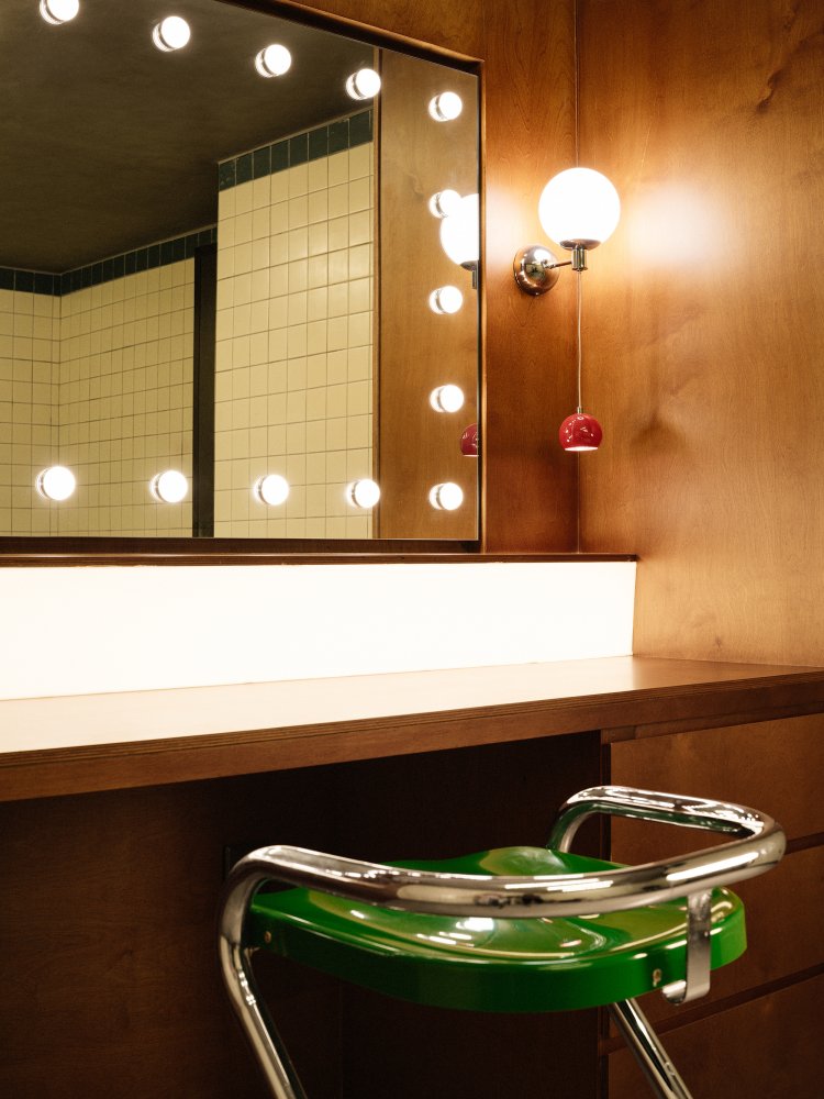
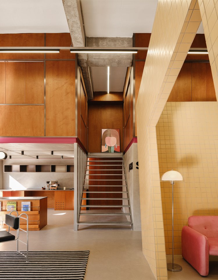
The metal staircase divides the space into leisure and working areas, providing customers with a distinct transition between scenes. The makeup room and dressing room, primarily constructed with wooden partition walls, adopt a layout reminiscent of Japanese-style rooms, enclosing each area into individual compartments. While meeting the essential requirement for privacy, the space also embodies a pursuit of simplicity and comfort in its aesthetic.
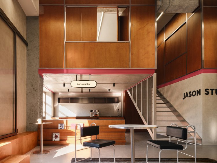
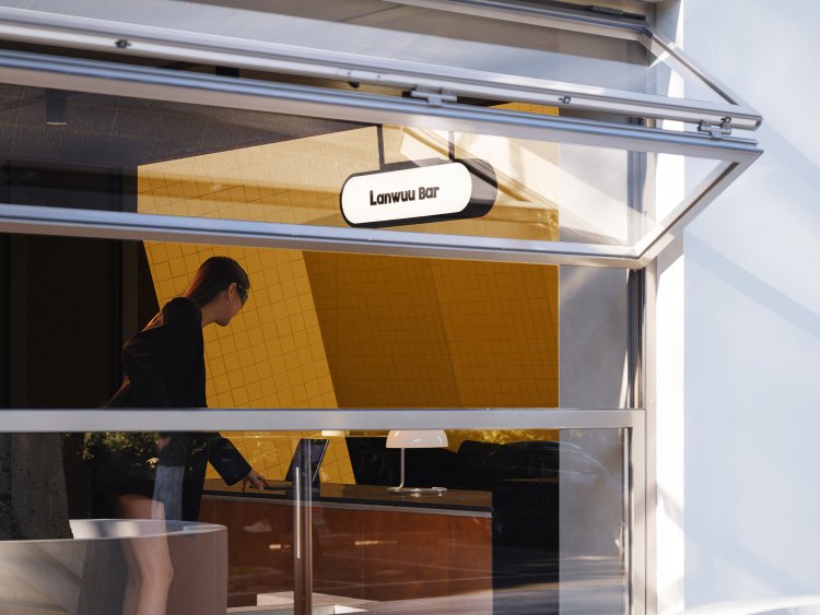
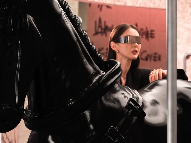
The metal-textured sliding door transports us back to the bustling city. As we stroll along the streets, we encounter graffiti at the intersection, where free-flowing brushstrokes depict the carefree pathways within the corridor space. The contrast of reflective metal surfaces and architectural concrete materials carves out the texture and structural beauty of the entire space. Through simplicity, strength is built, and through reflection, the essence of self is revealed. The designer's use of material contrasts interprets the brand's essence, expressing qualities of self-improvement.
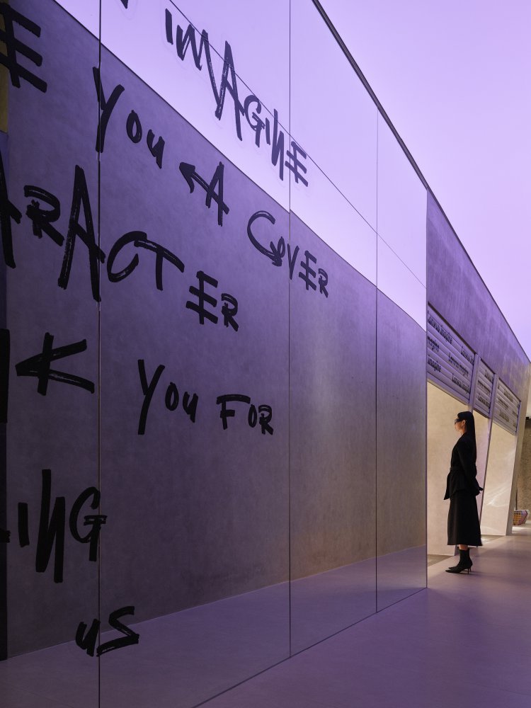
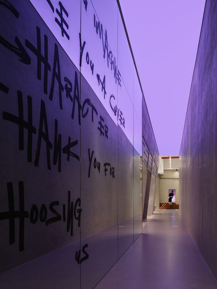
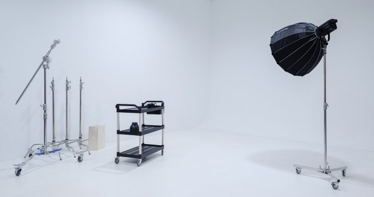
The designer employs various scene changes to present different understandings of beautiful moments within the space. By blending and exchanging the designer's perspective with the emotions and memories of the experiencers, the essence of the brand and the spirit of the space are vividly depicted.
AURORA DESIGN analyzes and deconstructs the brand profile, taking the ordinary aspect of life as its starting point. Through the concept of "unfinished" time and space, it extends the beauty of fleeting moments and expresses the brand's pursuit of self through bold colors. We look forward to discovering more unseen beauty and warmth in the future through deeper reflections on changes in scenery.
