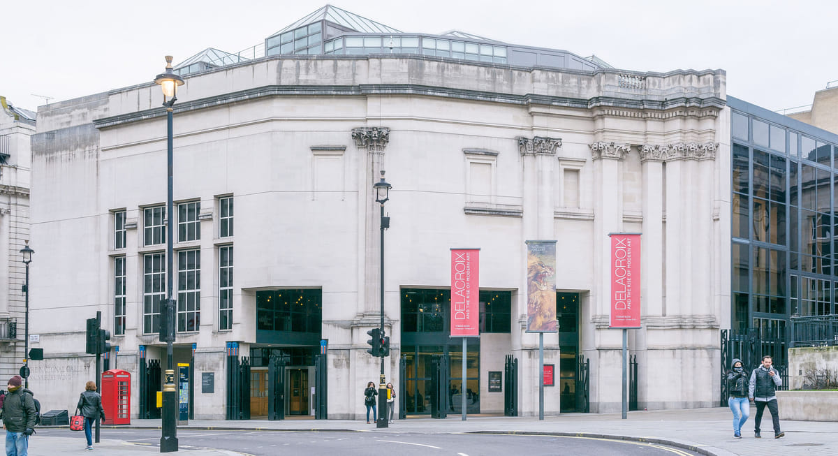
Message In a Bottle In Sainsbury
The false columns in the foyer were part of the intended spatial sequence, conceived as a procession from shadow to light, inspired by the entry to an ancient church. Visitors would enter this crypt-like lower level, proceed up a grand staircase, and arrive in the airy galleries above.Call it a reactionary's revenge if you want, but "a message in a bottle" was found inside one of the Sainsbury Wing's pilasters during the demolishment activity. It is said to have been written as a time capsule by one of the major donors of the Museum, Lord John Sainsbury.While the message's author goes as far as to say, “I believe that the false columns are a mistake of the architect (VSBA) and that we would live to regret our accepting this detail of his design. Let it be known that one of the donors of this building is absolutely delighted that your generation has decided to dispense with the unnecessary columns.” The Guardian's architecture critic Oliver Wainwright has the last piercing words for the client and their architect doing away with the old design; "More than 30 years later, Sainsbury’s view is shared by the National Gallery’s current administration. Director Gabriele Finaldi has said it is the “heavy grey architecture” and “forest” of thick pillars on the ground floo...


The false columns in the foyer were part of the intended spatial sequence, conceived as a procession from shadow to light, inspired by the entry to an ancient church. Visitors would enter this crypt-like lower level, proceed up a grand staircase, and arrive in the airy galleries above.
Call it a reactionary's revenge if you want, but "a message in a bottle" was found inside one of the Sainsbury Wing's pilasters during the demolishment activity. It is said to have been written as a time capsule by one of the major donors of the Museum, Lord John Sainsbury.
While the message's author goes as far as to say, “I believe that the false columns are a mistake of the architect (VSBA) and that we would live to regret our accepting this detail of his design. Let it be known that one of the donors of this building is absolutely delighted that your generation has decided to dispense with the unnecessary columns.”
The Guardian's architecture critic Oliver Wainwright has the last piercing words for the client and their architect doing away with the old design; "More than 30 years later, Sainsbury’s view is shared by the National Gallery’s current administration. Director Gabriele Finaldi has said it is the “heavy grey architecture” and “forest” of thick pillars on the ground floo...
