Parasite house designed from "simple floor plan" sketched by Bong Joon-Ho
Production designer Lee Ha Jun created the house at the centre of the film Parasite based on a basic sketch drawn by director Bong Joon–Ho. In this interview, Jun explains how he designed the set that many people thought was a real house. The Korean film, which won four Oscars at this year's Academy Awards, The post Parasite house designed from "simple floor plan" sketched by Bong Joon-Ho appeared first on Dezeen.

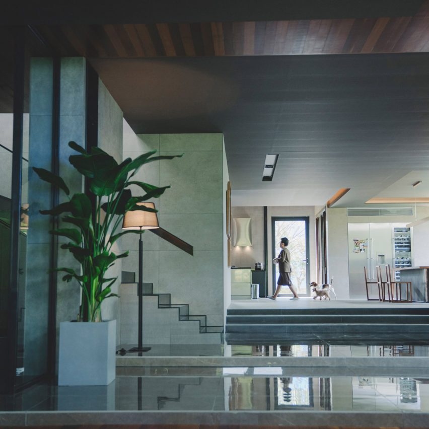
Production designer Lee Ha Jun created the house at the centre of the film Parasite based on a basic sketch drawn by director Bong Joon–Ho. In this interview, Jun explains how he designed the set that many people thought was a real house.
The Korean film, which won four Oscars at this year's Academy Awards, predominantly takes place in the residence of the wealthy Park family. In the movie, the home was designed by fictional architect Namgoong Heonja, but in reality, the property is a series of sets created by Jun.
Jun refrained from sticking to a particular architectural style
"Bong left it all to me in terms of its architectural style," Jun told Dezeen. "He showed me a simple floor plan which he sketched whilst writing the script."
Jun talked with a friend who is an architect, looked at house designs and even his son's toy Lego blocks to imagine the design and layout of Park house. He said he tried to refrain from sticking to a particular architectural style.
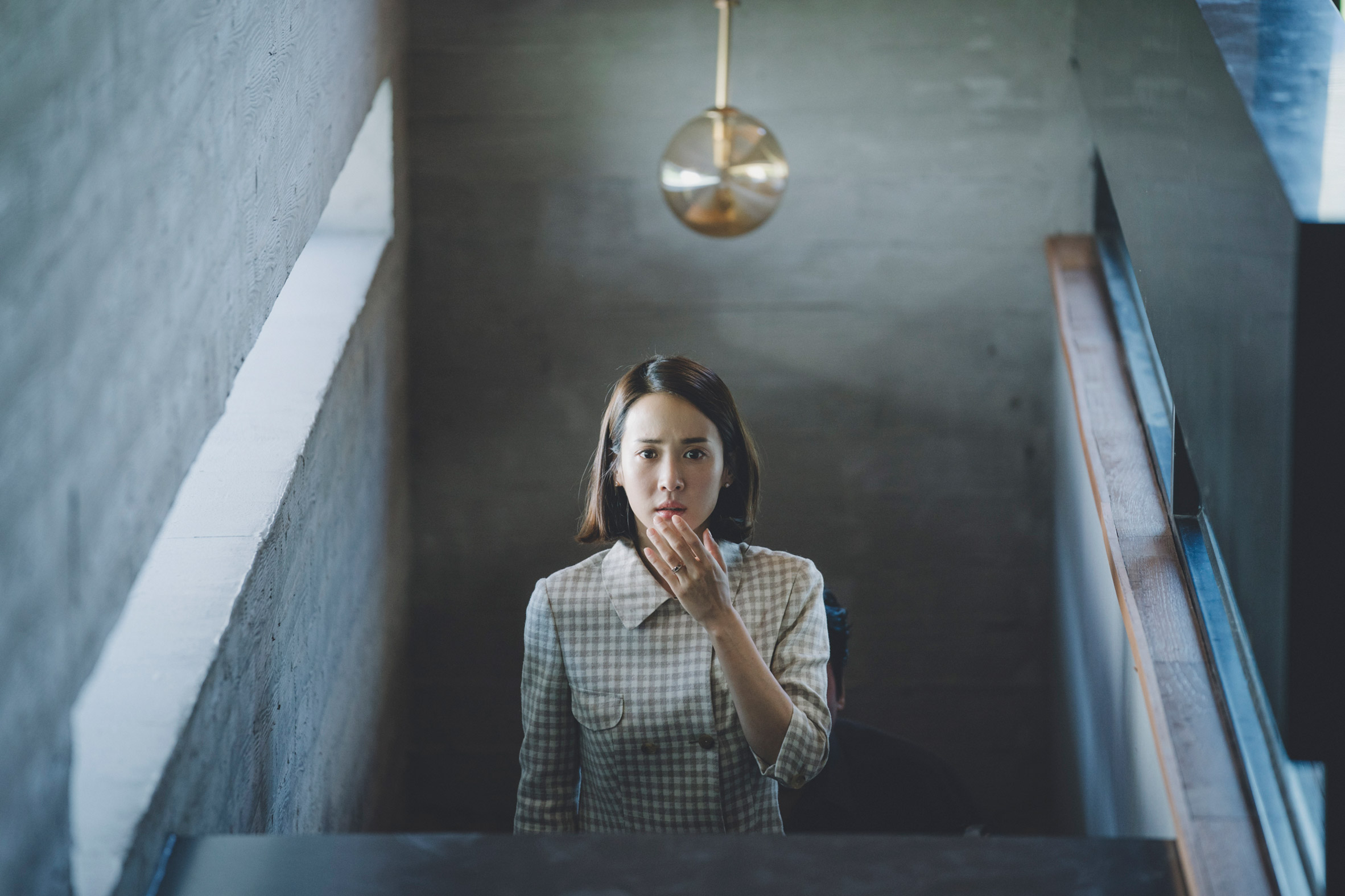
"It wasn't easy finding the right approach to designing the house, since I am a production designer, not an architect," he said. "I definitely referred to other architects' work."
"I didn't look at specific architectural styles, rather I took inspiration from minimalistic, modern houses with great space arrangement," Jun added.
The aesthetic of the house set takes many cues from modernism, including a flat roof, large expanses of glass and minimal furnishings inside.
Park house built as a series of sets
In addition to creating what appears to be a real home, Jun said he wanted to create spaces that were suited to shooting specific scenes.
"Architects and production designers approach their work differently," Jun said. "For me blocking and framing are prioritised; on the other hand, architects build spaces for people to actually live in and thus consider how the environment informs the way the inhabitants live in the space."
"I was concerned about being able to create a space that works well as a film set," he added. "Bong's script is always meticulous and precise and describes the movements of every actor within the scene."
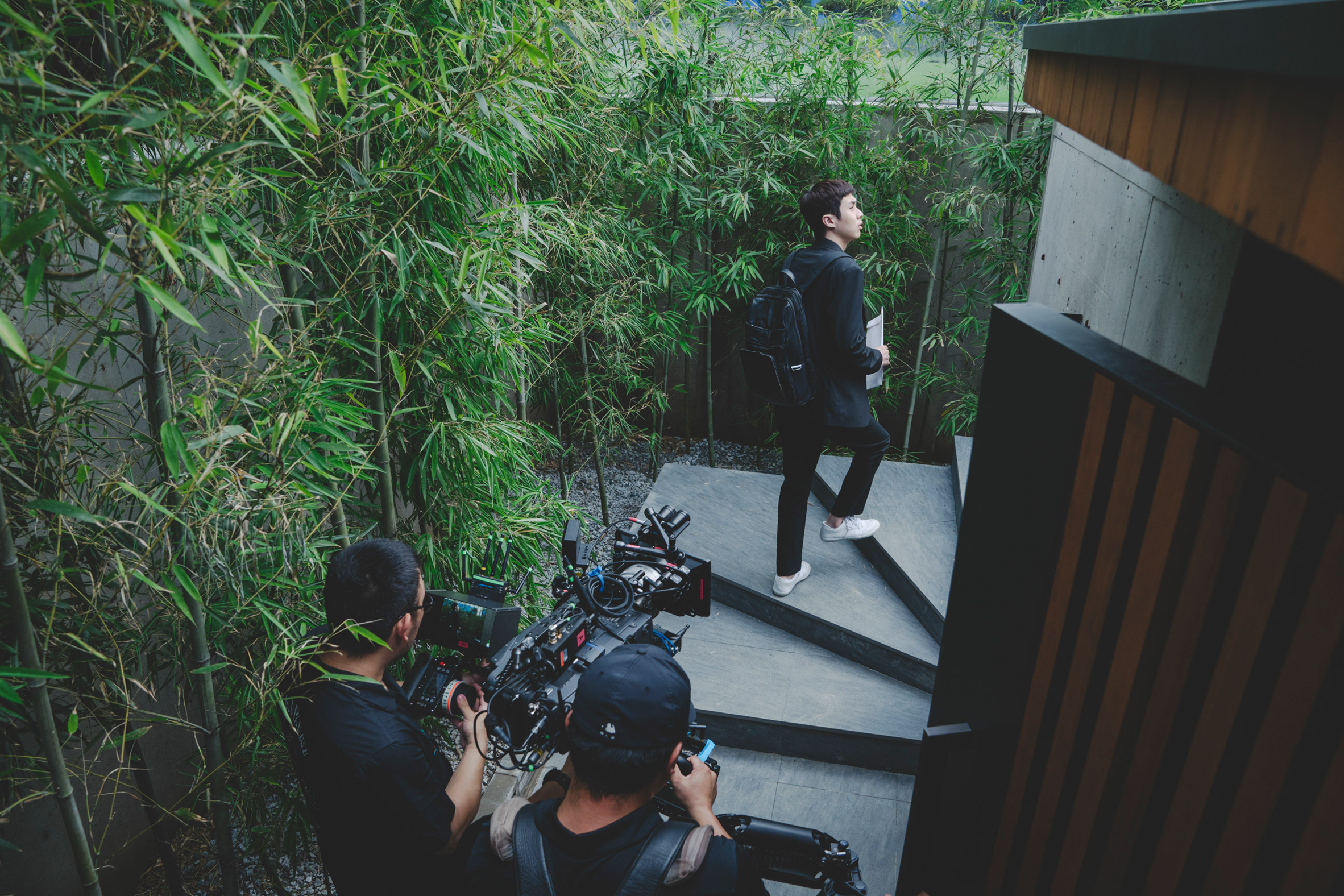
A key element to Parasite is the Park's living room that has a long, glass wall that provides views to a garden – the setting of the film's climax. The window was designed to meet the proportions of the ratio for shooting a widescreen picture.
"We created the window wall in accordance with the 2.35:1 aspect ratio, and I wanted the large living room and garden to feel like a nice photograph on screen," said Jun.
The Park house is created as a collection of production sound stages. A massive section houses the stairs from the kitchen to the basement, the secret passage below, and the bunker further underground, in order to enhance the effect of descending.
Parasite is first non-English language film to win Best Picture
Jun said the vertical movement symbolises the different lives between the rich and the poor, which is a theme of the film.
"I wanted to show the increasing and suffocating density that reflects the class difference between elevated areas and lower ones," he said.
Lee Ha Jun was nominated for Best Production Design at the 2020 Oscars, and although missing out on this award, Parasite became the first non=English language film to win Best Picture and was also awarded Best Directing, Best International Feature Film and Best Writing (Original Screenplay).
Dezeen selected Parasite among 10 films to watch during coronavirus self–isolation that use architecture in exciting ways.
Photography is by CJ ENM Corporation, Barunson E&A.
Read on for an edited version of our interview with Jun:
Bridget Cogley: The movie is set mostly in a contemporary house. Is the house a real place, or is it a set?
Lee Ha Jun: Park's house, Kim's semi–basement house and the surrounding neighbourhood were all sets built for the film.
Bridget Cogley: What guidance, or stylistic freedom per se, did you have in designing the house? Did Bong Joon–ho give much direction or feedback?
Lee Ha Jun: Bong's script is always meticulous and precise and describes the movements of every actor within the scene. The key factor to consider in the creation of this house was blocking. Bong left it all to me in terms of its architectural style. However, he emphasised that the beautiful front garden was an essential element. He showed me a simple floor plan which he sketched whilst writing the script. So based on this, I designed this house architecturally whilst meeting all the blocking requirements.
Bridget Cogley: Why did you decide to create the set in such a contemporary architectural style?
Lee Ha Jun: This story supposes that the house is designed by an architect Namgoong Heonja, and Moon–gwang – the original housekeeper – worked for him. So we decided to design a modern house, something not too old.
Bridget Cogley: Where did you take your influences from?
Lee Ha Jun: In general I find design inspiration from many different places. For references, I take inspiration from remembering the past, watching films and TV dramas, and even watching my son playing with Lego.
Bridget Cogley: Does the house reference the works of other architects? If so, who and how does it reference them?
Lee Ha Jun: I definitely referred to other architects' work, however I don't often take a specific idea from one particular architect. As I said, for me everything can be a reference and creative stimulation. If I had to pick a reference that influenced me during this project, I would say houses with beautiful gardens.
I needed to build something that would also seem credible to the audience
Bridget Cogley: Did you reference any particular architecture styles or buildings? If so, which ones and how does it reference them?
Lee Ha Jun: I didn't look at specific architectural styles, rather I took inspiration from minimalistic, modern houses with great space arrangement. I also found paintings by Mondrian and Kandinsky as well as some illustration magazines inspiring. I even got some great ideas from my son's Lego structures.
Bridget Cogley: What was your process for creating the house? Did you talk with architects and designers? Do you consider yourself an architect?
Lee Ha Jun: Since Park's house was built by an architect in the story, it wasn't easy finding the right approach to designing the house, since I am a production designer, not an architect. Architects and production designers approach their work differently. For me blocking and framing are prioritised; on the other hand, architects build spaces for people to actually live in and thus consider how the environment informs the way the inhabitants live in the space. I came to this understanding by spending time with my architect friend and his colleagues.
I was concerned about being able to create a space that works well as a film set – a virtual house for the film's characters – and at the same time functions as a real space reflecting the characters' lives – their circumstances and philosophy. I needed to build something that would also seem credible to the audience.
Bong commented that architect Namgoong Heonja designed this living room to allow the residents to observe the garden, which was the philosophy of this fictional architect. That's why there's no TV in the living room.
So we created the window wall in accordance with the 2.35:1 aspect ratio, and I wanted the large living room and garden to feel like a nice photograph on screen. In order to highlight the contrast between the exterior and interior space, we used darker-toned materials – dark wood and grey walls – for the interior. The space was intended to be simple and roomy, rather than complex.
The staircase is one of the key visual elements of this film
This is a story about co-existence, but both Bong and I were certain that we had to show clear contrasts within the terms of that co-existence. This is emphasised by how the appearance of the neighbourhoods gradually changes when the family endlessly descends from the rich neighbourhood to the poorer one, from top to bottom. The staircase is one of the key visual elements of this film. I wanted to show the increasing and suffocating density that reflects the class difference between elevated areas and lower ones.
Bridget Cogley: How do you think creating such a modern house communicates Seoul's architecture and design scene? Is it accurate? How have locals responded?
Lee Ha Jun: As I said I am not an architect, so I am not sure about how this house reflects Seoul's architectural style. But what I can say is that even Korean audiences were very surprised by the fact that this was a set.
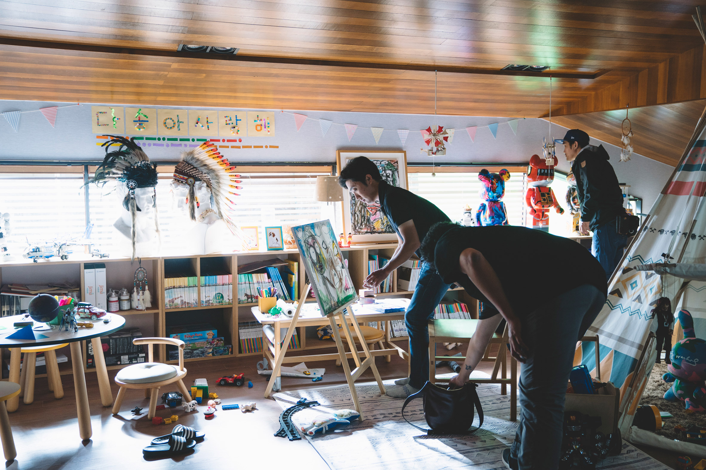
Production design can help create deeper meanings in characters and indicate space that is sometimes invisible. For that reason, the two different spaces I created for Parasite were something personally meaningful.
Bridget Cogley: Inside, the home is very minimal. Does this have any meaning?
Lee Ha Jun: For the big rich house, I didn't want there to be too much going on. Something simple, minimalistic, with well–planned layouts with a limited colour palette. However, with Kim's house it was the opposite. There was no masterplan in terms of its layout, and the decor is complicated, with lots of different colours and textures. As I said, I wanted to express the increasing density both in terms of space and colour as one moves from top to bottom, from the rich house to the semi–basement neighbourhood.
Bridget Cogley: How did you come up with the furniture designs, like the coffee table and the dining chairs, and the glass cabinet in the basement?
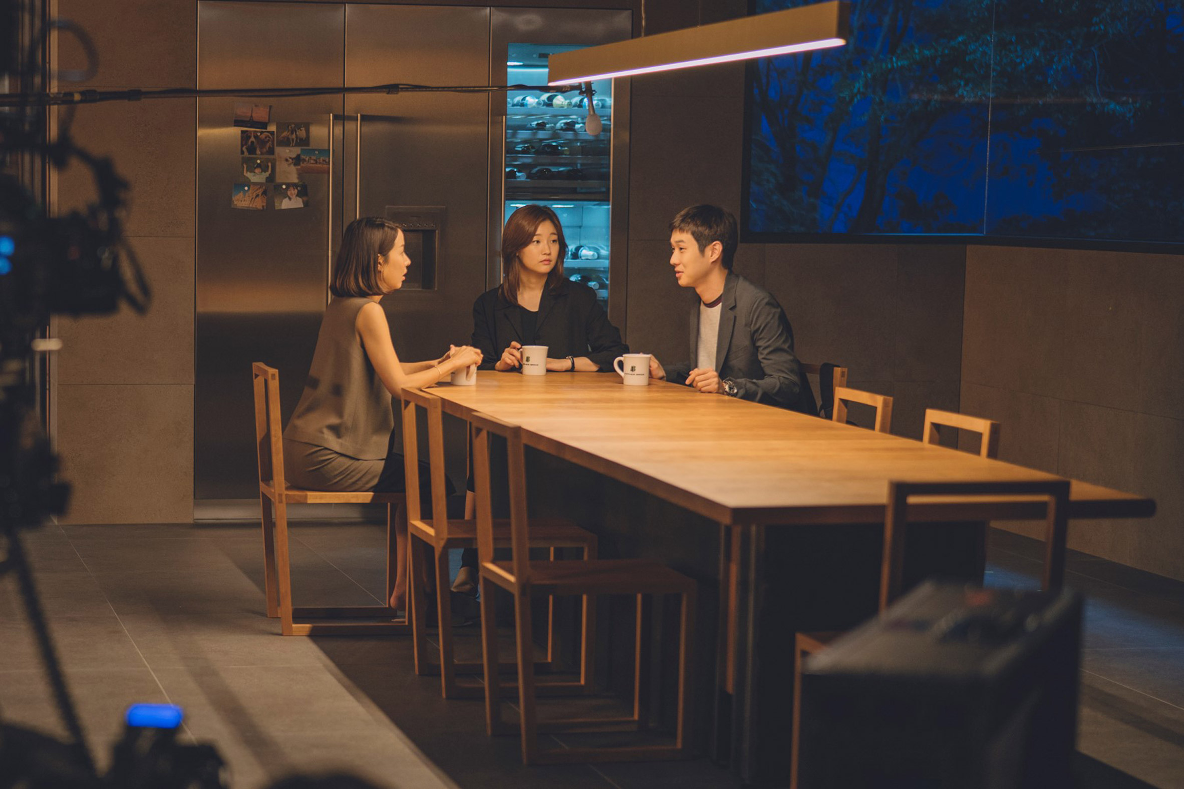
Lee Ha Jun: Most of the furniture in this film, including the coffee table in the living room and the dining chairs were created by Korean furniture designers. With the case of the coffee table and dining chairs, we worked together from the concept stage to suit the director's intention. We also tried to avoid recognisable brands as it might prevent audiences from being absorbed in the story. The cupboard in the basement functions as a secret passage so rather than a minimalistic feel, we wanted it to look a bit more aged. The wine store makes it seem like it hasn't been touched for a long time – it was important that the audiences wouldn't imagine that it might move.
This giant set at first seemed a bit ridiculous but in the end, it was a good decision
Bridget Cogley: How did you go about designing the basements? They play such an important role in the movie, and the second one is a real surprise and plot twist.
Lee Ha Jun: The basement storage room, the secret passage, and the secret bunker where Geunse lives were all built as one set in a Sound Stage, including the stairs between the kitchen and the basement storage, as well as the passage between the storage and the bunker. So the set is built on top of the ceiling in sound stage slowing descending vertically to the bottom of the set.
The reason we built this as one set was because of the scene where the actors move down from the kitchen to the bottom bunker, and Bong wanted to be able to film this without stopping, so that their breathing could be captured realistically. This giant set at first seemed a bit ridiculous but in the end, it was a good decision. The efficiency it afforded in terms of filming, and in allowing the actors to concentrate, was brilliant. When you first encountered the space you felt suffocated, and I think this was helpful for the actors.
Another reason why we built one giant set was to illustrate that Geunse, who lives underneath Park's house is in a similar situation to Kim and his family. The vertical structure of the house reflects the relations between the three families, with Geunse at the bottom. Whilst Park's family mostly only go up the stairs, Kim and Geunse's families move up and down repeatedly. That's the essence of this film.
The post Parasite house designed from "simple floor plan" sketched by Bong Joon-Ho appeared first on Dezeen.
