Place-making at the Madeleine
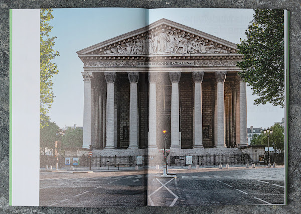
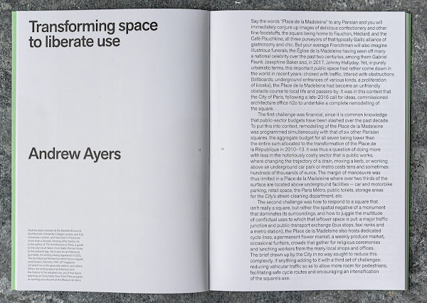
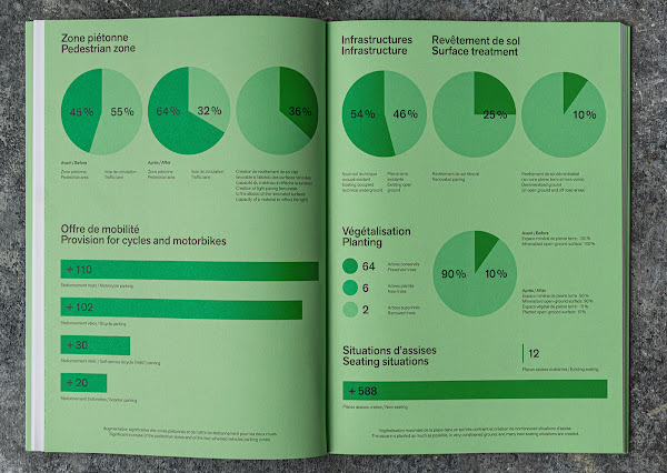
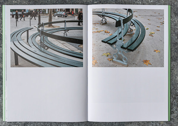
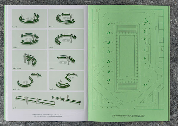
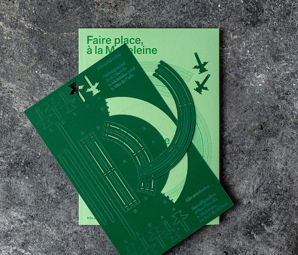
Place-making at the Madeleineh2o architectesBuilding Books, December 2020Paperback | 6-3/4 x 9-1/2 inches | 80 pages | 73 illustrations | French/English | ISBN: 9782956781561 | 19 €PUBLISHER'S DESCRIPTION:Place de la Madeleine conjures up images of delicious confectionery and other fine foodstuffs as well as illustrious funerals. With a tight budget and many constraints, h2o architectes have pulled off a major use revolution at the Madeleine by giving back 4,500 square metres to pedestrians—a huge gain of 40% that was achieved almost by stealth, no opportunity having been lost to claw back space from the automobile. What, therefore, in the context of that hyper-dense urbanity could be a finer gift to Parisians than the one thing they almost never encounter: flexible open space in its purest form?h2o architectes, founded by Charlotte Hubert, Jean-Jacques Hubert and Antoine Santiard, is a Paris-based firm working on projects of various types and scales, from housing to public space and cultural facilities. The office is dedicated to architectural, heritage and urban creation and reprogramming.REFERRAL LINKS:dDAB COMMENTARY:One of the most memorable images in Openings, the monograph on Paris's h2o architectes, is a photograph showing models of straight and curved benches stacked on platforms and inserted into a box as if they are drawers. The benches are green, like most standard benches in many cities around the world, but they are curved, reminiscent of Martha Schwartz's curlicue benches that once occupied Jacob Javits Plaza. The benches were designed by h2o for Place de la Madeleine, an island of public space ringing L'Eglise de la Madeleine (first spread, below) in Paris, a couple of blocks north of Place de la Concorde. The benches are an integral part of h2o's remodeling of Place de la Madeleine and therefore make up a large part of the new book devoted to the project.Place-making at the Madeleine starts with a short essay by Andrew Ayers, author of The Architecture of Paris, who spells out the numerous challenges faced by h2o, including a small budget combined with a complex brief, an abundance of underground infrastructure to contend with, and working on a square whose qualities can at best be called "residual." The solutions, mentioned in the same essay, are centered on "a huge gain of 40% [more public space] that was achieved almost by stealth." The before and after plans of the square that follow show very few structural changes, with many curbs staying in place, but a lot of surface treatment that manages to tie previously detached spaces together, and some narrowing of traffic lanes to take space from cars and give it to pedestrians.Then there are the benches. The dramatic increase of seating is evident in the two-page spread with graphs calling attention to the various improvements (third spread); the graph at bottom-right shows seating increasing from 12 to 588. It doesn't matter if those numbers refer to occupancy or linear meters or something else — a 49-fold increase is huge! Photographs by Myr Muratet depicting the remodeled square in use follow the drawings and graphs. Many people are sitting on the south-facing steps of the church, but just as many sit on the new benches, which are mainly curved to embrace the existing trees on the east and west sides of the church. The benches are broken down into four types, with variations, based on their length and configuration but also the integration of tables that help people eat lunch (fourth spread).Plans, fabrication details, and other drawings of the benches follow the photographs at the back of the book. These drawings are another indication of the seating's importance in the project, as are some photographs of the construction of the benches and their constituent parts: the cast iron bases and the timber slats for the seating and backs. These pieces appear in the book's most surprising feature, a loose page tucked into one of the cover's internal flaps with a laser-cut assembly model for three benches (last spread): one straight and two curved. I couldn't resist popping out the pieces and fitting them together, putting one of my daughter's toys in the place of a tree. Not only is the model a neat bonus, something not usually found in a book, it's a hands-on way of increasing an understanding of the design and construction of the benches in readers. For that alone, it was no doubt worth the extra expense and effort in the production of Place-making at the Madeleine.SPREADS:
h2o architectes
Building Books, December 2020
Paperback | 6-3/4 x 9-1/2 inches | 80 pages | 73 illustrations | French/English | ISBN: 9782956781561 | 19 €
PUBLISHER'S DESCRIPTION:
REFERRAL LINKS:
SPREADS:


