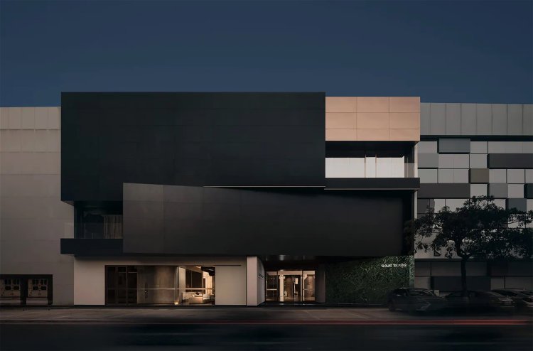
Spanish GOJE Slate Exhibition Hall by Topway Space Design
"Long in the cage, I return to nature." Walking out of the narrow passage and passing through a hole stacked with rocks, a vast expanse of scenery unfolds before our eyes. This space is designed as an outdoor courtyard, with a plain cement slate path and a tea pavilion in the center of the courtyard. Quite the opposite of its interior, the infusion of natural light imbues the courtyard with tranquility and poetic beauty. In this elegant and quiet environment, people can enjoy tea, entertain guests, and feel the natural and simple tranquility. This courtyard provides a place for people to get close to nature, allowing them to relax their mind and body and enjoy a peaceful and calm atmosphere. From the art gallery to the outdoor courtyard, an Eastern artistic conception of "Every step reveals a scenic view, while winding paths lead to secluded tranquility." is created. Through the winding and twisting garden-style circulation route, the space is full of mystery, stimulating people's desire for exploration and leading them to gradually explore and discover. Each step presents different scenery and landscape, allowing people to feel the changes and flow of the space. This design technique creates an environment full of poetic and mysterious feelings, allowing people to immerse themselves, explore and appreciate it. By using the form of building blocks, spatial deconstruction, geometric segmentation, and creation of scene experiences, we can demonstrate our understanding of the product and construct a brand concept that combines product aesthetics with spatial application. The traditional exhibition hall is no longer a single material selection place, but a fusion of multiple functions such as scene experience, art appreciation, and social contact.

Project Name: Spanish GOJE Slate Exhibition Hall
Project Location: Guangdong, China
Space Design: Topway Space Design (www.topwayspace.com)
Chief designers: Wang Zhike, Li Xiaoshui
Design Team: Lan Jingwei, Lu Zhongwen, Luo Hongli, Liu Zhu, Zhou Shenghua, Huang Jinghe, Zhou Yingxian
Decoration design: Topway Space Design (www.topwayspace.com)
Project Area: 1000㎡
Design Time: 2021.11
Completion Time:2022.12
Photographers: Ou Yangyun
Writer: Lan Jingwei
The shape of diamond: oblique deconstruction, the beauty of undefined geometry

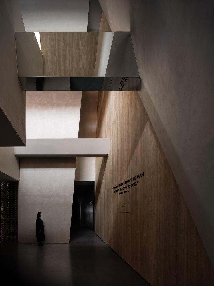
The architect Antoni Gaudí once said, "Curves belong to God and lines belong to man." What about slant line? It seems to belong to an undefined form. The oblique shape of an object has multiplicity from the perspective of physics; it represents both extreme instability and extreme stability. For example, the twin leaning towers of Bologna in Italy and the Leaning Tower of Pisa represent instability while the The Pyramids of Egypt represent stability. A unique spirit of the space is formed by constructing and dividing space with undefined oblique line.


Slash cutting, diamond-shaped space
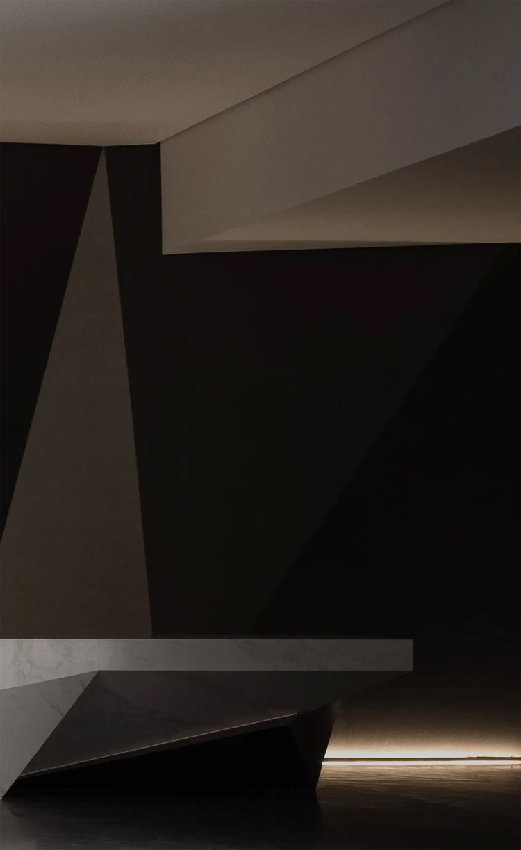
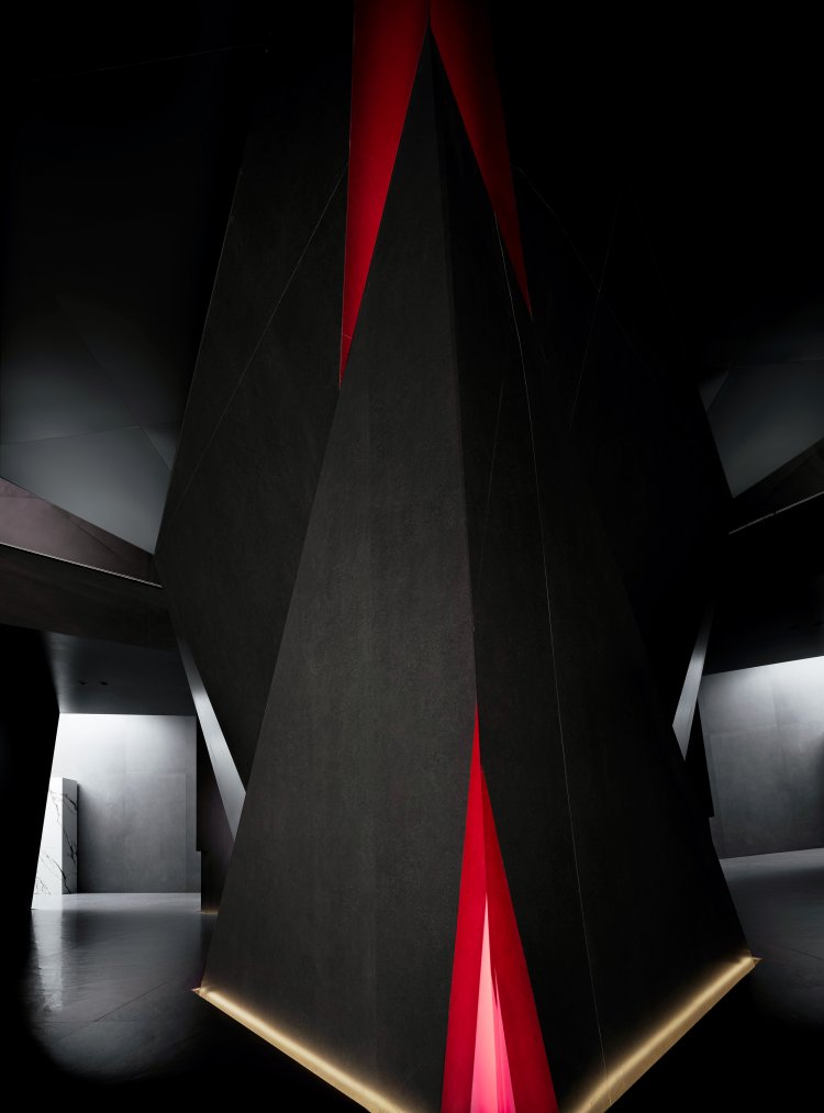
The Spanish slate display in lobby is reconstructed with slash cutting. It breaks away from the traditional horizontal and vertical construction of buildings, creating a space similar to the shape of diamond. Diamond cutting is a processing method for diamonds, representing an extreme processing technique. Each surface presents a different light state and shows the unique beauty of geometry because of the diamond cutting.
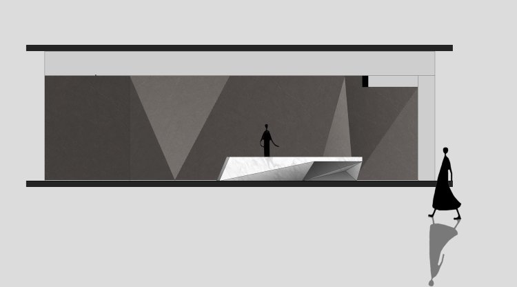
By cutting the space through various scale of oblique shapes, different volumes are broken down and recombined. The language of geometry constructs a space that is interlaced and full of contradictions. This is no longer a traditional material exhibition hall, but more like a three-dimensional art gallery, a non-real space pieced together by fragments of memory.

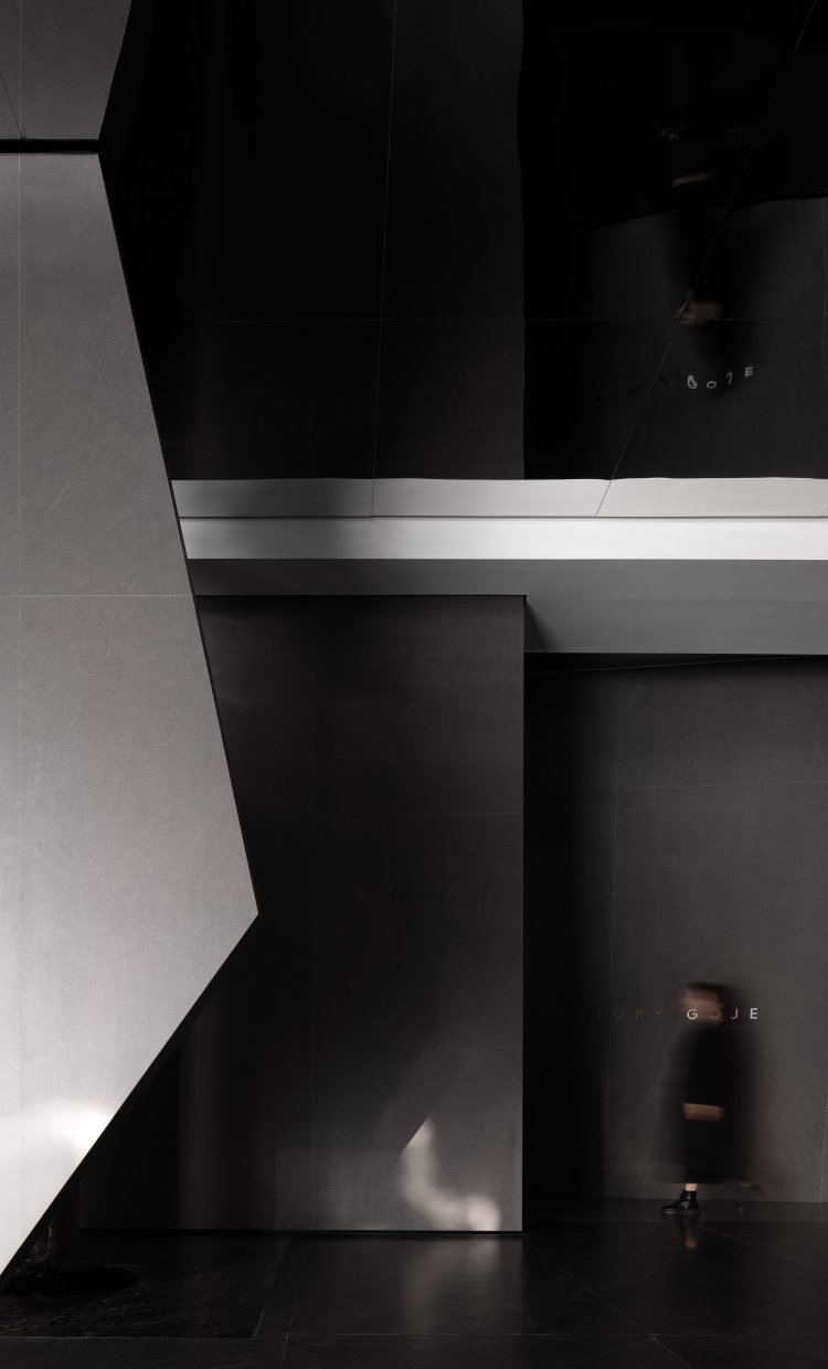
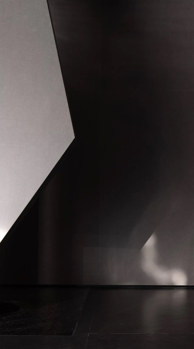
Borrowing light by digging the wall. lights shine for the future
The original building had windows only on the west-facing side, while the other three sides were enclosed. The designer optimized and transformed the building structure, especially by opening a three-story hollow atrium at the corner of the exhibition hall's east side and cutting a window on the east side of the third floor to bring in sunlight. The inverted triangle design was used for the hollow ceiling, while the sloping surface facing the window outside used a mirrored material. The light was refracted twice through the reflection effect. The sunlight pours in through the beams and columns, making the entire space instantly sacred.


△ “Conceptual Design of a Central Light Well for Borrowing Light”

△ "Animated Visualization of an Atrium Design"

△"Visualization of 'Borrowing Light' Spatial Concept"

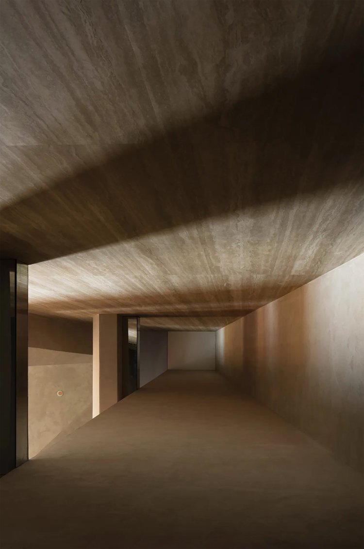
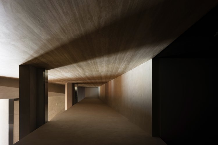
This is an exploration of a process, mysterious, cramped, dark and almost oppressive journey, all for reaching to God in the end. The shocking, magnificent divine light, appearing before us in the last moment.
——Prometheus
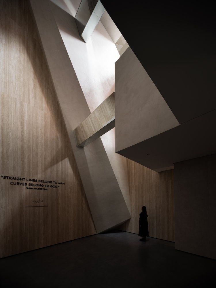


The introduction of natural light makes the space more natural, soft, and touching. Various functional areas has been connected by the reasonable circulation. It creates an open relationship in the space that brings communication between people back to the most primitive, effective, and interesting way.

By alternating the use of natural light in space and combining it with a smooth circulation route, people can feel an inherent sense of time, that is, the uncertainty about space and time. This design creates a feeling of being here and there, and gives people a unique experience.
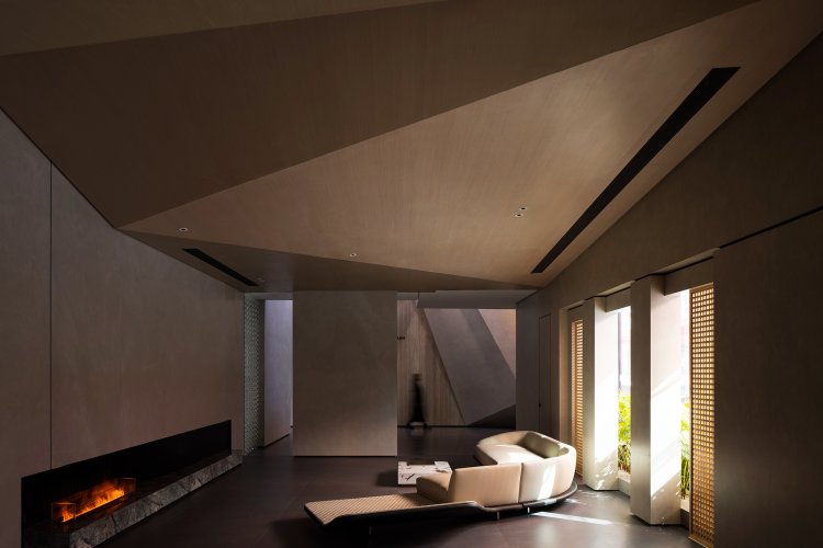
Standing on the light gallery, away from the hustle and bustle, one can feel the wandering in the inch-square space. In the separated and cut space, it seems to enter a realm beyond time. The wooden ceiling is divided diagonally, running through the entire living, dining, and kitchen space, making the boundaries of the space blurred. The simple and elegant cement slate give the space a simple and warm feeling. The morning and evening light creates different feelings of warmth and coldness in different seasons, allowing people to experience a rich and diverse range of emotions here.

In the space interwoven with light and shadow, visitors have become a part of time and space. The space not only brings us peace and comfort but also calms our mind. Thus, we are able to re-examine the memories and emotions that has been neglected for a long time and rethink the meaning and value of life. This space encourages people to contemplate and think deeply about the important things in life, finding a deeper understanding and realization for themselves.

Fantasy gallery, the mysterious place
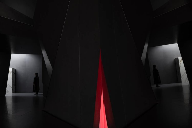
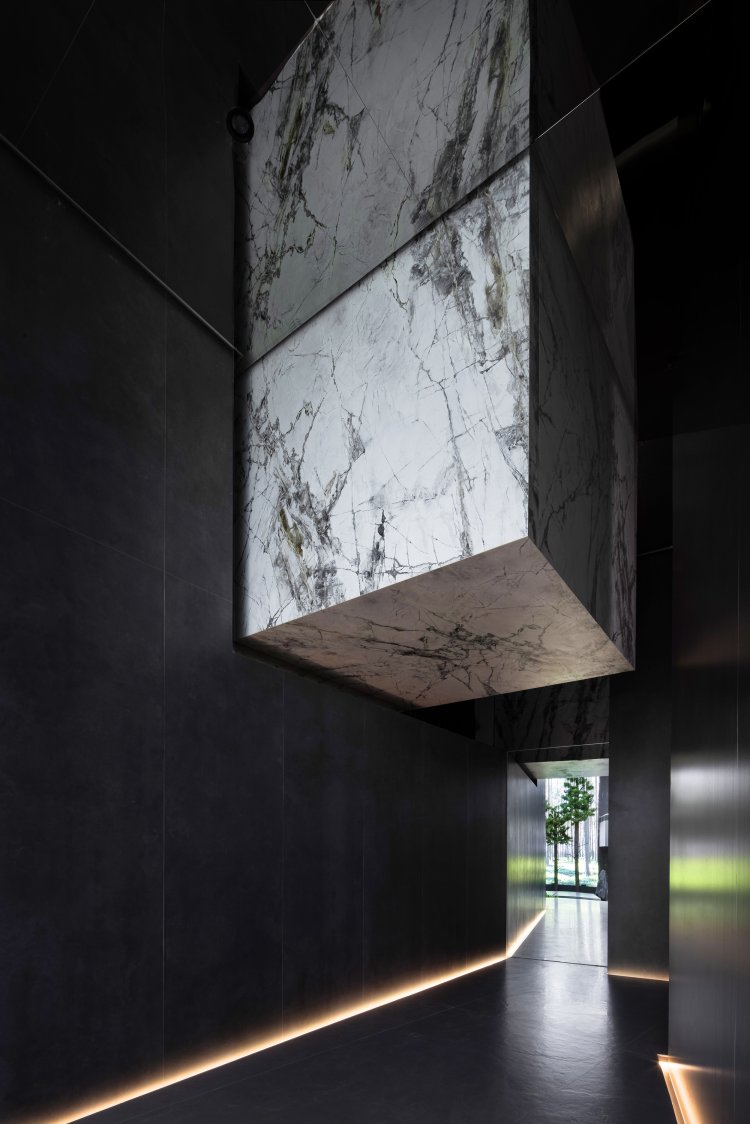
Passing through a narrow oblique corridor, visitor enters an art gallery where the ceiling and walls continue the diamond-cutting design. The wall uses slates with a dark volcanic texture and metal materials to create a unique texture. The LED screen in the center of the gallery extends the space into the distance and creates unforeseen circumstances, triggering people's unlimited associations and imaginations. This space can either be used as a brand roadshow area or an art salon. It is a place that provides people with various experiences and communications.


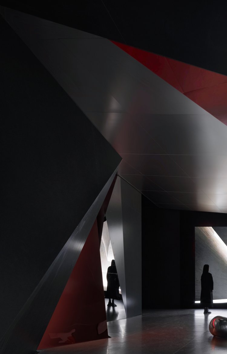


As a part of the building's skin, slates form a symbiotic relationship with the building. Due to the variety of textures and materials, slates can be combined with different architectural spaces, presenting a thousand different architectural postures. The different postures of the slates formed different spatial emotions in different light and shadow and decorations.
It has become a vibrant carrier precisely because slates have unique spatial contexts, architectural moods, and space demand scenarios that are truly related to users. Slates give buildings unique features, blending them with the environment, while also creating an experience for users to interact with the space.

The elegant room, the poetic place
"Long in the cage, I return to nature." Walking out of the narrow passage and passing through a hole stacked with rocks, a vast expanse of scenery unfolds before our eyes. This space is designed as an outdoor courtyard, with a plain cement slate path and a tea pavilion in the center of the courtyard. Quite the opposite of its interior, the infusion of natural light imbues the courtyard with tranquility and poetic beauty.
In this elegant and quiet environment, people can enjoy tea, entertain guests, and feel the natural and simple tranquility. This courtyard provides a place for people to get close to nature, allowing them to relax their mind and body and enjoy a peaceful and calm atmosphere.
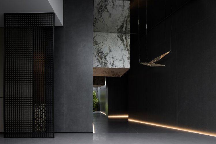
From the art gallery to the outdoor courtyard, an Eastern artistic conception of "Every step reveals a scenic view, while winding paths lead to secluded tranquility." is created. Through the winding and twisting garden-style circulation route, the space is full of mystery, stimulating people's desire for exploration and leading them to gradually explore and discover. Each step presents different scenery and landscape, allowing people to feel the changes and flow of the space. This design technique creates an environment full of poetic and mysterious feelings, allowing people to immerse themselves, explore and appreciate it.




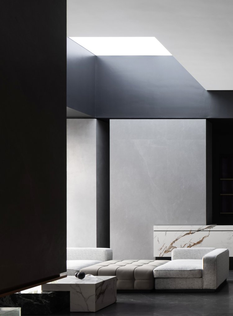
By using the form of building blocks, spatial deconstruction, geometric segmentation, and creation of scene experiences, we can demonstrate our understanding of the product and construct a brand concept that combines product aesthetics with spatial application. The traditional exhibition hall is no longer a single material selection place, but a fusion of multiple functions such as scene experience, art appreciation, and social contact.
