The Mill Project
A Mid-Century Modern and Wabi-Sabi influenced contemporary office in Erode – Tamil Nadu that houses an heirloom textiles operation.
The balmy city of Erode is the nucleus of Tamil Nadu’s thriving textile industry and is cloaked in a riot of sound and colour. The location celebrates the harmonious binary coexistence of the old and new, both tingeing the city’s history. With its terrain dotted with the presence of factories and industrial plants, Erode is a melting pot of modernised trade and enduring heritage that its residents have kept alive. Sequestered in one such remote factory premises, abuzz with activity is The Mill Project (Ālai - translates to ‘Mill’ in Tamil) — an office crafted for a family-run enterprise wherein the patriarchal head and his two sons shoulder the operations. The rugged natural landscape on the fringes of the city, houses the built mass in its vast entirety, offering the space a unique topography to occupy, and evocative of creating an oasis amid barren lands.

A mandate of the client’s needs dictates the requirement for a workplace that is an ode to the rooted context within which the built form is situated, a tribute to the suburban habitat where it all began. The inspiration to sculpt the blank industrial canvas stems from the architecture of the building intrinsically — towering fourteen-foot-high ceilings punctuated with large floor-to-ceiling fenestrations overlooking abundant stretches of tropical verdure and the azure skies above.
The design atelier has created pragmatic zones within the bare shell of the industrial enclosure. This forms functional spaces that work jointly to induce a functional flow in the office. The minimalism sewn into the workplace’s construct allows each space to honour the brief while engaging playfully with elements of scale, light, and materials that ink the saga of the office. A raw material profile encompassing cement finishes, lime plaster textures, and wooden nuances is juxtaposed against the panache of marbles in monochrome palettes. The omnipresence of glass partition systems in the interior layout ties together the floor plan visually, lending it a seamless character while the intriguing interplay of light and shadow through the glazed surfaces washes the interiors fleeting daylight.
The workplace’s narrative is a compelling collage of Wabi-Sabi and Mid-Century Modern timeless design styles that converge to create a functional and luxe work environment. The commonalities that make the chosen design styles the idyllic fit are derived from their shared penchant for clean geometry which departs from inessential ornamentation, the celebration of materials in their untainted form, and the prevalence of an understated yet artistic simplicity across spaces and their objects. A sense of calm continuity presides over the segments of the office with curated furniture, curios, and lighting fixtures endowing the space with a harmonious vision through the mediums of colour, texture, and sleek silhouettes. The doses of greenery introduced indoors don a sculptural presence with their form and tall forms scaling up to ten feet, iterating the voluminous spaces.

The office’s unassuming exterior façade composed of a double-tiered band of rectilinear wood and glass windows steals glimpses of the interior workspace and is speckled with modernist black and white gooseneck wall sconces, planters, and a spindled bench. Attributed to its remote location, the site often faces prolonged spells of power outages, hence the need for active air ventilation and the presence of natural light assumes pivotal importance. The windows lining the exterior elevation enable conducive flow between the factory and the office, allowing spaces indoors to maintain habitable indoor conditions during unforeseen outages.
The entrance leads into the compact reception space that is framed by a stone veneer adorned by swirling marbling patterns in charcoal, grey, and browns. A monolithic concrete-body reception desk is coupled with a black and white globe cluster chandelier; this preliminary space acknowledges the ingrained design inclination of the office.
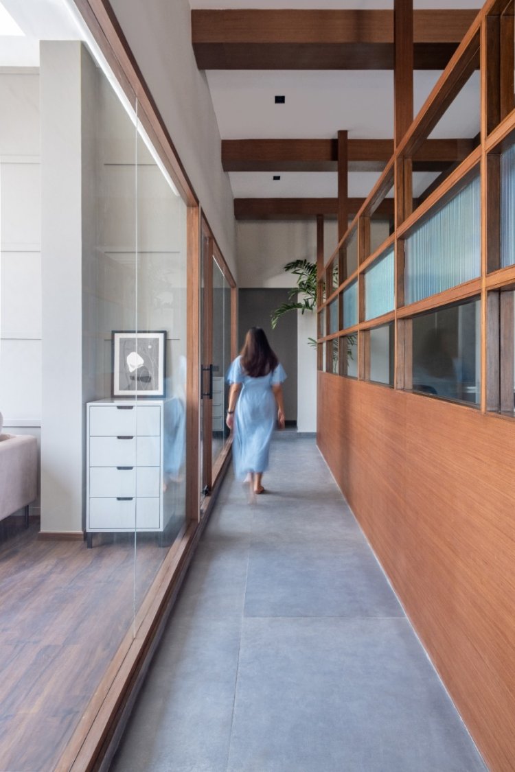
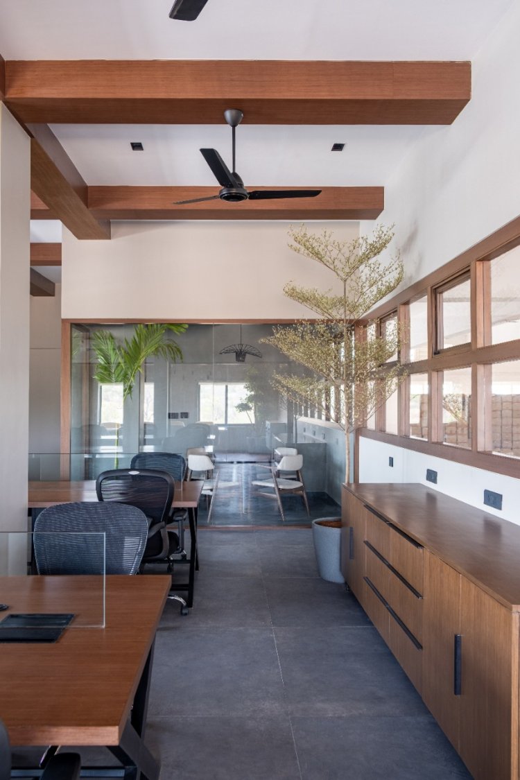
The communal workstation bay is the epicentre of the open-plan layout and is devoid of obsolete mammoth partitions witnessed in bygone corporate spaces. The articulate placement of furniture defines the zones and renders it with a clean aesthetic via the employment of ergonomic wood and black metal furniture — a material alliance synonymous with Mid-Century modern aesthetics. The placement of community desks encourages conversation and interaction among end-users while maintaining viable circulation. The ensemble of cement-finished flooring, bright ivory walls, and the grid of wooden rafters on the ceiling create a pared-down yet stimulating aura. Bordered by the window-lined façade wall on one end and a wood and fluted glass partition system on the other, the workstation bay is coherently distinguished from the private cabins by a spinal circulation passageway. The custom partition administers privacy for the private cabins towards the rear of the layout and also filters in light into the main workspace, eliminating the need to utilize mechanical lighting until dusk. A private discussion room occupies a glass-enclosed cabin within the workspace which is bathed in a monotone palette and can host concentrated groups around its suave round table and upholstered taupe chairs.

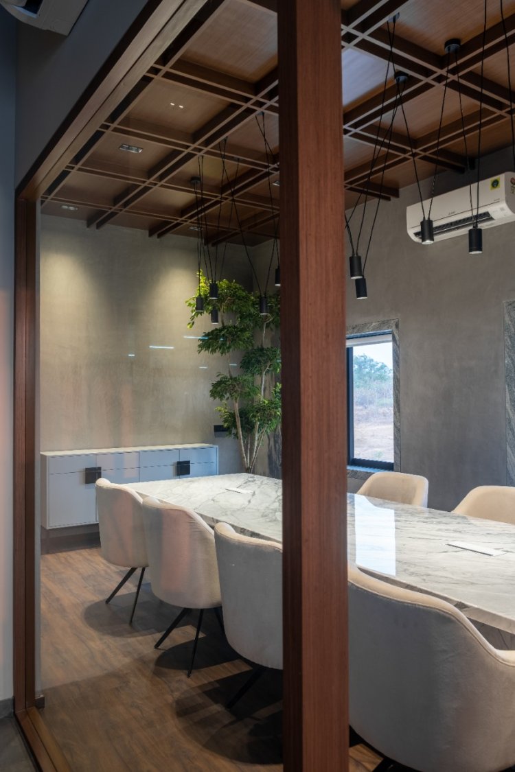
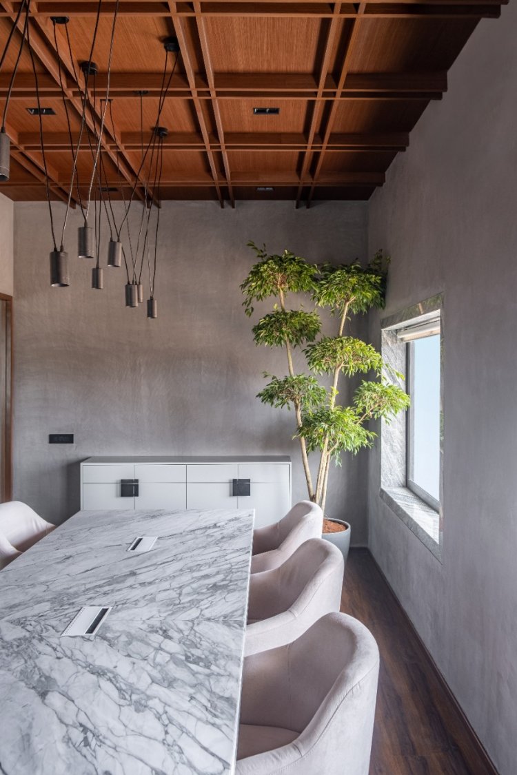
Tucked into the quiet perimeter of the layout beholding external views, the conference room bears a stated demeanour that exudes tactful material play and creates vignettes of alluring design. The pièce de résistance is the expansive ten-seater marble conference table that commands the room. A vision in monochrome with stunning accentuated veining that envelopes its body, the table is paired with slender off-white upholstered chairs that build on the tonal play. The restrained lime plastered walls and deep-toned wooden flooring humbly bear themselves to allow the design elements to take the spotlight. The ceiling bedecked in teak finishes is layered with a grid pattern of rafters, lending it an added sense of dimension is the poised contemporary black minimalist chandelier. the grid motif of the ceiling trickles onto the wall, creating a visual linkage between the surfaces.
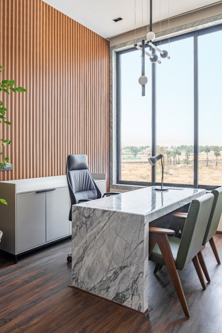
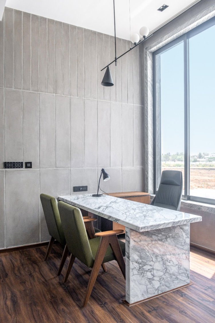
A crossover amidst modernist sensibilities and intuitive forms, the Managing Director’s cabin is set apart by its grooved wooden focal wall which poses as the backdrop to the space. A suede grey sofa dominates the lounge in the cabin, a stark marble desk rests boldly in the foreground, and is complemented by classic Jeanneret-inspired chairs in an olive hue. The desk area is canopied by a neoteric pendant that unites spherical and cylindrical forms gracefully. The cabin soaks in boundless views of the topography through its lofty fenestrations whilst experiencing uninterrupted privacy.
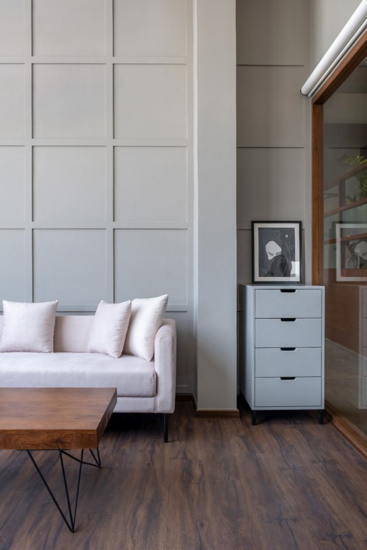
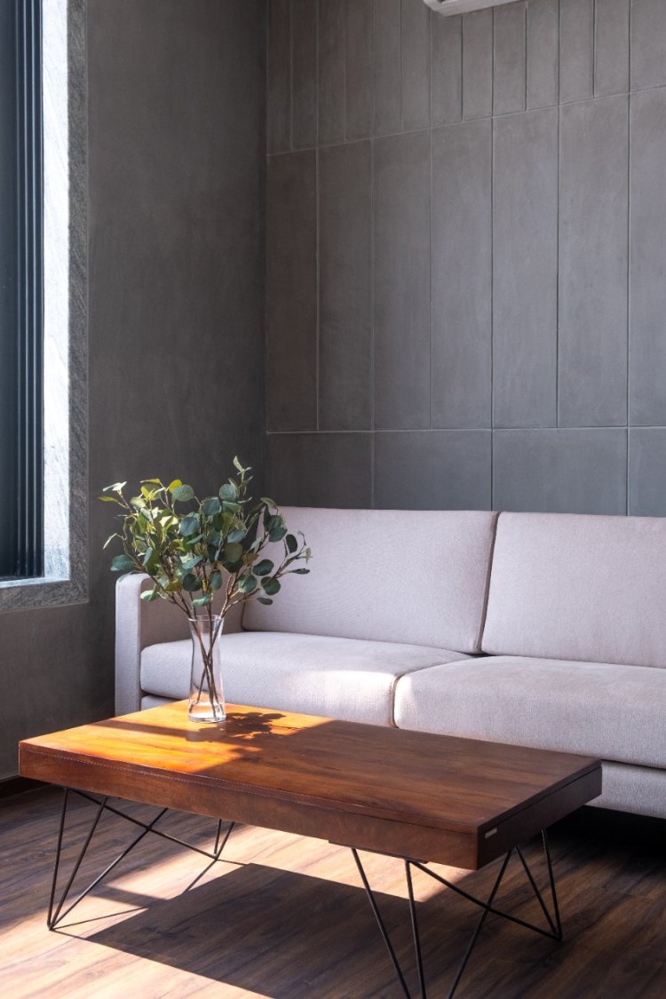
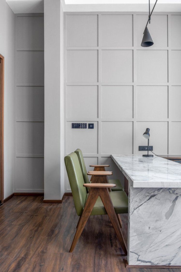
The two private cabins have been conceptualised with a shared vision in which functionality layered with statement materials, hues and textures manifest the design scheme. The former cabin employs slate grey grooved panelling that assembles to form an array of rectilinear motifs; this pattern is replicated on opposite walls to generate visual symmetry in the space. The second cabin sheaths its walls in a mild grey grid box panelling which is carried over on the opposing wall of the room. Both private cabins are peppered with marble work desks, olive-tone chairs, off-white lounge sofas, sculpturesque indoor plants, and geometric-inspired monotone task lighting. The cabins too witness the stretched-out scenic views through their ample windows that look into the surroundings.

Supplemental zones in the office are a cluster of the pantry and the powder bathroom. The utilitarian pantry assumes an L-configuration and emanates minimalism which is summoned forth by the usage of marble as a running countertop and backsplash material and muted cabinetry. The tessellated indigo, black and grey cement tile flooring pervades the pantry and dining nook, adding a touch of zest to the space. The slick powder bathroom is veiled in black-veined marble ubiquitously, where the framed mirror, dapper wall sconce, and Venetian blinds accent the space.

The Mill Project is a dexterous design endeavour that has inverted the approach towards conceiving spaces in the realm of industrialisation. Its acute devotion towards the adapted design grammar has allowed the workplace to redefine stated opulence in a novel light! The project liberates itself from archaic design directives to bestow its end-users with a venue that honours their bona fide roots while weaving together a perceptive narrative that straddles the past, present, and future with empathy.

