The NGO Office
An office space that is just as humble and comforting as the organisation that inhabits it
An office space that is just as humble and comforting as the organisation that inhabits it.
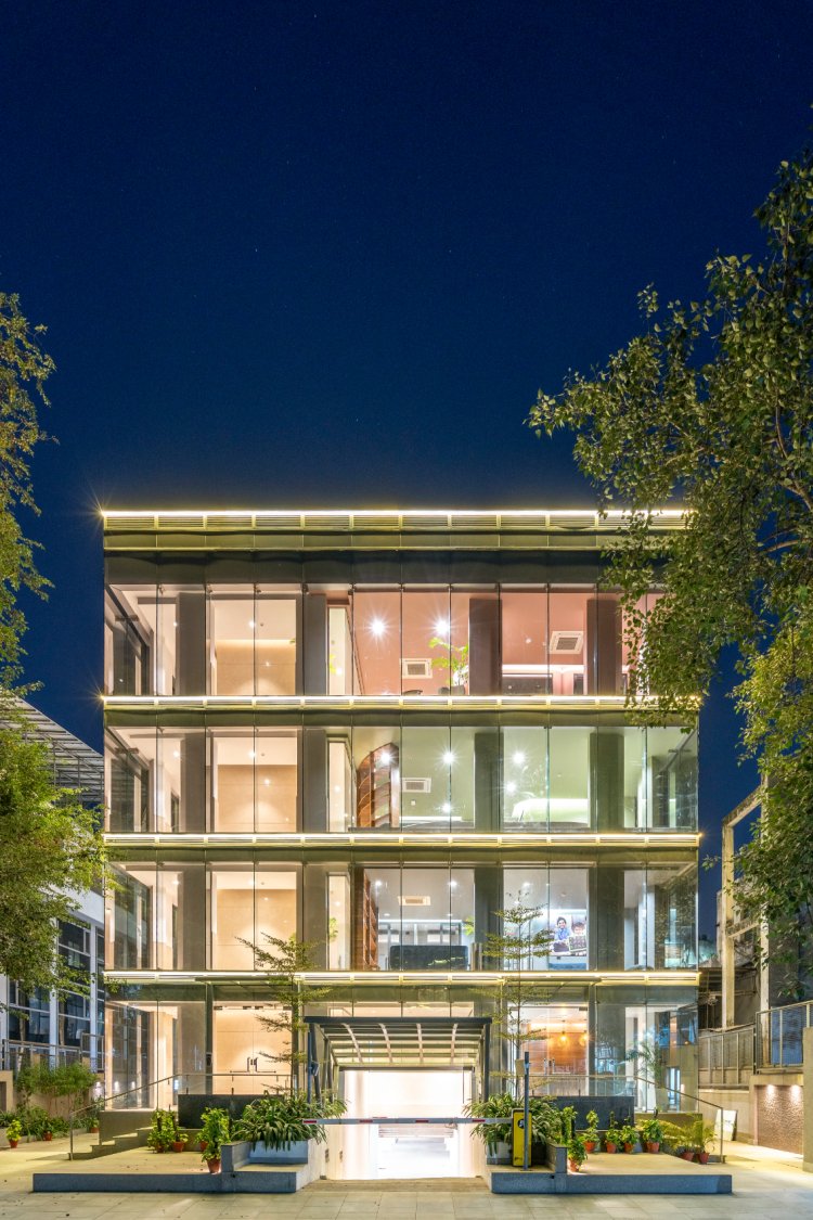
When building an office for a team that works on noble endeavours like children’s safety and education, women's empowerment and welfare, fighting for climate change, and many more, the office space must be as humble, thoughtful, and comforting as the organisation itself. Built in Delhi, this 22,000 square feet office is the headquarters of an NGO and is designed cost-efficiently to bring out the best in the space yet create an energising environment for a young and dynamic team.
The brief was to keep it simple since a non-profit organisation commissioned the work. The offices run by various groups are divided over four levels. Our objective was to find the most efficient way to distinguish each level yet unite them all under a common theme.
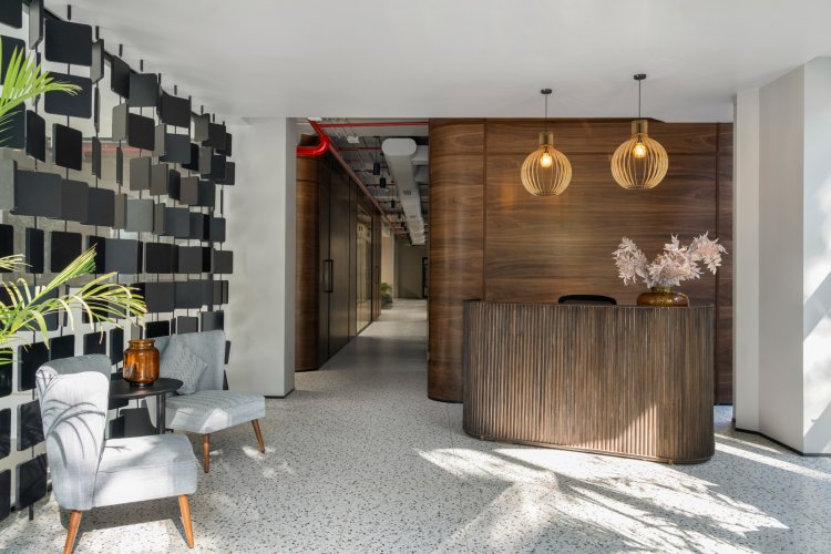
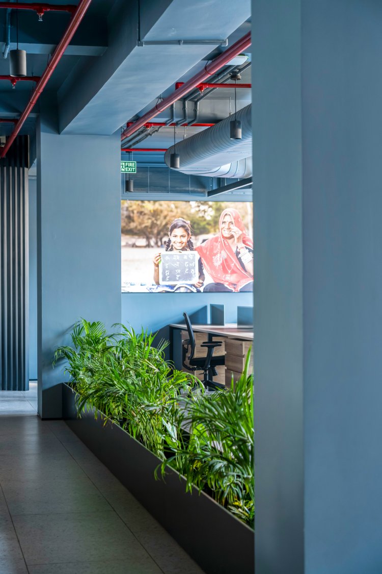
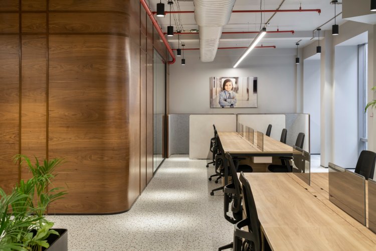
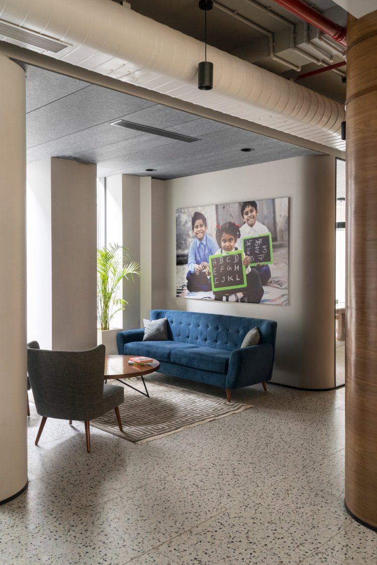
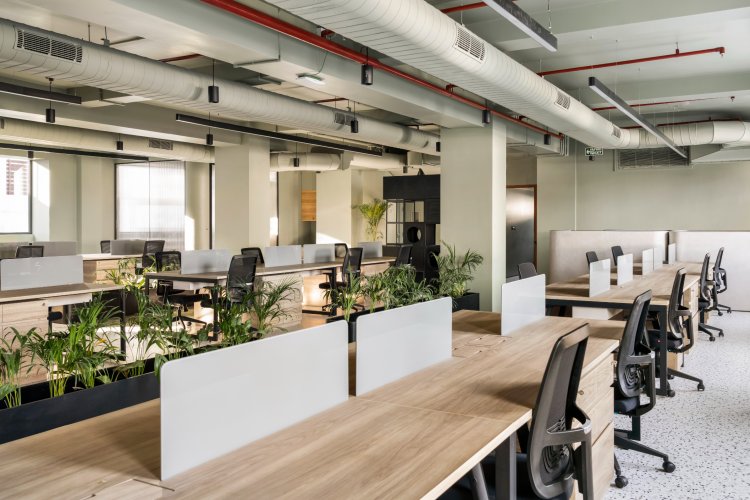
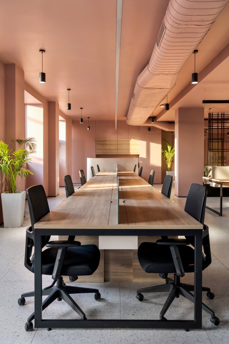
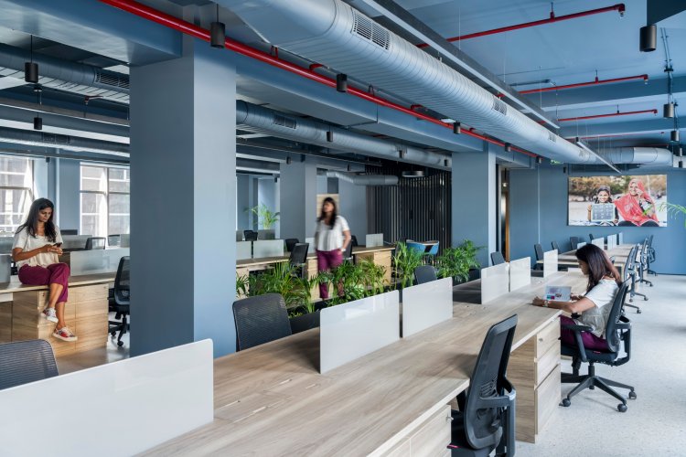
Terrazzo flooring, curved walls, exposed mechanics and large glass partitions are the key design features that tie the four levels together. Each floor is then enveloped in a unique colour representing the inhabiting organisation’s branding and ethos.
Executed in grey, the ground floor houses the reception, the executive board room, and formal and informal visitor interaction spaces. A dynamic branding wall that visually connects the reception and the driveway, is designed as a display for the logos of the various organisations working within the building. The reception table is made with swoops of metal, which is left unfinished, and it compliments the dressy veneer-panelled background, delicately finding a balance between the finished and raw.
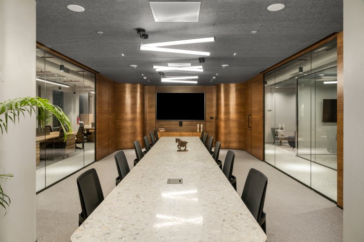
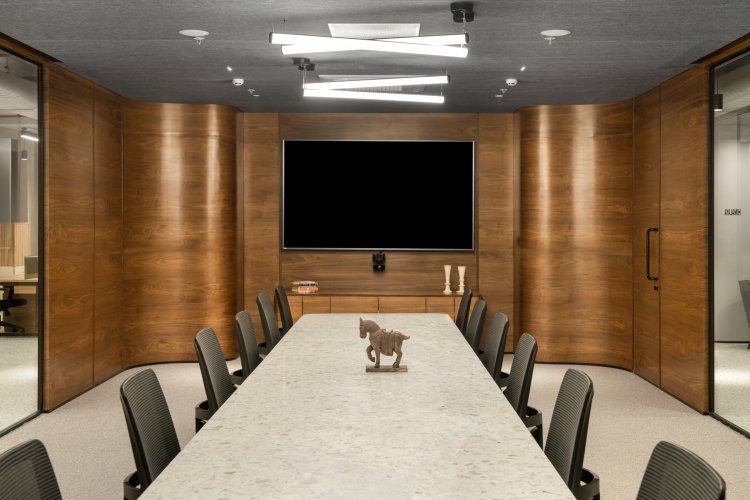
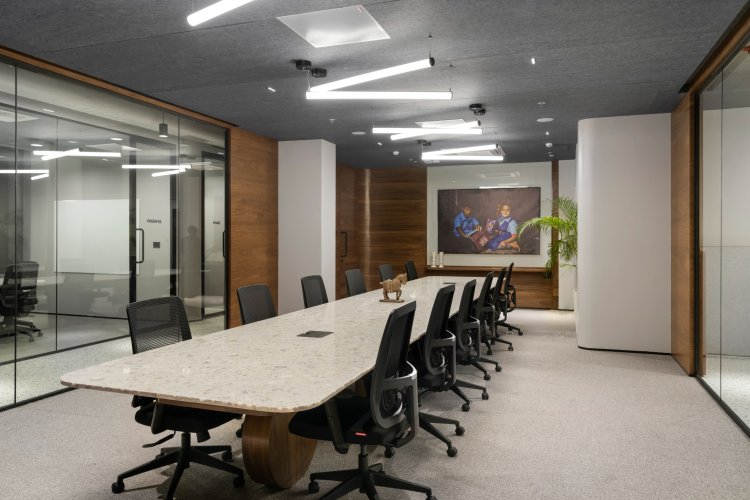
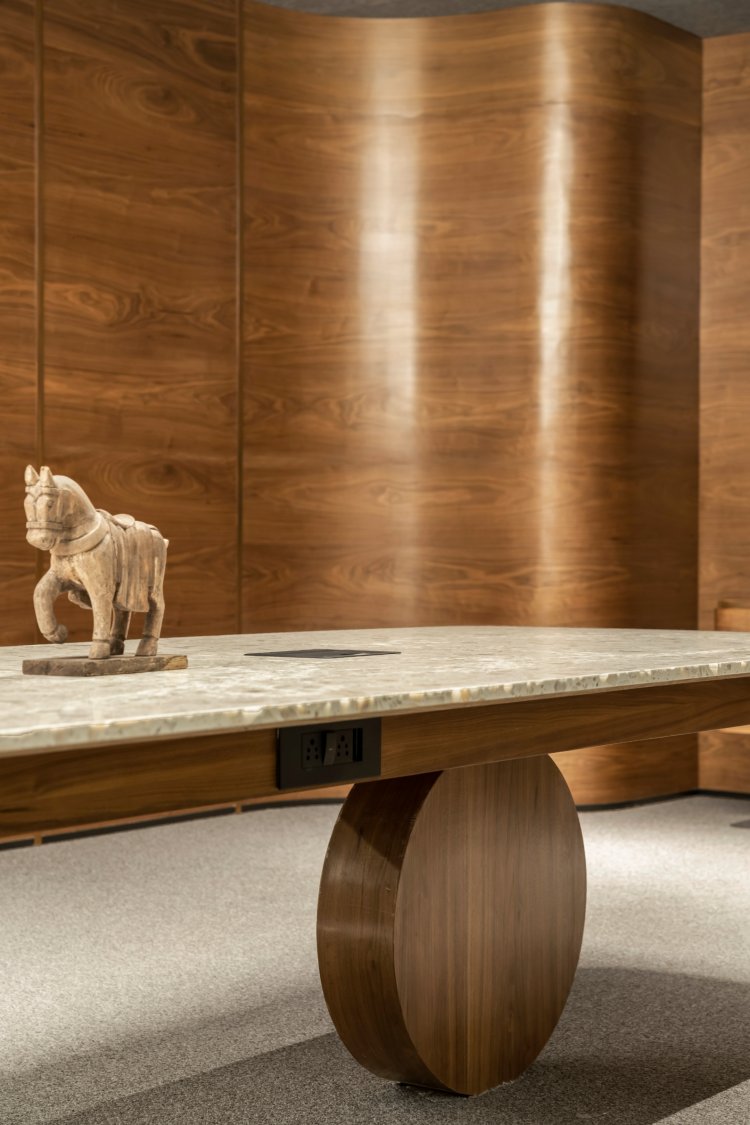
The edges of the passage leading to the rear of the office have been curved to allow for softer, more fluid planning and movement through the space. The conference room is designed with a terrazzo table as the centrepiece. The curved design language of the rest of the floor extends into the conference room as the sparingly used veneer walls add elegance to the otherwise simplistic space. Besides adding warmth, the acoustically treated ceiling also absorbs any excess echo and noise. Every meeting room has a distinctive shape for the leg of the table, adding a quirky detail that brings homogeneity yet adds a unique character to each meeting room. The large glass partitions double up as canvases for creative thinking while allowing for light to penetrate the core of the office.
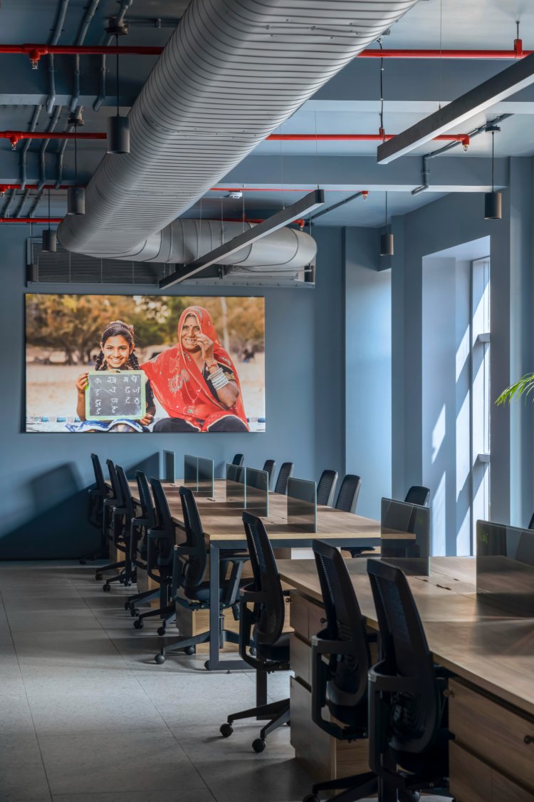
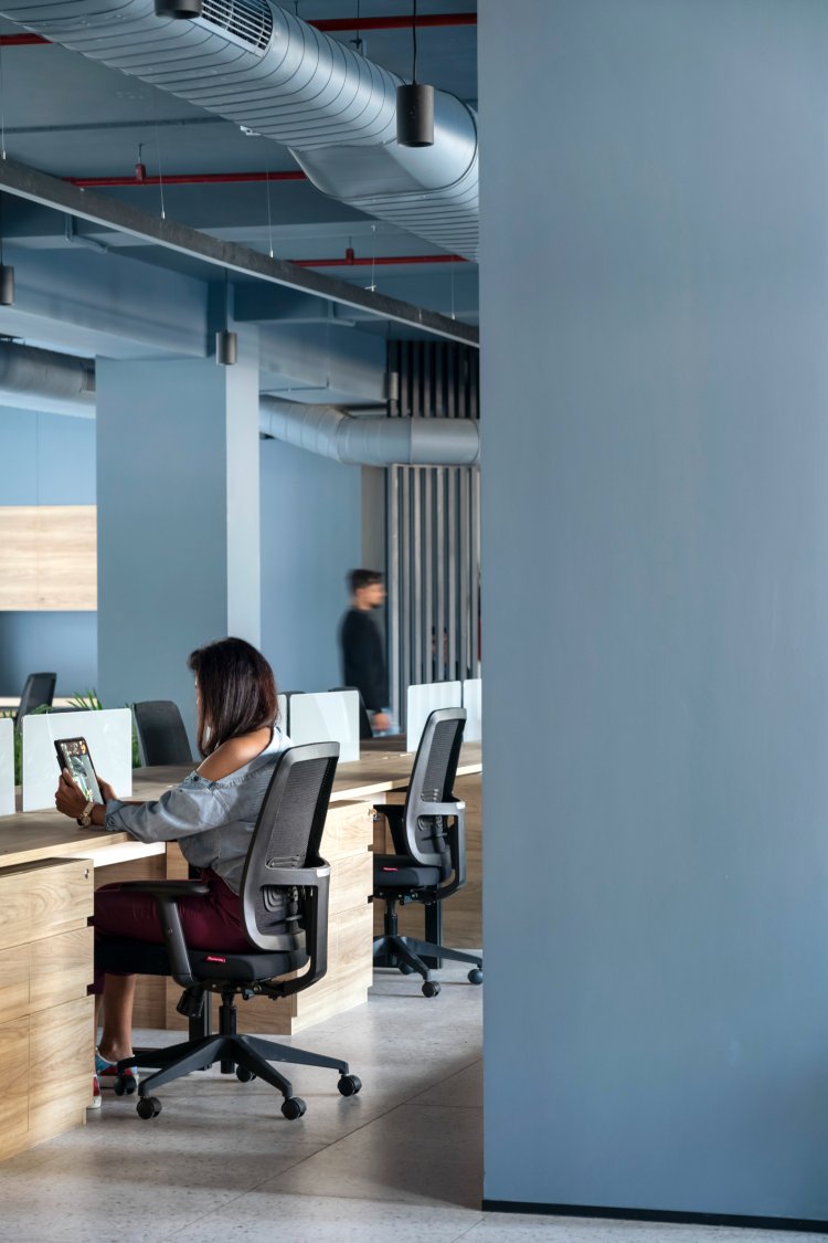
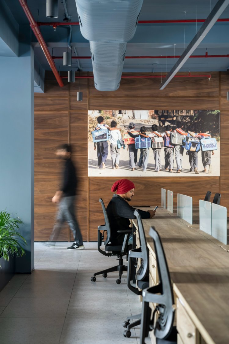
Discouraging private offices, an open office plan with acoustically treated enclosures for executives is the pattern that has been adopted throughout the building. Cosy corners and intimate units of telephone booths facilitate quiet getaways and the need for privacy. Small pockets of green act as gentle screens while keeping indoor air fresh. The floor’s unique colour extends up to the ceiling, making the otherwise industrial-looking feature seamless, warm and cosy. The open office makes the team’s energy contagious, while the various hand-writings on the glass walls bring the space alive, bringing the team in even on weekends.
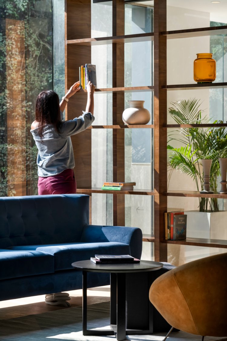
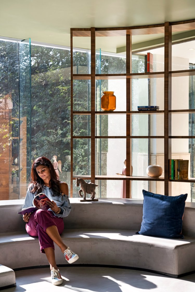
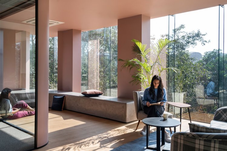
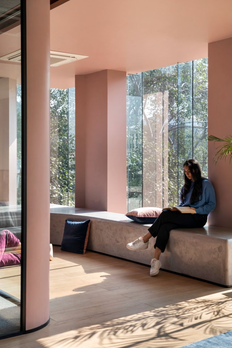
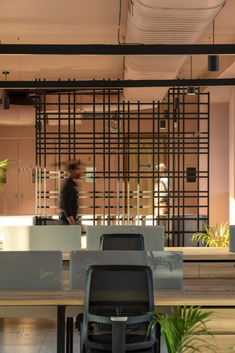
An enormous tree wraps itself around the northeast corner of the building and seeks pivotal attention from the breakout zones planned across all the floors keeping the tree in mind. Cosy corners that encourage interaction with this magnificent tree are the highlight of the break-out areas. In addition, the library books and multiple seating levels in these casual spaces act as conversation starters. The artworks on each floor are a reflection of the team’s efforts printed on canvas, constantly encouraging and inspiring. For instance, the first floor works on children’s education, and the walls have images printed onto the canvases of the children whose lives they have touched through their work. What makes the green floor unique is the interactive divider between the workspace and the pantry at the rear. The divider is made up of loose seating squares similar to lego that can be picked up and moved around to suit your mood. While on the pink floor, a wall of fins and grey concrete steps lend uniqueness to the space.
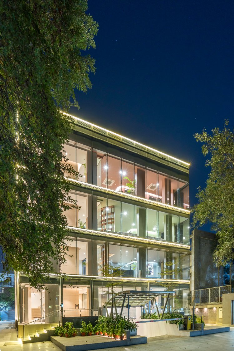
Additionally, to remain economically efficient, every element or design decision is driven by purpose, and not just aesthetics. Since the office is housed within a glass building, the windows have been coated with a film to reduce the heat gain in the summer months and subsequently conserve energy. Most of the loose furniture has been repurposed without compromising on the aesthetics of the space. To extend the idea of biophilia within the workspace, the terrace is proposed to be transformed into a roof garden that acts as a common break-out space for the entire building as well as a seating area for lunch breaks.
All in all, the NGO office by lyth design is envisioned as a humble, cost-effective workspace that boosts productivity and team well-being through sensitive design.

