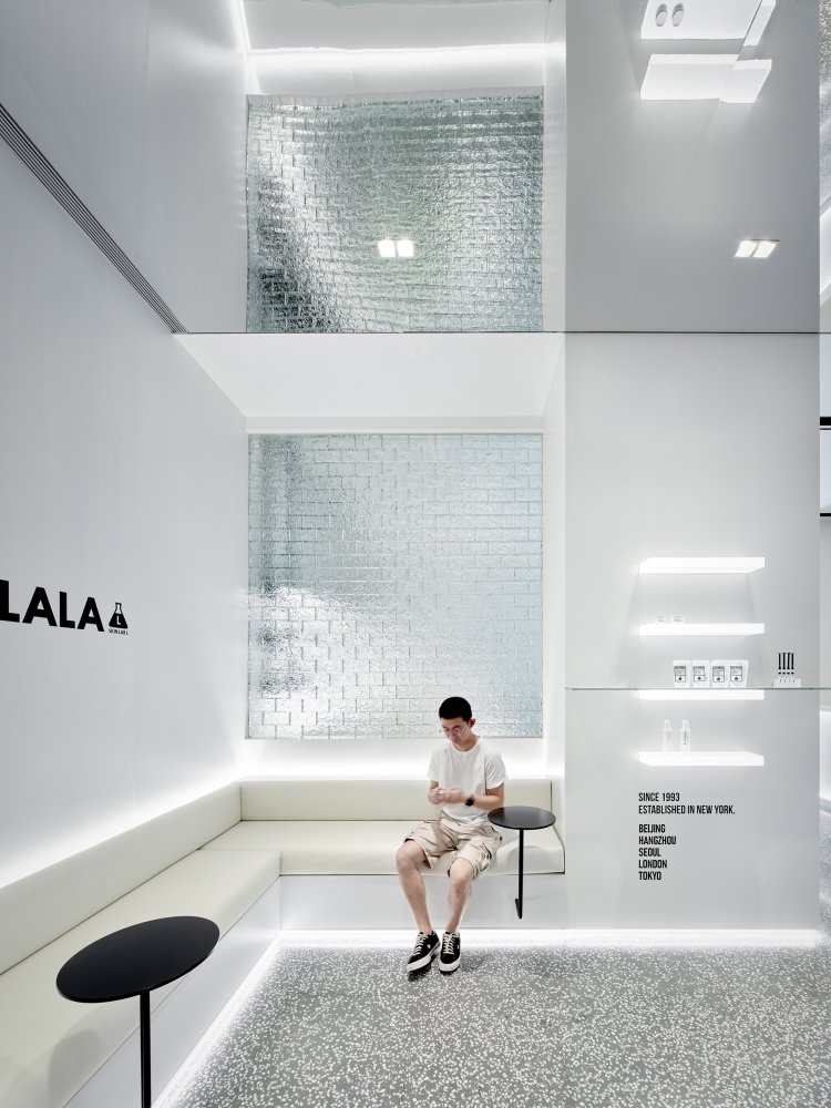
ISENSE DESIGN | SKINLALA Beauty Spa Flagship Store
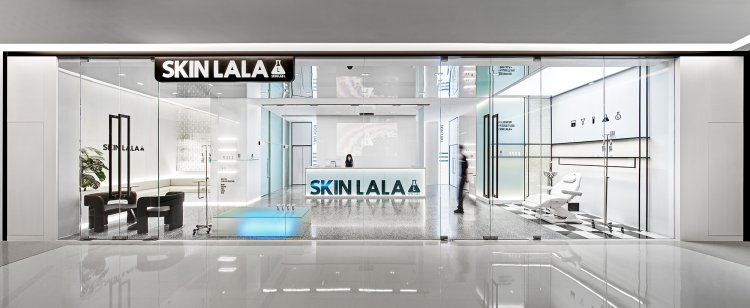
With the philosophy of “activating the power of skin with a scientific spirit", as an internationally renowned beauty and skincare brand, SKINLALA sticks to the rigorous scientific experimental spirit and advocates the natural beauty of skin activated in a healthy way. As the first flagship store in Beijing, China, conveying the brand concept visually through the space is the first concern for ISENSE DESIGN. Regarding this space as a woman, the design team hopes to highlight her healthy, active, and pure character, rather than the "technical beauty" that floods social media. "Water", an essential element of life, is the origin of design ideas.

SKINLALA BEAUTY SPA FLAGSHIP STORE

ISENSE DESIGN X SKINLALA
CHASE
“Fuzzy concepts are more expressive than clear ones. Beauty can be felt, but not be expressed in words, and people can not express all the thoughts in words.” -- Immanuel Kant
Fuzziness is one of the top-level expressions in art. Our lifelong pursuits always reach the peak of "beauty" at the moment we are about to touch it—that is, a state full of possibilities and unknown.


Prologue
With the philosophy of “activating the power of skin with a scientific spirit", as an internationally renowned beauty and skincare brand, SKINLALA sticks to the rigorous scientific experimental spirit and advocates the natural beauty of skin activated in a healthy way.
As the first flagship store in Beijing, China, conveying the brand concept visually through the space is the first concern for ISENSE DESIGN. Regarding this space as a woman, the design team hopes to highlight her healthy, active, and pure character, rather than the "technical beauty" that floods social media. "Water", an essential element of life, is the origin of design ideas.


▲HEADSPA SHOWCASE


Water, ice, crystal, frost, and ink
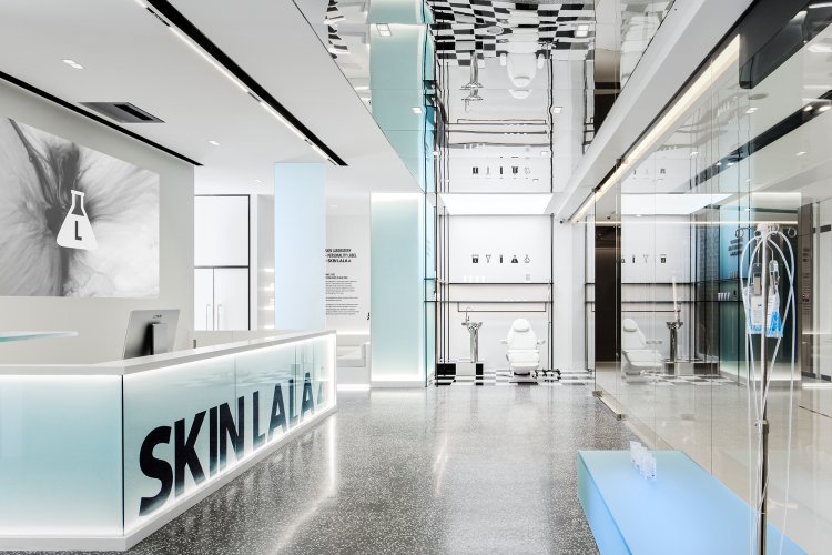
Water nourishes human beings, and washes dirt to make beauty appear. The five states of water are extracted to match the concise black and white palette of the brand's visual identity, applying materials such as lacquered panels, mirror panels, jade sand glass, glass bricks, and tempered glass to the space. Blended with ice blue, the rigid relationship of black and white is softened to create a clear and pure space feeling.


Frost
Fuzziness and clarity can produce a wonderful chemical reaction at the tipping point when they are about to merge. Just as the brand advocates a rigorous scientific skincare concept, this kind of scientific research spirit refers to the ultimate exploration in the pursuit of truth, which is also the intention of the project name as CHASE. The design is a metaphor that every consumer who pursues "beauty" will have a positive attitude to life.


▲SKIN INDEX skin consultation room


Crystal
Glass materials are used to fulfill the function area division and reasonable circulation while introducing light so that the small space is not cramped, and the inside and outside are more interactive. At the same time, on the product display, the technical crystallization of the brand's deep research is also fully displayed, highlighting the brand differentiation through scientific medical forms such as infusion bags and injections. This is also one of the biggest features of SKINLALA, which is customized for individuals and dispenses the most targeted skin awakening program on the spot.


Ink
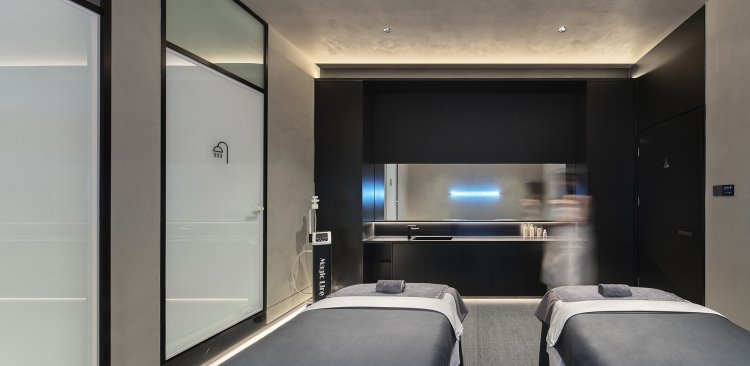
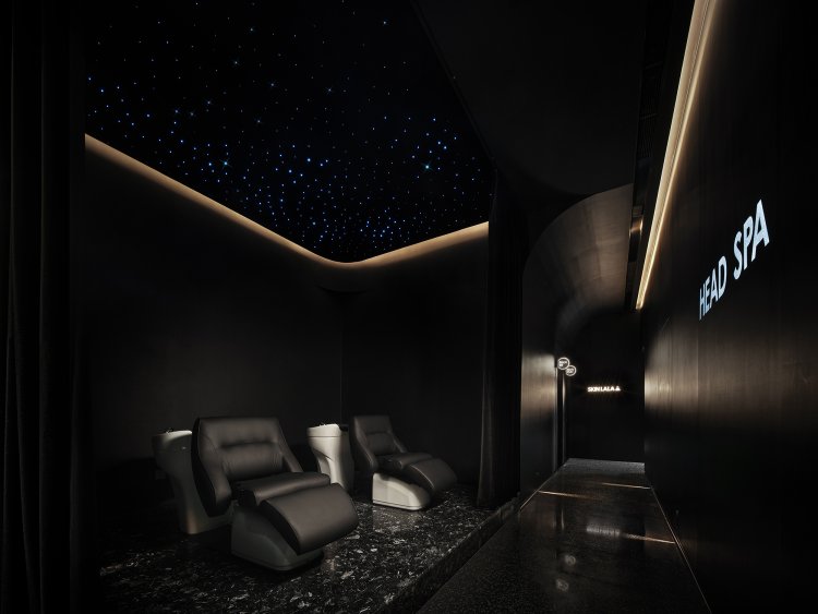
More comfortable and relaxing lighting is required for facial oxygenation, facial Pilates, head care, and body spa. When customers enter the guest area from the front hall, they will become silent in an instant when coming into the quiet black space. The head care area has a shimmering blue starry ceiling, supplemented by projections on the wall, creating a theater-like feeling as the black curtain is drawn. Lighting is extremely restrained in this space, where footlights are used to guide the way. All the equipment is hidden in the black stainless steel slot at the top, and the curved top and jade sand glass break the monotony in the narrow and long corridor.


Restroom
The public restroom is divided into two parts by black and white to increase the visual width. The full-length mirrors with customized LOGO are convenient for customers to take selfies while achieving brand communication. All sanitary wares are high-end German brands to provide customers with the best experience in detail.

Room
With a luminous acrylic sign on the door, each room has intelligent lighting and sound systems, which has a low-light and silent mode when unoccupied; when the guests approach the room, the lights will slowly light up, and as the guests enter, the "welcome mode" will be activated, and the greeting words and music will be played automatically. What’s more, the smart panel can meet the calling function of customers and staff.


Makeup
The ladies’ room is on the left side of the guest area. Like all other spaces, ISENSE DESIGN pays attention to every detail, and hides all unnecessary equipment and air vents in invisible places to achieve a small pure space. Arched design elements extend in this space, creating an interesting powder room, where the soft light environment has an imagenomic portraiture effect for photo-taking.


Project name: SKINLALA Beauty Spa Flagship Store
Brand: SKINLALA
Project area: 300㎡
Completion time: August 2022
Design Company: ISENSE DESIGN (www.isensedesign.cn)
Chief designer: Sissi Bu
Designer team: Shouxin Sun, Zihao Song, Jian Lin
Photographer: Lv Bo

