Where I Work: David Stark
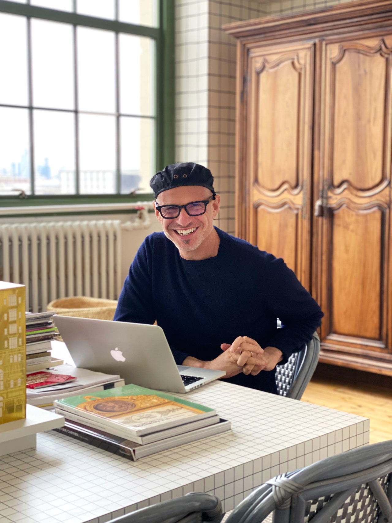
We visit the busy David Stark in his Industry City headquarters in Brooklyn to see where he works and how he makes it all happen.

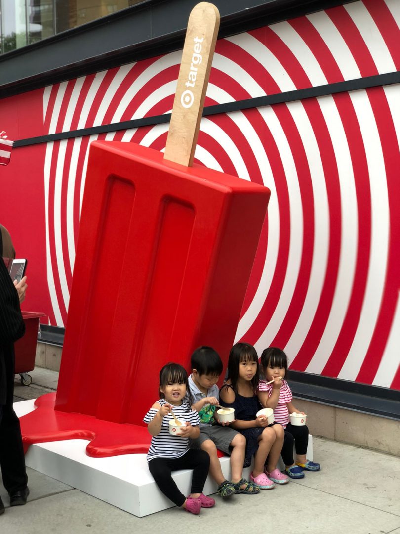
It’s been exactly a decade since we checked in with David Stark, a New York-based event producer, designer, author, and President + Creative Director of his eponymous, full-service event design and planning firm, David Stark Design and Production. Founded in 2006, the company has become a go-to expert for fully immersive experiences providing their innovative expertise to the likes of Target, Kiehl’s, Uniqlo, non-profit The Robin Hood Foundation, The Whitney Museum of Modern Art, and The Metropolitan Opera, in addition to a range of one-of-a-kind events for a host of celebrities. He’s also collaborated with West Elm on several collections, done a “store ambush” of Haus Interior in NYC for his WOOD SHOP collection, and a limited edition collection of unique art pieces made exclusively for Bergdorf Goodman. For this month’s Where I Work, we visit the busy mogul in his company’s Industry City headquarters in Brooklyn to see where he works and how he makes it all happen.
What’s your studio/work environment like?
Our office, where we design and mastermind events is a large, light-flooded loft that overlooks a great view of the Statue of Liberty in Brooklyn’s Industry City. It’s comfortable with many conference rooms, a kitchen where the team regularly makes all kinds of yummy, home-cooked meals, a design library that houses material samples and reference books, and an open office plan, encouraging the collaborative process. We also have an area that we use as a photo studio and crafting areas where we experiment regularly. While not fastidious in an overly fussy way, the office has a quiet intensity that wonderfully exudes rapt concentration and innovative thinking.
Our studio, where we build the things we design, is a few blocks away. There are buzzing wood and paint shops, crafting areas, and a floral studio with a giant floral fridge. We also have an adjacent warehouse that houses a wonderful history of items we have purchased or built over the years that we regularly transform or reutilize. Trucks pull right up to the dock, and we load straight out of roll-up garage doors. The studio is a wonderland of art-making where anything is possible. The talented and passionate team there trumpet such optimism while continuously pushing out work that is innovative and of the highest quality.
How is your space organized/arranged?
I do have a personal office with a door as well as a glass wall facing into the communal team workspace. There are a few other individual offices like that including the ones for our fabulous administrative and finance teams, but the rest of the gang works in the open plan area. The truth is that I am actually in my office proper very little. I meet with the teams daily in our design library for what we call Office Hours. During Office Hours, the teams present the projects that we are working on for feedback, we kick-off new projects, and we discuss issues related to the events we are producing. Because our projects are incredibly collaborative, it’s more common that we use our conference rooms for big, group work sessions or meetings. We use my office in this way too. I have a giant table in the center of it in which the teams will join me for conference calls with clients or group discussions.
How long have you been in this space? Where did you work before that?
We have been in our home in Industry City for about four years. We have what now feels like a very “adult office” and a much more advanced studio than we had prior. These spaces were designed and planned to be efficient and to meet the needs of our growing organization which is very different than the original spaces we were in for about 20 years prior, held together by tape, hope, and a whole lot of love and ingenuity.
You know, our previous offices and studio were first my home and painting studio/loft when I was a fine artist. I and a former partner lived there, and when our business started to grow, and when we added staff, we simply got rid of the sofa, for example, to make way for a desk. There was no planning at all, and as our business grew organically, so did the way we used (or abused!) our limited space. We were more than overdue a new home for the scale of what our company had grown into. I mean, I remember waiting in line to use the one, single stall bathroom we had in the old, two-floor office with my legs crossed in angst and anticipation. It was time to move!
If you could change something about your workspace, what would it be?
You know, there is very little I would change, to be honest – I truly LOVE it, and I can barely remember life before our current home. Our studio and office feel so, so natural and so “us.”
Is there an office pet?
There is not.
Do you require music in the background? If so, who are some favorites?
At the office, we don’t have music playing, but it is not uncommon for our team to be listening to their own tunes on their headphones while they work.
At the studio, there is music of all kinds on at all times. The gang takes turns playing their favorite mixes. For a while, Buena Vista Social Club was on a constant rotation, but sometimes I walk in and am surprised (as well as delighted) to hear classical music playing in the wood shop!
How do you record ideas?
I have a series of pads all over the house, in my office, and in the bag that I carry around with me. They are mostly nothing fancy, usually simple, blue-lined legal pads, but at home, I like the thick blocks of white paper with silver painted edges by WMS & Co. It feels really luxurious to write on those blocks, especially with a mechanical pencil. One of our wonderful designers, Daria Semenova has taught me the joys of the mechanical pencil – she’s got a whole array of them that I am envious over. I finally got one for my home, but I don’t carry it around with me because I would lose it in an instant.
My best ideas come while I am in the shower shaving. I often have to take a break to quickly write them on a pad close by in the bathroom, jumping right back, under the water to finish after. If I don’t do that, I forget the thoughts by the time I am done with the shower. I mourn the many forgotten ideas that I imagined I would remember but did not.
Do you have an inspiration board? What’s on it right now?
I used to keep traditional, black-hardbound sketchbooks where I would draw or paste in clippings or other inspirations, but I have not done that in years. Now, we typically keep track of inspiration digitally, either with Pinterest or mood boards that our team creates in InDesign.
On occasion, though, we make physical boards that are particular to a project. For example, we are currently collaborating on a new tabletop book with designer and co-author Jane Schulak and photographer Aaron Delesie. There is so much content that we need to examine simultaneously that it was natural to go old-school and create pin-up boards that allow us to see all the materials in one place.
What is your typical work style?
I am personally quite disciplined. I get up every day (Monday through Friday) somewhere between 4:00 and 5:00am. I am freshest between then and 7:00am, before the world wakes up and before I am pulled in a thousand directions. I wouldn’t say it’s easy for me to get out of bed, though. When that alarm goes off at 4:15, it’s painful, but I love the focus that I have in those early hours and being that creatively fresh overcomes the temptation to stay in bed. At 7:00am, I go to the gym to take care of my body and my mind, and then I am off and running to the office, to outside meetings, and events into the evening.
My days are very, very scheduled, generally back-to-back, and the rigor can be intense. It’s a combination of inner office meetings with the team as well as meetings with clients and potential clients outside of the office, and then there are installation and event days/nights on top of that. It’s a marathon, for sure, but I thrive on it. I suppose I have built pretty good stamina up over the years.
But because there is an intensity to the work I do, it was very important for me, when designing and conceiving of our offices, that a sense of serenity and calm were as considered as how our spaces function for the work we do.
What is your creative process and/or creative workflow like? Does it change every project or do you keep it the same?
We strategically keep our creative process similar from project to project. Because we have a large team, with multiple people collaborating on each project, it’s most productive to have systems in place, so that we’re all working towards the same milestones. We start off with a team kick-off where we share the goals of our clients. It is super important to establish from the outset what we want/need to achieve, and then we outline the plan of attack as to how we are going to achieve it. We ask ourselves: What are the presentation methods we are all agreeing upon? What is the timeline? What is the budget? How do we build-in the right check-ins along the way? This stuff sounds boring, but the structure is critical to successful workflow.
What kind of art/design/objects might you have scattered about the space?
We have a collection of sculptures of old-school phones we have recently started. One, my husband (performer and artist) Migguel Anggelo made out of matches. A few others are from past projects, and a tiny one I picked up at the Brooklyn Flea. It’s what the old telephone door-to-door salesman used to bring to “sell” the concept of a rotary phone. I love them.
We also have our light-up building number, “87” from our old digs. It’s a fun reminder of where we came from. We even took the door from our old design studio. These relics are meaningful to me. They chart our journey.
Are there tools and/or machinery in your space?
We have quite an extensive wood shop, paint room, and floral production area, so we have all the tools-of-the-trade for those pursuits. The team is particularly pumped about our new quiet air compressor! We’ve also recently started using a Hopper gun which allows us to finish off our builds with various textures: sand, plaster, glitter, and more.
What tool(s) do you most enjoy using in the design process?
It’s not a “tool” in the traditional sense but . . . I most enjoy the collaborative nature of working with a team. The old adage of Together Everyone Accomplishes More, is so true, and it’s one of the reasons why I transitioned from fine art to design. I started off as a painter which was a very solo endeavor, but I much prefer working within a thriving community of doers, and that collaboration has become an integral part of my design process!
Let’s talk about how you’re wired. Tell us about your tech arsenal/devices.
I typically have my laptop, iPad, and iPhone all going at the same time. I review designs presented to me by the various teams on my iPad, while I type them feedback on my laptop.
What design software do you use, if any, and for what?
Because our team includes technical designers that come from all kinds of architectural, stage, and industrial design backgrounds as well as graphic designers, and 3D designers, we intermingle a lot of software platforms that include: Sketchup, Vectorworks, Adobe Creative Suite (InDesign, Illustrator, Photoshop), and a whole bunch of image search engines.
What’s on your desk right now?
My desk is covered with stacks of books, folders with notes for our current projects, a sculpture of the Carnegie Hall building which is also a lantern. We made 70 of them as centerpieces for their gala a few years back, and I kept one!
Is there a favorite project/piece you’ve worked on?
It’s very difficult for me to cite a favorite project as they are all so meaningful to me. I am proud, though, of the long collaboration we have had with the Robin Hood Foundation, designing their big benefit at the Jacob K. Javits Convention Center for so, so many years. It’s probably one of the largest projects that we work on and includes a seated dinner for about 4,500 people with another 2,000 joining for an after-party concert. It’s a giant team sport where we partner with a cast of truly inspiring, talented folks to pull off what is ultimately one of the most successful and moving fundraisers to fight poverty in NYC – or anywhere, for that matter.
Last year’s theme was Robin Hood to the Power of You. Our transformation included installations relating to math, measurement, calculations, education, and teamwork in general. Guests entered through a grand corridor of backpacks filled with school supplies that created vivid stripes on the walls. After the event, the backpacks were donated to over 7,000 New York City school kids. I loved telling an education story with materials that are meaningful and have a life after the event, so that there’s no waste.
Tell us about a current project you’re working on. What was the inspiration behind it?
We are currently designing and planning the Metropolitan Museum of Art’s 150th Anniversary Gala. This is another institution near and dear to our hearts, and we have just begun to dive into the research. We love nothing more than exploring an institution’s archives to find that perfect, conceptual idea to base the whole night upon! It’s a truly exciting milestone to be part of!
Do you have anything in your home that you’ve designed/created?
Yes! I have many, many things in my home that I have designed or created, for sure, and probably too many to name in their entirety. Here are three examples:
• Upon entering my apartment there is a piece of artwork that is hanging above an entry table. It’s essentially a chalk drawing that has been sealed, but it was actually cut down from a giant set piece that was created for a benefit we designed for the Robin Hood Foundation many years ago. For this event, we rendered New York City as a giant, dimensional chalk drawing so that the guests could, as a metaphor, redraw the city as we know it, erasing poverty in the process. The remaining piece that I kept as a keep-sake is somewhat abstract, but you can make out some figures walking across a series of horizontal lines. Before the piece was cut down, it depicted the New York Public Library, with horizontal lines as the grand staircase leading from the street to the Library. A fabulous artist named Dave Singley did the drawing. He has been a central part of studio team at David Stark Design for many years as well.
• In our kitchen, a basket woven “bull’s head” presides over the central island proudly. Years ago, when I was designing a collaborative collection with West Elm, this was a sample for a product within a Picasso inspired collection. West Elm did not move our bull into production, but I kept the sample and love it as much today as I did when we first viewed it.
• I also have a set of plates that I designed for Culture Lab Detroit in collaboration with Pewabic Pottery, Detroit’s iconic ceramics house. I love these and take good care of them, because it’s impossible to replace ones that break!


