Global designers collaborate on Li Beirut typeface to support victims of blast
Beirut-born type designer Nadine Chahine has commissioned a typeface from contributors including Erik Spiekermann and Mamoun Sakkal to raise funds for victims of the devastating explosion in Beirut. Li Beirut, which means "For Beirut" in Arabic, consists of over 300 glyphs and was designed by 157 creatives from all over the world. The glyphs have been combined The post Global designers collaborate on Li Beirut typeface to support victims of blast appeared first on Dezeen.

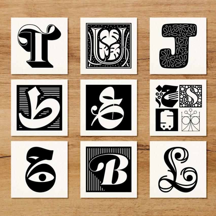
Beirut-born type designer Nadine Chahine has commissioned a typeface from contributors including Erik Spiekermann and Mamoun Sakkal to raise funds for victims of the devastating explosion in Beirut.
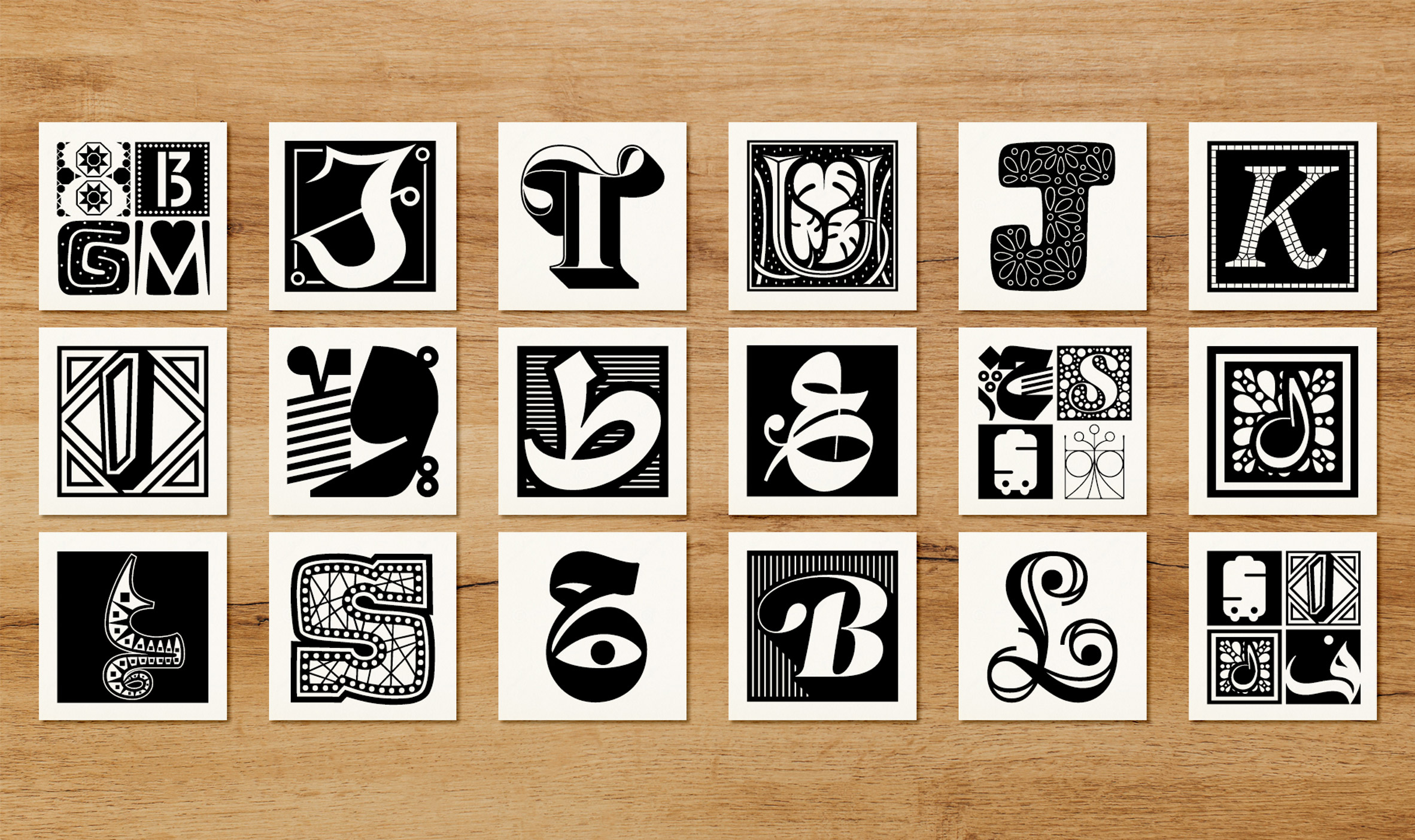
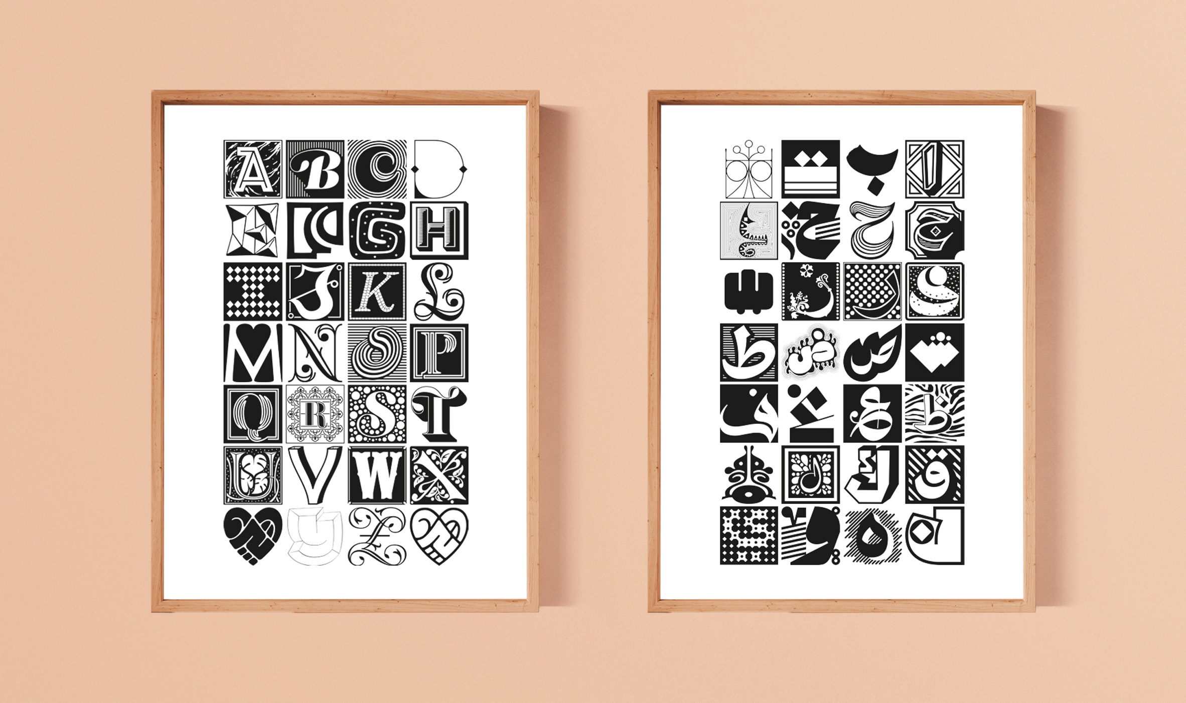
Li Beirut, which means "For Beirut" in Arabic, consists of over 300 glyphs and was designed by 157 creatives from all over the world.
The glyphs have been combined into a working typeface that can be downloaded as part of the fundraiser.
The project started as a way for Chahine to help support the city of Beirut after the blast on 4 August.
"The blast was a very short drive from our family home, and the areas affected are ones I know very well," she told Dezeen.
"So many of my friends in the design community immediately called or texted and I knew that many more would want to show support, so I just started reaching out to designer friends to see if they would want to work together to fundraise."
The resulting submissions came from designers including Chahine herself, Jean-François Porchez, Jessica Hische, Erik Spiekermann, Martina Flor, Tobias Frere-Jones, and Hannes von Doehren.
Arabic designers taking part include Mamoun Sakkal, Bahia Shehab, Khajag Apelian, Wael Morcos, Yara Khoury, Kristyan Sarkis, and Maha Akl.
Designers could create any letter, number or symbol they wanted in Arabic or Latin lettering, with the Arabic letter Waw and the Latin letter B the most popular. The final collection includes letters from both alphabets.
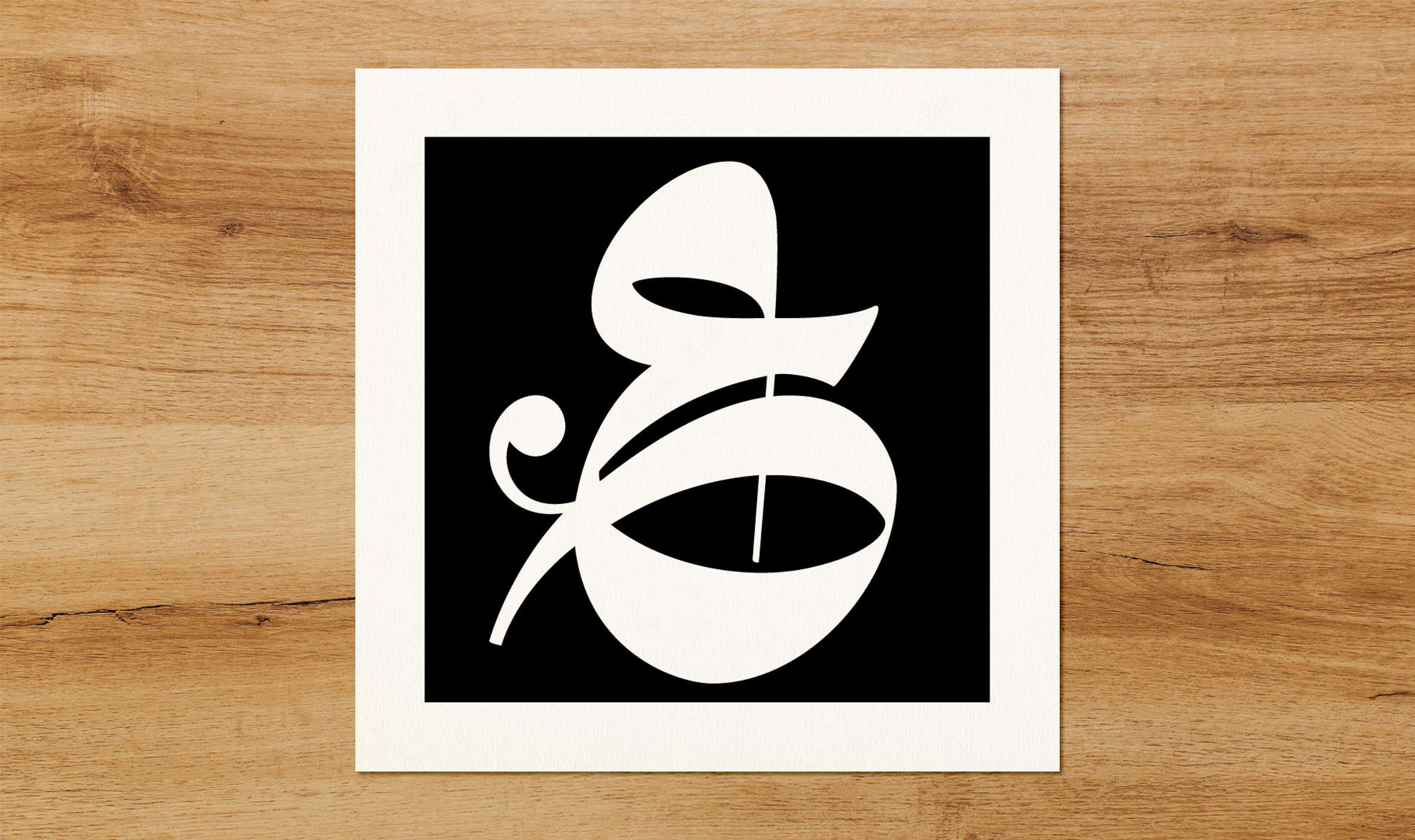
"The font includes decorative isolated Arabic letters and Latin capitals as well as Arabic numerals and a few symbols, all in one font file, together symbolising the solidarity of the international community with Beirut and its people," Chahine said.
Her personal favourite is the design that ended up being used as the campaign logo.
"It's the word Beirut drawn in the shape of a heart, designed by award-winning designer Mamoun Sakkal," she said. "It's simple and yet very powerful."
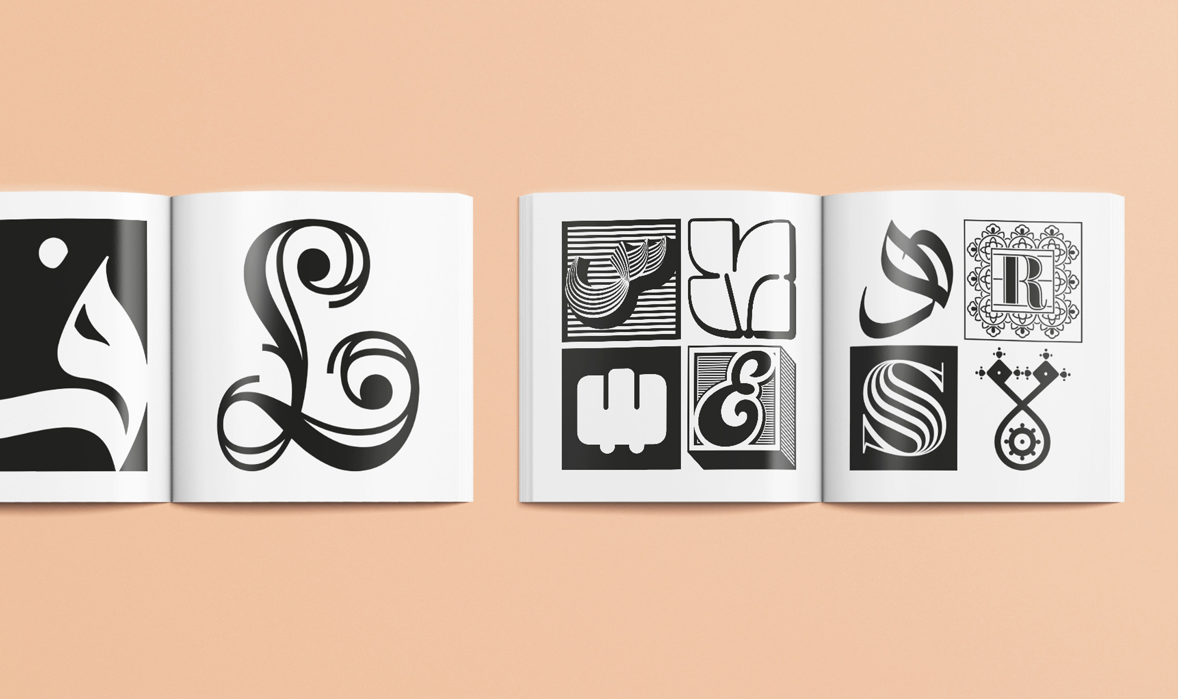
Li Beirut launched a crowdfunder on 18 August that will sell both the typeface itself and related merchandise, including postcards, alphabet posters and a print catalogue of the work. All products will be printed and shipped from Beirut.
"This way we raise funds for charity and support small local businesses to get back on their feet," Chahine told Dezeen.
"The charities and organisations that will receive the funds are local ones, starting with the Lebanese Red Cross and the three hospitals destroyed in the blast. We're also looking for local charities or NGOs that support small businesses and designers."
Chahine has previously created typefaces including Frutiger Arabic, Neue Helvetica Arabic, Univers Next Arabic, Palatino and Palatino Sans Arabic, and Koufiya.
In her former role at typeface design specialist Monotype she was one of the designers, together with Malou Verlomme, who gave Transport for London's 100-year-old Johnston typeface an upgrade.
The post Global designers collaborate on Li Beirut typeface to support victims of blast appeared first on Dezeen.
